

Bootstrap Groups
Bootstrap Button Groups allow you to combine multiple buttons into a single line or stack them vertically. This feature is useful for organizing related actions in a compact space.
Classes for Bootstrap Button Groups
Here's a table of classes used for creating button groups in Bootstrap:
| Class Name | Discription |
|---|---|
| .btn-group | Base class to group button horizontally. |
| .btn-group-lg | creates a group with large buttons. |
| .btn-group-sm | creat a group with small buttons. |
| .btn-toolbar | Combines multiple button groups into a toolbar. |
| .btn-group-vertical | Stacks buttons vertically. |
| role=”group” | ARIA role indicating grouped buttons for accessibility. |
| .dropdown-toggle | Used to create a dropdown within a button group. |
1. Basic Button Group
<!DOCTYPE html>
<html lang=”en”>
<head>
<meta charset=”UTF-8″>
<meta name=”viewport” content=”width=device-width, initial-scale=1.0″>
<title>Bootstrap Button Group Example</title>
<!– Bootstrap CSS –>
<link href=”https://cdn.jsdelivr.net/npm/bootstrap@5.3.3/dist/css/bootstrap.min.css” rel=”stylesheet”>
</head>
<body>
<div class=”container mt-5″>
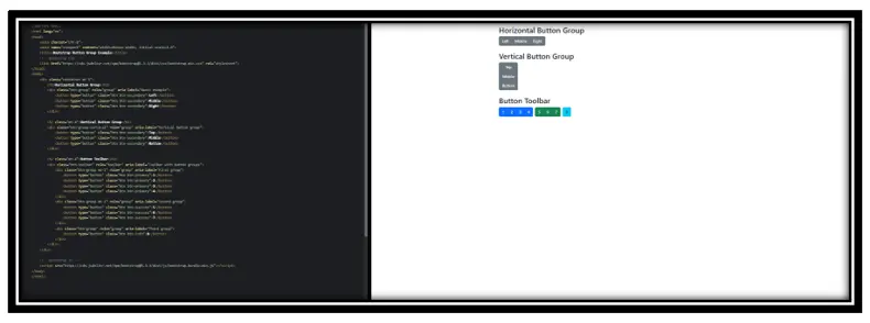
<h2>Horizontal Button Group</h2>
<div class=”btn-group” role=”group” aria-label=”Basic example”>
<button type=”button” class=”btn btn-secondary”>Left</button>
<button type=”button” class=”btn btn-secondary”>Middle</button>
<button type=”button” class=”btn btn-secondary”>Right</button>
</div>
<h2 class=”mt-4″>Vertical Button Group</h2>
<div class=”btn-group-vertical” role=”group” aria-label=”Vertical button group”>
<button type=”button” class=”btn btn-secondary”>Top</button>
<button type=”button” class=”btn btn-secondary”>Middle</button>
<button type=”button” class=”btn btn-secondary”>Bottom</button>
</div>
<h2 class=”mt-4″>Button Toolbar</h2>
<div class=”btn-toolbar” role=”toolbar” aria-label=”Toolbar with button groups”>
<div class=”btn-group me-2″ role=”group” aria-label=”First group”>
<button type=”button” class=”btn btn-primary”>1</button>
<button type=”button” class=”btn btn-primary”>2</button>
<button type=”button” class=”btn btn-primary”>3</button>
<button type=”button” class=”btn btn-primary”>4</button>
</div>
<div class=”btn-group me-2″ role=”group” aria-label=”Second group”>
<button type=”button” class=”btn btn-success”>5</button>
<button type=”button” class=”btn btn-success”>6</button>
<button type=”button” class=”btn btn-success”>7</button>
</div>
<div class=”btn-group” role=”group” aria-label=”Third group”>
<button type=”button” class=”btn btn-info”>8</button>
</div>
</div>
</div>
<!– Bootstrap JS –>
<script src=”https://cdn.jsdelivr.net/npm/bootstrap@5.3.3/dist/js/bootstrap.bundle.min.js”></script>
</body>
</html>
Output:
In this Example:
Horizontal Button Group: Groups buttons in a horizontal line using the .btn-group class.
Vertical Button Group: Stacks buttons vertically with the .btn-group-vertical class.
Button Toolbar: Combines multiple button groups into a toolbar using the .btn-toolbar class.
2. Button Toolbar
<!DOCTYPE html>
<html lang=”en”>
<head>
<meta charset=”UTF-8″>
<meta name=”viewport” content=”width=device-width, initial-scale=1.0″>
<title>Bootstrap Button Toolbar Example</title>
<!– Bootstrap CSS –>
<link href=”https://cdn.jsdelivr.net/npm/bootstrap@5.3.3/dist/css/bootstrap.min.css” rel=”stylesheet”>
</head>
<body>
<div class=”container mt-5″>
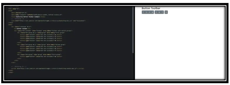
<h2>Button Toolbar</h2>
<div class=”btn-toolbar” role=”toolbar” aria-label=”Toolbar with button groups”>
<div class=”btn-group me-2″ role=”group” aria-label=”First group”>
<button type=”button” class=”btn btn-secondary”>1</button>
<button type=”button” class=”btn btn-secondary”>2</button>
<button type=”button” class=”btn btn-secondary”>3</button>
<button type=”button” class=”btn btn-secondary”>4</button>
</div>
<div class=”btn-group me-2″ role=”group” aria-label=”Second group”>
<button type=”button” class=”btn btn-secondary”>5</button>
<button type=”button” class=”btn btn-secondary”>6</button>
<button type=”button” class=”btn btn-secondary”>7</button>
</div>
<div class=”btn-group” role=”group” aria-label=”Third group”>
<button type=”button” class=”btn btn-secondary”>8</button>
</div>
</div>
</div>
<!– Bootstrap JS –>
<script src=”https://cdn.jsdelivr.net/npm/bootstrap@5.3.3/dist/js/bootstrap.bundle.min.js”></script>
</body>
</html>
Output:
In this example:
<div class=”btn-toolbar” role=”toolbar” aria-label=”Toolbar with button groups”>: Establishes the toolbar container, grouping multiple button sets.
<div class=”btn-group me-2″ role=”group” aria-label=”First group”>: Defines individual button groups within the toolbar, with me-2 adding right margin for spacing between groups.
<button type=”button” class=”btn btn-secondary”>1</button>: Represents individual buttons within each group, styled with Bootstrap’s secondary button class.
3. Vertical Button Group
<!DOCTYPE html>
<html lang=”en”>
<head>
<meta charset=”UTF-8″>
<meta name=”viewport” content=”width=device-width, initial-scale=1.0″>
<title>Bootstrap Vertical Button Group Example</title>
<!– Bootstrap CSS –>
<link href=”https://cdn.jsdelivr.net/npm/bootstrap@5.3.3/dist/css/bootstrap.min.css” rel=”stylesheet”>
</head>
<body>
<div class=”container mt-5″>
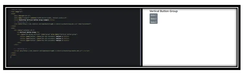
<h2>Vertical Button Group</h2>
<div class=”btn-group-vertical” role=”group” aria-label=”Vertical button group”>
<button type=”button” class=”btn btn-secondary”>Button 1</button>
<button type=”button” class=”btn btn-secondary”>Button 2</button>
<button type=”button” class=”btn btn-secondary”>Button 3</button>
</div>
</div>
<!– Bootstrap JS –>
<script src=”https://cdn.jsdelivr.net/npm/bootstrap@5.3.3/dist/js/bootstrap.bundle.min.js”></script>
</body>
</html>
<!DOCTYPE html>
<html lang=”en”>
<head>
<meta charset=”UTF-8″>
<meta name=”viewport” content=”width=device-width, initial-scale=1.0″>
<title>Bootstrap Vertical Button Group Example</title>
<!– Bootstrap CSS –>
<link href=”https://cdn.jsdelivr.net/npm/bootstrap@5.3.3/dist/css/bootstrap.min.css” rel=”stylesheet”>
</head>
<body>
<div class=”container mt-5″>
<h2>Vertical Button Group</h2>
<div class=”btn-group-vertical” role=”group” aria-label=”Vertical button group”>
<button type=”button” class=”btn btn-secondary”>Button 1</button>
<button type=”button” class=”btn btn-secondary”>Button 2</button>
<button type=”button” class=”btn btn-secondary”>Button 3</button>
</div>
</div>
<!– Bootstrap JS –>
<script src=”https://cdn.jsdelivr.net/npm/bootstrap@5.3.3/dist/js/bootstrap.bundle.min.js”></script>
</body>
</html>
Output:
In this example:
.btn-group-vertical: This Bootstrap class stacks buttons vertically, creating a vertical button group.
.role=”group” and aria-label=”Vertical button group”: These attributes enhance accessibility by informing assistive technologies about the purpose of the button group.
.btn and .btn-secondary: These classes style the buttons with Bootstrap’s default button styles and apply the secondary color scheme.
4. Button Group with Dropdown
<!DOCTYPE html>
<html lang=”en”>
<head>
<meta charset=”UTF-8″>
<meta name=”viewport” content=”width=device-width, initial-scale=1.0″>
<title>Bootstrap Button Group with Nested Dropdown</title>
<!– Bootstrap CSS –>
<link href=”https://cdn.jsdelivr.net/npm/bootstrap@5.3.3/dist/css/bootstrap.min.css” rel=”stylesheet”>
</head>
<body>
<div class=”container mt-5″>
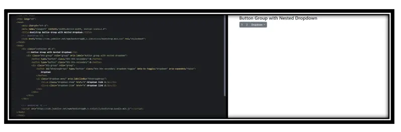
<h2>Button Group with Nested Dropdown</h2>
<div class=”btn-group” role=”group” aria-label=”Button group with nested dropdown”>
<button type=”button” class=”btn btn-secondary”>1</button>
<button type=”button” class=”btn btn-secondary”>2</button>
<div class=”btn-group” role=”group”>
<button id=”btnGroupDrop1″ type=”button” class=”btn btn-secondary dropdown-toggle” data-bs-toggle=”dropdown” aria-expanded=”false”>
Dropdown
</button>
<ul class=”dropdown-menu” aria-labelledby=”btnGroupDrop1″>
<li><a class=”dropdown-item” href=”#”>Dropdown link 1</a></li>
<li><a class=”dropdown-item” href=”#”>Dropdown link 2</a></li>
</ul>
</div>
</div>
</div>
<!– Bootstrap JS –>
<script src=”https://cdn.jsdelivr.net/npm/bootstrap@5.3.3/dist/js/bootstrap.bundle.min.js”></script>
</body>
</html>
Output:
In this example:
.btn-group: Groups a series of buttons on a single line.
.role=”group” and aria-label=”Button group with nested dropdown”: Enhance accessibility by informing assistive technologies about the grouped buttons’ purpose.
.dropdown-toggle: Styles the button to indicate it controls a dropdown menu.
data-bs-toggle=”dropdown”: Enables the dropdown functionality using Bootstrap’s JavaScript.
.dropdown-menu: Contains the dropdown items.
Conclusion:
Bootstrap’s Button Groups are a powerful tool for creating organized, responsive, and accessible user interfaces. By grouping related actions, they enhance the user experience and provide a consistent look and feel across applications. Their flexibility in arrangement and sizing makes them suitable for a wide range of design requirements.
Practice Scenarios:
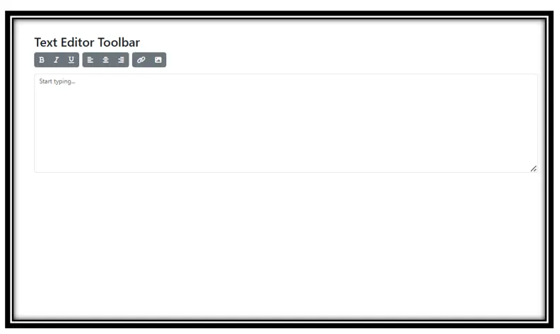
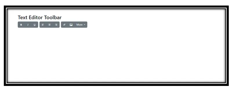
Creating a Text Editor Toolbar:
Objective: Design a toolbar for a text editor that includes grouped buttons for text formatting (e.g., bold, italic, underline), alignment (e.g., left, center, right), and inserting elements (e.g., links, images). Utilize horizontal button groups and dropdowns for expandable options.
Output:
Developing a Vertical Navigation Menu:
Objective: Implement a vertical navigation menu for a dashboard using vertical button groups. Each button represents a different section of the dashboard, and nested dropdowns provide additional sub-menu options. Ensure the menu is responsive and accessible.
YouTube Reference :
Form Validation to Bootstrap in Hindi/Urdu
Bootstrap button groups are a component that allows multiple buttons to be grouped together for better layout and user experience.
Yes, Iqra Technology offers this tutorial free of charge.
The tutorial includes creating button groups, vertical button groups, nesting, and customizing styles for responsiveness.
This tutorial is perfect for beginners and developers looking to enhance their skills in Bootstrap button group components.
Yes, the tutorial provides examples for horizontal, vertical, and mixed button group layouts.
Absolutely! All examples and code snippets provided in the tutorial are free to use for personal and commercial projects.
Iqra Technology offers its tutorials in both English and Hindi.
Yes, the tutorial covers how to make button groups responsive for mobile and desktop layouts.
Visit the Bootstrap Button Groups Tutorial Page to start learning.
Yes, the tutorial includes advanced topics such as integrating dropdown menus into button groups.
