

HTML Forms
An HTML form is a section of a web page that collects information from users. It typically contains input fields like text boxes, checkboxes, radio buttons, and buttons that users interact with to enter data. When a user submits a form, the information entered is sent to a server for processing. Forms are essential for various web interactions, such as logging in, signing up, submitting comments, or making purchases online. They help websites gather and process user input efficiently.
Basic Structure of an HTML Form
Here’s a simple example of an HTML form:
Output
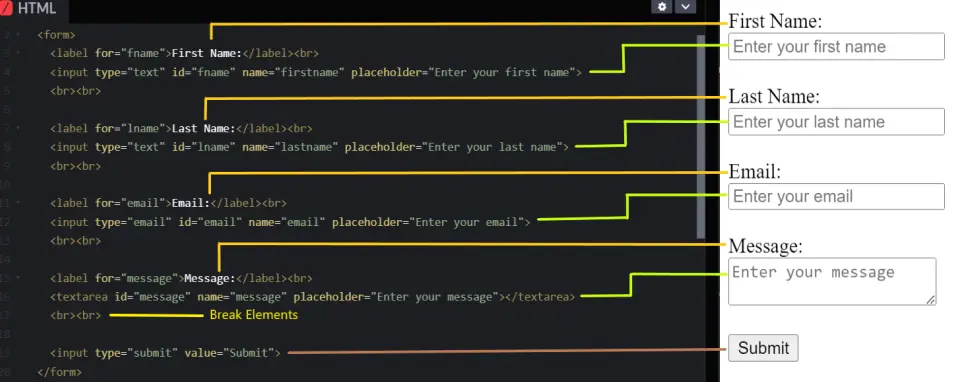
In this example:
- Form Tags:
• <form>: The HTML form element.
• <label>: Used to define a label for an input element.
• <input type=”text”>: Creates a single-line text input field for the user’s first and last name.
• <input type=”email”>: Creates an email input field that ensures a valid email format.
• <textarea>: Creates a multi-line text input field for the user’s message.
• <input type=”submit”>: Creates a submit button that submits the form. - Attributes:
• for: Specifies which form element a label is bound to.
• id: Provides a unique identifier for form elements.
• name: Specifies the name of the form element, which is used when the form data is submitted.
• placeholder: Provides a short hint that describes the expected value of an input field.
HTML Form Attributes
Form attributes provide additional information and control how the form behaves.
Here’s a list of Form Attributes:
| Attribute | Description | Example |
|---|---|---|
| action | Specifies the URL to send the form data to. | <form action=”/submit.html”> |
| method | Specifies the HTTP method to use when sending the form data. Common methods are GET and POST. | <form method=”post”> |
| target | Specifies where to display the response after submitting the form. Common values are _self (same window) and _blank (new window). | <form target=”_blank”> |
| enctype | Specifies how the form data should be encoded when submitted. This is used when the form includes file uploads. | <form enctype=”multipart/form-data”> |
| autocomplete | Enables or disables the browser’s autocomplete feature. | <form autocomplete=”off”> |
| novalidate | Disables the browser’s default form validation. | <form novalidate> |
Here’s an example of a form that combines these attributes:
Output

In this example:
- Form Tag Attributes:
• action=”/submit.html”: Sets the URL to which the form data will be sent upon submission.
• target=”_blank”: Ensures the form response opens in a new tab.
• method=”get”: Specifies the HTTP method to use when sending form data.
• enctype=”multipart/form-data”: Allows the form to handle file uploads.
• autocomplete=”off”: Disables the autocomplete feature for the form.
• novalidate: Disables default HTML5 form validation, allowing custom validation if needed. - Label and Input Tags:
• <label for=”name”>: Associates the label with the input field having id=”name”.
• <input type=”text” id=”name” name=”name” placeholder=”Enter your name”>: Creates a text input field for the user’s name.
• <input type=”email” id=”email” name=”email” placeholder=”Enter your email”>: Creates an email input field.
• <input type=”file” id=”resume” name=”resume”>: Creates a file input field for uploading resumes.
• <input type=”submit” value=”Submit”>: Creates a submit button to send the form data.
Common HTML Form Elements
HTML forms are essential for collecting and submitting user data on a web page. You need various form elements to create forms, each serving a specific purpose.
Here’s a list of Common HTML Form Elements
| Element | Description | Example |
|---|---|---|
| <input type=”text”> | Used for single-line text input. | <input type=”text”> |
| <input type=”password”> | Used for entering passwords (hidden characters). | <input type=”password”> |
| <input type=”email”> | Used for entering email addresses and performing basic validation. | <input type=”email”> |
| <input type=”number”> | Used for numeric input, with optional min and max values. | <input type=”number”> |
| <input type=”checkbox”> | Allows users to select multiple options from a list. | <input type=”checkbox”> |
| <input type=”radio”> | Allows users to select one option from a list. | <input type=”radio”> |
| <input type=”date”> | Allows users to select a date from a date picker. | <input type=”date”> |
| <input type=”file”> | Allows users to upload files. | <input type=”file”> |
| <textarea> | Multi-line text input. | <textarea>Text area</textarea> |
| <select> | Drop-down list. | <select> <option value=”o1″>Option 1</option> <option value=”o2″>Option 2</option> </select> |
| <button> | Button (submit, reset, or custom actions). | <button type=”submit”>Submit</button> |
| <label> | Label for form elements. | <label type=”submit”>Username:</label> |
| <input type=”hidden”> | Used to include data that is not visible to the user but is submitted with the form. | <input type=”hidden” name=”user_id” value=”123″> |
| <input type=”range”> | Provides a slider control for selecting a value within a specified range. | <input type=”range” min=”0″ max=”100″ step=”1″> |
Here is an example that combines all these elements into a single form:
Output


In this example:
- Password Input (type=”password”): For entering a password; the characters are masked.
- Email Input (type=”email”): For entering an email address; provides validation.
- Number Input (type=”number”): For entering a numeric value within a specified range.
- Checkbox Input (type=”checkbox”): For selecting an option.
- Radio Input (type=”radio”): For selecting one option from a group.
- Date Input (type=”date”): For entering a date.
- File Input (type=”file”): For uploading a file.
- Textarea: For entering multi-line text.
- Select Dropdown: For selecting an option from a dropdown menu.
- Hidden Input (type=”hidden”): For sending hidden data.
- Range Input (type=”range”): Selecting a numeric value from a range using a slider.
- Submit Button: For submitting the form.
HTML Input Attributes
| Attribute | Description | Example |
|---|---|---|
| type | Specifies the type of input element. | <input type=”text”> |
| name | Specifies the name of the input element, which is used to identify the form data after it is submitted. | <input type=”text” name=”username”> |
| value | Specifies the default value of the input field. | <input type=”text” value=”Default Text”> |
| placeholder | Provides a hint to the user about what to enter in the input field. | <input type=”text” placeholder=”Enter your name”> |
| required | Makes the input field mandatory to fill out before submitting the form. | <input type=”text” required> |
| readonly | Makes the input field read-only, so users cannot modify the value. | <input type=”text” value=”Read-only text” readonly> |
| disabled | Disables the input field, preventing users from interacting with it. | <input type=”text” value=”Disabled text” disabled> |
| maxlength | Limits the number of characters that can be entered in the input field. | <input type=”text” maxlength=”50″> |
| min and max | Specifies the minimum and maximum values for number and date input types. | <input type=”number” min=”0″ max=”100″> |
| pattern | Specifies a regular expression that the input field’s value must match for the form to be submitted. | <input type=”text” pattern=”[A-Za-z]{3}”> |
| autofocus | Automatically focuses on the input field when the page loads. | <input type=”text” autofocus> |
HTML input attributes are special properties added to HTML input elements to define their behavior, appearance, and restrictions. These attributes help control how users interact with the form elements.
Here’s a list of some common HTML input attributes:
Here’s an example of an HTML form input element that combines various attributes:
Output


In this example:
- Name Input (type=”text”):
• required: Ensures the field must be filled out before submission.
• maxlength=”20″: Limits the input to a maximum of 20 characters.
• autofocus: Automatically focuses the input field when the page loads. - Phone Input (type=”tel”):
• pattern=”[0-9]{3}-[0-9]{3}-[0-9]{4}”: Specifies a pattern for the phone number, requiring it to match the format 123-456-7890. - Age Input (type=”number”):
• min=”18″ and max=”100″: Restricts the age input to between 18 and 100. - Bio Textarea:
• readonly: Makes the textarea read-only, meaning the user cannot edit its content. - Agreement Checkbox (type=”checkbox”):
• required: Ensures the user must check the box to agree to the terms before submitting the form.
Course Video
Course Video In English
YouTube Reference :
1. HTML Tutorial: Forms & Input Tags | In Hindi
2. HTML Form Tag Tutorial in Hindi / Urdu – Part I
3. HTML Form Select Tags & File Input Tutorial in Hindi / Urdu – Part II
4. Basic Form | form, input, label, button elements | In English
Practice Scenarios
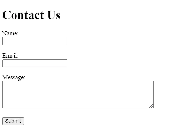
Practice Scenario 1: Simple Contact Form
Objective: Create a simple contact form with fields for name, email, and message, including a submit button.
Expected Output: A form where users can enter their name, email, and a message, and then submit the form.
Output:
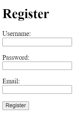
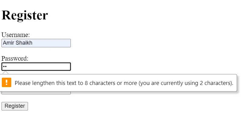
Practice Scenario 2: Registration Form with Validation
Objective: Create a registration form with fields for username, password, and email. Include basic HTML5 validation.
Expected Output: A form with required fields for username, password, and email, including validation for email format and password length.
<!DOCTYPE html>
<html>
<head>
<title>Registration Form</title>
</head>
<body>
<h1>Register</h1>
<form>
<label for=”username”>Username:</label><br>
<input type=”text” id=”username” name=”username” required><br><br>
<label for=”password”>Password:</label><br>
<input type=”password” id=”password” name=”password” minlength=”8″ required><br><br>
<label for=”email”>Email:</label><br>
<input type=”email” id=”email” name=”email” required><br><br>
<button type=”submit”>Register</button>
</form>
</body>
</html>
Output:
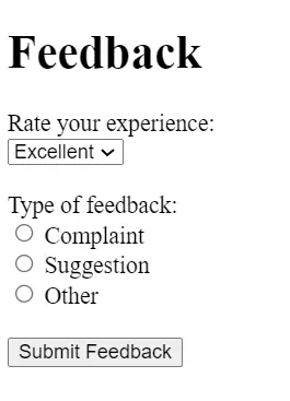
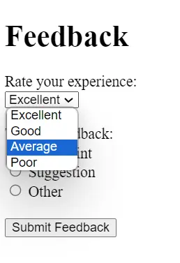
Practice Scenario 3: Feedback Form with Select and Radio Buttons
Objective: Create a feedback form that includes a select dropdown for rating, radio buttons for feedback type, and a submit button.
Expected Output: A form where users can rate their experience, choose the type of feedback, and submit their feedback.
<!DOCTYPE html>
<html>
<head>
<title>Feedback Form</title>
</head>
<body>
<h1>Feedback</h1>
<form>
<label for=”rating”>Rate your experience:</label><br>
<select id=”rating” name=”rating”>
<option value=”excellent”>Excellent</option>
<option value=”good”>Good</option>
<option value=”average”>Average</option>
<option value=”poor”>Poor</option>
</select><br><br>
<label>Type of feedback:</label><br>
<input type=”radio” id=”complaint” name=”feedbackType” value=”complaint”>
<label for=”complaint”>Complaint</label><br>
<input type=”radio” id=”suggestion” name=”feedbackType” value=”suggestion”>
<label for=”suggestion”>Suggestion</label><br>
<input type=”radio” id=”other” name=”feedbackType” value=”other”>
<label for=”other”>Other</label><br><br>
<button type=”submit”>Submit Feedback</button>
</form>
</body>
</html>
Output:
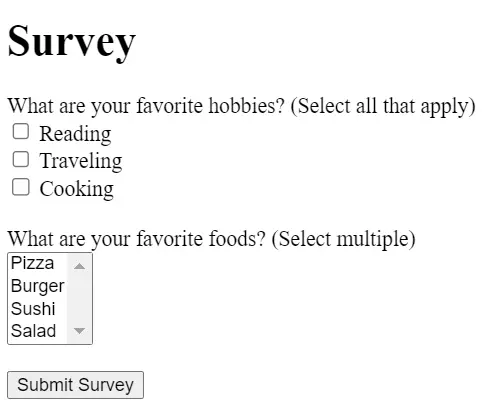
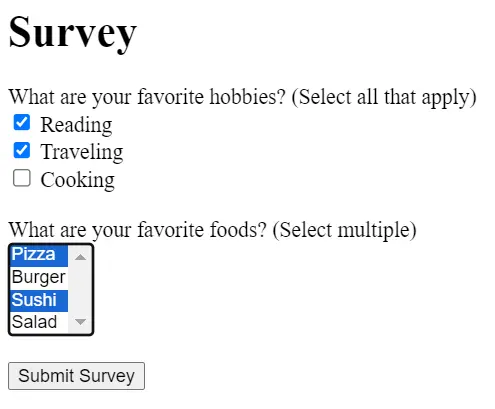
Practice Scenario 4: Survey Form with Checkbox and Multiple Select
Objective: Create a survey form that includes checkboxes for multiple answers and a multiple select list.
Expected Output: A form where users can select multiple options for survey questions and submit their answers.
Output:
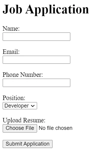
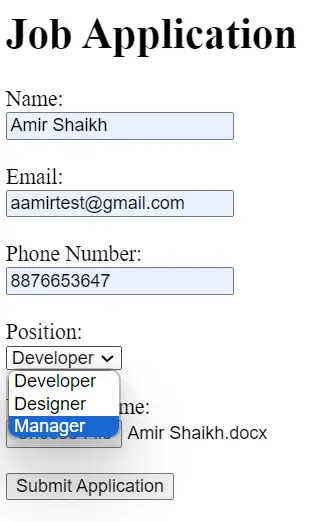
Practice Scenario 5: Job Application Form
Objective: Create a job application form with fields for name, email, phone number, a dropdown for job position, a file input for resume upload, and a submit button.
Expected Output: A form where users can enter their personal information, select a job position, upload their resume, and submit the form.
Output:
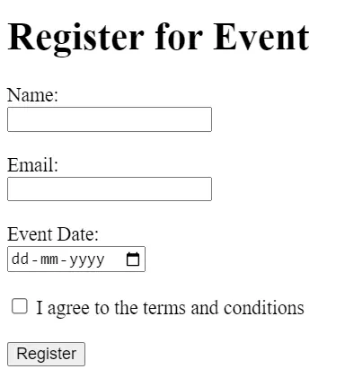
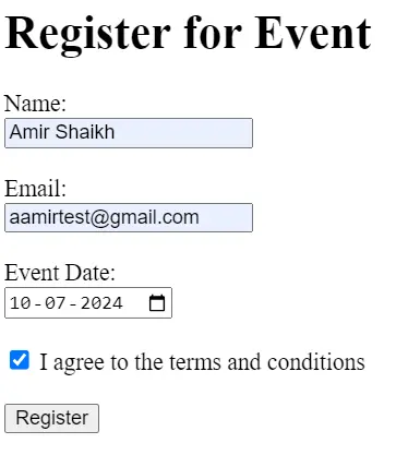
Practice Scenario 6: Event Registration Form
Objective: Create an event registration form with fields for name, email, event date, and a checkbox to agree to terms and conditions.
Expected Output: A form where users can enter their details, select the event date, agree to the terms, and submit the form.
Output:
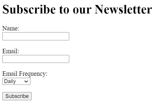
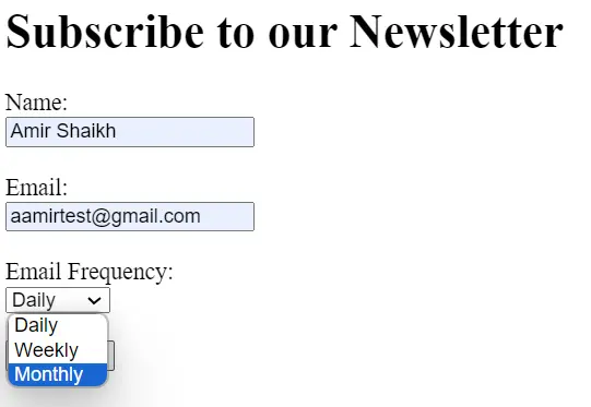
Practice Scenario 7: Newsletter Subscription Form
Objective: Create a newsletter subscription form with fields for name, email, and a dropdown for frequency of emails.
Expected Output: A form where users can enter their details, select how often they want to receive emails and submit the form.
Output:
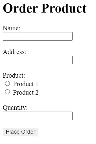
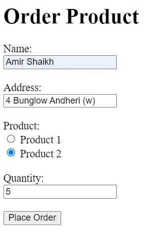
Practice Scenario 8: Product Order Form
Objective: Create a product order form with fields for name, address, product selection (using radio buttons), and quantity (using a number input).
Expected Output: A form where users can enter their details, choose a product, specify the quantity, and submit the order.
Output:
Practice Scenario 9: Feedback Form with Text Area and Rating
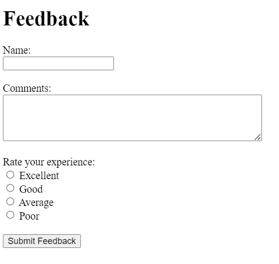
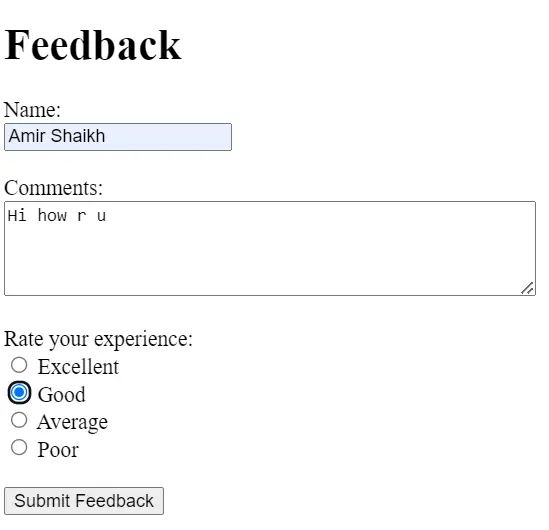
Objective: Create a feedback form with fields for name, a text area for comments, and a rating system using radio buttons.
Expected Output: A form where users can enter their name, leave comments, rate their experience, and submit feedback.
Output:
Forms and validation in HTML: HTML forms collect user input, and validation ensures accuracy before submission.
5 types of HTML forms: Text, button, checkbox, radio button, and submit.
Why use form validation?: To ensure the data entered by users is accurate and complete.
Form example: A simple contact form with fields like name, email, and message.
Advantages of a form: Efficient data collection, user engagement, and interaction.
Creating HTML forms: Use <form> and input elements like text fields and buttons.
HTML form with an example: An HTML form allows users to enter data. Example: <form><label for=”name”>Name:</label><input type=”text” id=”name” name=”name”><input type=”submit” value=”Submit”></form>.
A form with a single input field, like a simple contact form.
Forms can be designed within a <table> using rows and columns for input fields and labels.
Use the <form> element, combined with input elements like text fields, buttons, and labels.
