

HTML Responsive
What is Responsive Design?
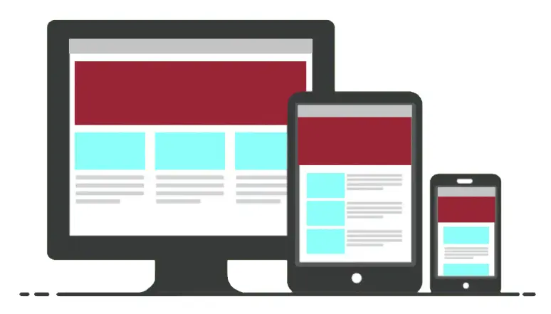
Responsive design makes your website look good on all devices, like desktops, tablets, and smartphones. It means your website can automatically adjust to fit different screen sizes and shapes.
Why is Responsive Design Important?
1. Better User Experience: People can easily read and navigate your website on any device without needing to zoom in or scroll sideways.
2. SEO Benefits: Search engines like Google rank responsive websites higher, which helps more people find your site.
3. Cost-Effective: You only need to create and maintain one website instead of different device versions.
How to Make Your Website Responsive
1. Meta Tag for Viewport
To make sure your website looks good on all devices, you need to tell the browser to adjust the page’s width and scale based on the device’s screen size. You can do this by adding a special line of code called the viewport meta tag. This tag goes inside the <head> section of your HTML document.
<head>
<meta name=”viewport” content=”width=device-width, initial-scale=1.0″>
</head>
Add this line in the head section of your HTML. It helps your website fit the screen size of any device.
In This code
⦁ name=”viewport”: This tells the browser that this meta tag is about the viewport.
⦁ content=”width=device-width”: This sets the width of the page to follow the screen-width of the device (which will vary depending on the device).
⦁ initial-scale=1.0: This sets the initial zoom level when the page is first loaded by the browser.
2. Flexible Grid Layout
A flexible grid layout divides your webpage into columns that resize based on the screen width. This ensures that your content looks good whether it’s viewed on a large desktop screen or a small mobile screen. Instead of using fixed widths (like pixels), you use percentages so that the layout can adapt to different devices.
Example:
Output:

In this example:
⦁ HTML Structure:
⦁ The div with the class container wraps around the two div elements with the class column.
⦁ The container ensures that both columns are inside a single container element.
⦁ CSS Styling:
⦁ The .container class: width: 100%; ensures the container takes the full width of the viewport or its parent element, and the padding: 15px; adds 15 pixels of padding inside the container.
⦁ The .column class: width: 50%; makes each column take up half of the container’s width, and the float: left; makes the columns float to the left, allowing them to sit side-by-side.
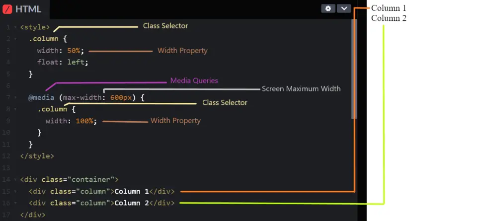
3. Media Queries
Media queries are a feature of CSS that let you specify different styles for different screen sizes. For example, you can change the layout of your webpage when viewed on a mobile device compared to a desktop computer.
Example:
Output:
Screen Size Above 600 px

Screen Size Below 600 px
In this example:
⦁ HTML Structure:
⦁ The div with the class container contains two div elements with the class column.
⦁ This structure creates the columns inside the container.
⦁ CSS Styling:
⦁ The .column class: width: 50%; ensures each column takes up half of the container’s width, and the float: left; allows the columns to sit next to each other.
⦁ The @media (max-width: 600px) media query: This section applies styles when the viewport width is 600 pixels or less, and the width: 100%; inside the media query makes each column take up the full width of the container, causing the columns to stack vertically.
4. Responsive Images
Responsive images are images that resize themselves to fit the dimensions of their container, making sure they look good on screens of all sizes, from large desktops to small smartphones.
Make images adjust to the screen size. The below code makes sure images don’t get bigger than the screen.
Example:
<!DOCTYPE html>
<html>
<head>
<title>Responsive Image Example</title>
</head>
<body>
<img src=”example.jpg” style=”max-width: 100%; height: auto;”>
</body>
</html>
Output:

In this example:
⦁ HTML Structure:
⦁ The img element displays an image.
⦁ The src attribute specifies the path to the image file (log.jpg).
⦁ CSS Styling (Inline Style):
⦁ max-width: 100%; ensures that the image will not exceed the width of its container. If the container is smaller than the image, the image will shrink to fit.
⦁ height: auto; maintains the aspect ratio of the image. This means the height will adjust automatically to preserve the image’s original proportions as the width changes.
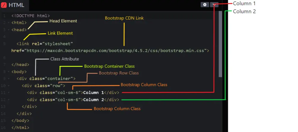
5. Using CSS Frameworks
CSS frameworks like Bootstrap come with built-in styles and components that help you quickly create a responsive website. They provide pre-designed layouts and utilities, saving you time and effort.
Example:
Output:
Desktop View

Mobile View
In this example:
⦁ HTML Structure:
⦁ The <head> section contains meta-information about the document, including the title and links to external stylesheets.
⦁ The <link> element links to the Bootstrap CSS file, which provides the styling framework.
⦁ The <body> section contains the main content of the document.
⦁ Bootstrap Classes:
⦁ container: A Bootstrap class that provides a fixed-width container that adapts to the screen size.
⦁ row: A Bootstrap class that creates a horizontal group of columns.
⦁ col-sm-6: A Bootstrap class that specifies that the column should take up 6 out of 12 grid columns on small devices and above. This results in two columns, each taking up 50% of the width.
Summary
Responsive design ensures that your website looks great on any device. By incorporating the following techniques, you can create a website that adapts to all screen sizes:
⦁ Viewport Meta Tag: This helps your website fit the screen size of any device.
⦁ Flexible Grid Layout: Uses percentages instead of fixed sizes to allow the layout to adjust based on the screen.
⦁ Media Queries: Applies different styles for different screen sizes to ensure optimal display.
⦁ Responsive Images: Make images adjust to the screen size, ensuring they don’t get bigger than the screen.
⦁ CSS Frameworks: Provides pre-designed styles and components for faster, consistent, and responsive design.
Course Video
Course Video In English
YouTube Reference :
Practice Scenarios
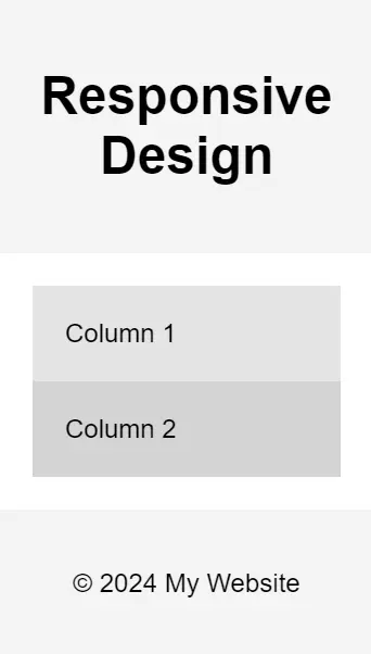
Practice Scenario 1: Simple Responsive Layout
Objective: Create a simple responsive layout that adjusts the content based on the screen size.
Expected Output: A web page with a header, a two-column layout for larger screens, and a single-column layout for smaller screens.
<!DOCTYPE html>
<html>
<head>
<title>Responsive Layout Example</title>
<meta name=”viewport” content=”width=device-width, initial-scale=1″>
<style>
body {
font-family: Arial, sans-serif;
margin: 0;
padding: 0;
}
header, footer {
background-color: #f4f4f4;
padding: 20px;
text-align: center;
}
.container {
display: flex;
flex-wrap: wrap;
padding: 20px;
}
.container div {
flex: 1;
padding: 20px;
box-sizing: border-box;
}
.column {
flex: 1 1 50%;
}
@media (max-width: 768px) {
.column {
flex: 1 1 100%;
}
}
</style>
</head>
<body>
<header>
<h1>Responsive Design</h1>
</header>
<div class=”container”>
<div class=”column” style=”background-color: #e4e4e4;”>Column 1</div>
<div class=”column” style=”background-color: #d4d4d4;”>Column 2</div>
</div>
<footer>
<p>© 2024 My Website</p>
</footer>
</body>
</html>
Output:
Desktop View

Mobile View
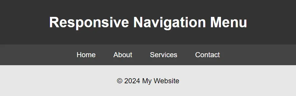
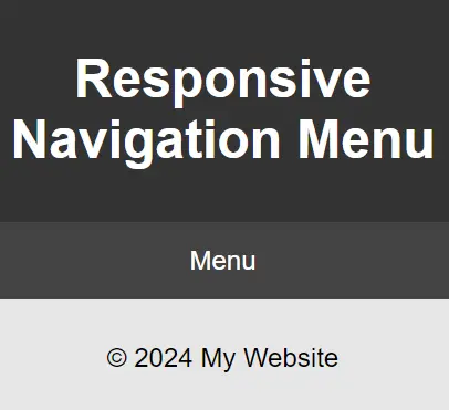
Practice Scenario 2: Responsive Navigation Menu
Objective: Create a responsive navigation menu that transforms into a dropdown menu on smaller screens.
Expected Output: A web page with a navigation bar that changes to a dropdown menu on smaller screens.
<!DOCTYPE html>
<html>
<head>
<title>Responsive Navigation Menu</title>
<meta name=”viewport” content=”width=device-width, initial-scale=1″>
<style>
body {
font-family: Arial, sans-serif;
margin: 0;
padding: 0;
}
.menu-toggle{
display:none;
}
footer{
text-align:center;
background-color: #e6e6e6;
padding: 10px;
}
header {
background-color: #333;
color: #fff;
padding: 10px 0;
text-align: center;
}
nav {
display: flex;
justify-content: center;
background-color: #444;
}
nav ul {
list-style: none;
padding: 0;
margin: 0;
display: flex;
}
nav ul li {
padding: 14px 20px;
}
nav ul li a {
color: #fff;
text-decoration: none;
}
nav ul li:hover {
background-color: #555;
}
@media (max-width: 600px) {
nav ul {
flex-direction: column;
display: none;
}
nav ul.show {
display: flex;
}
.menu-toggle {
display: block;
cursor: pointer;
padding: 14px 20px;
background-color: #444;
color: #fff;
text-align: center;
}
}
</style>
</head>
<body>
<header>
<h1>Responsive Navigation Menu</h1>
</header>
<nav>
<div class=”menu-toggle”>Menu</div>
<ul>
<li><a href=”#”>Home</a></li>
<li><a href=”#”>About</a></li>
<li><a href=”#”>Services</a></li>
<li><a href=”#”>Contact</a></li>
</ul>
</nav>
<footer>
<p>© 2024 My Website</p>
</footer>
<script>
const menuToggle = document.querySelector(‘.menu-toggle’);
const nav = document.querySelector(‘nav ul’);
menuToggle.addEventListener(‘click’, () => {
nav.classList.toggle(‘show’);
});
</script>
</body>
</html>
Output:
Desktop View
Mobile View
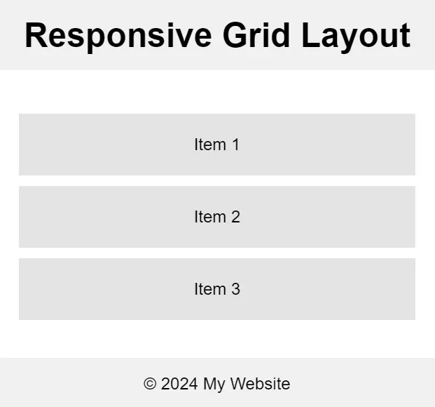
Practice Scenario 3: Responsive Grid Layout
Objective: Create a responsive grid layout that adjusts the number of columns based on the screen size.
Expected Output: A web page with a grid layout that changes from three columns on larger screens to one column on smaller screens.
Output:
Desktop View

Mobile View
Practice Scenario 4: Responsive Image Gallery
Objective: Create a responsive image gallery that displays images in a grid layout, adjusting the number of columns based on the screen size.
Expected Output: A web page with an image gallery that changes from three columns on larger screens to one column on smaller screens.
Output:
Desktop View

Mobile View

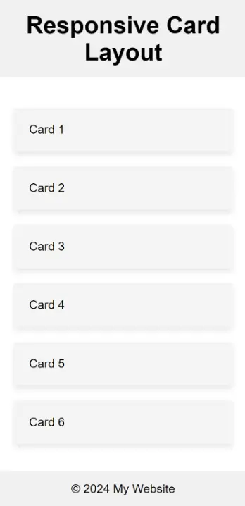
Practice Scenario 5: Responsive Card Layout
Objective: Create a responsive card layout where each card adjusts its size and positioning based on the screen size.
Expected Output: A web page with cards that stack on smaller screens and display in a grid layout on larger screens.
Output:
Mobile View
Tablet View
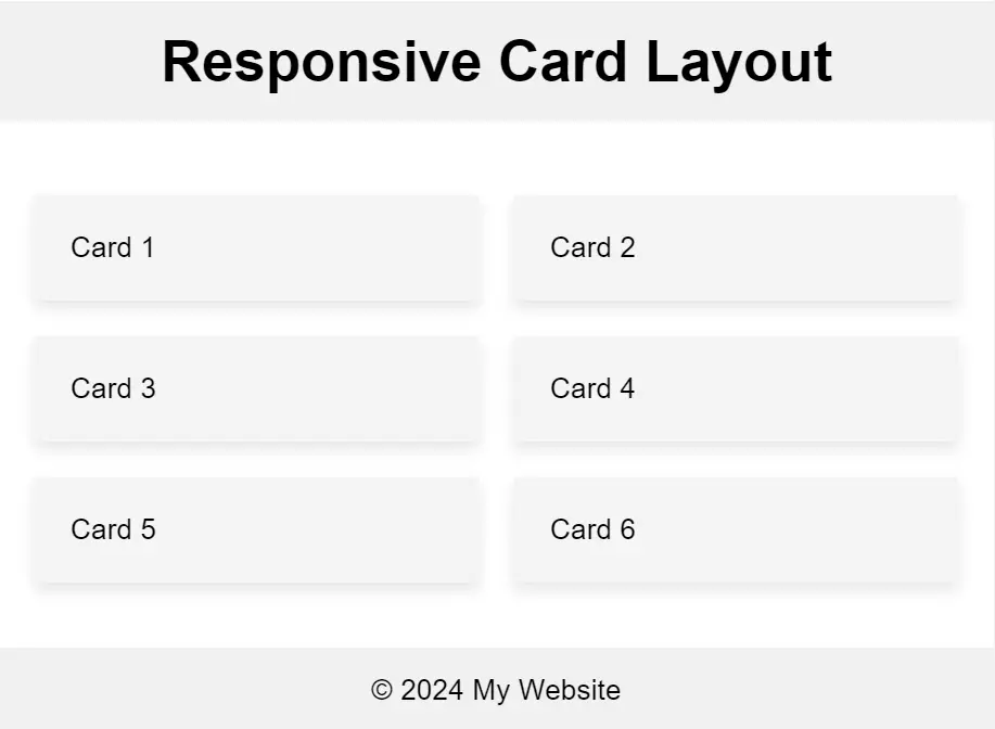
Desktop View
Responsive design mode: Ensures a webpage adapts to different screen sizes.
Change HTML to responsive: Use media queries and flexible layouts.
Responsive design rule: Ensures content adapts to various screen sizes and devices.
Best defines responsive design: Design that adjusts to different screen sizes for better user experience.
Importance: It provides an optimized browsing experience across all devices.
Create a query: Use media queries like @media in CSS.
Convert HTML to readable format: Use proper HTML tags for text formatting.
Convert HTML text to normal text in React: Use .dangerouslySetInnerHTML method.
Media query: A CSS feature that applies styles based on device characteristics like width.
