

Reports and Dashboards
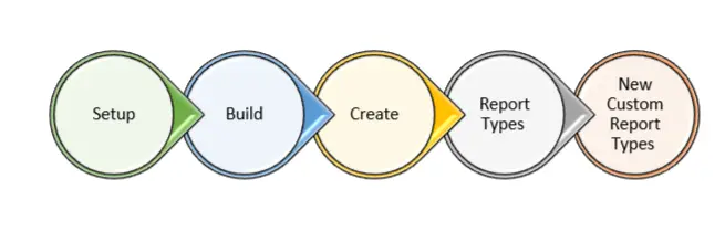
What Is a Report Type?
A report type is like a template. Choosing the right report type is important in building report, because when you choose a report type, you’re selecting the records and fields that are available for your report. Each report type has a primary object and can optionally include related Products, and with related objects, like Opportunities with Projects and Campaigns with Contacts.
What’s in a Report?
In its simplest form, a report is a group of data that meets a set of criteria, for example, agroup of accounts or opportunities. To get the exact data you need, you can filter, group, and do math on the data in the report. If visuals work better for you, you can view the data in a graph or chart.
Report Type:
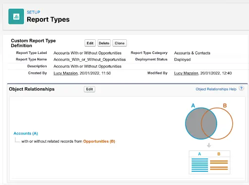
To create a report on a custom object, first we need to create a report type on that custom object.
Navigation:
Steps to create a Report Type:
Step 1: Select Primary object
Step 2: Enter ReportType label and Name
step 3: Enter the description
Step 4: Choose the folder in which you want to store the report type
Step 5: Deployment Status
Step 6: Specify on which set of data you want to create a report
a. If you want to include any child objects for the primary object
We can select up to three levels
b. We have two choices to specify on which records we can create reports
1. Every parent record should have at least one child
Note: if we select this option only those parent records which have at least one child only included in report .
OR
2. Every parent may or may not have child record
Note: if we select his option all the parent records with their corresponding child will be included in report.we can choose any one choice to include the data in the report
Step 7: Click on Edit layout and select the list of fields available in the report
Reports :
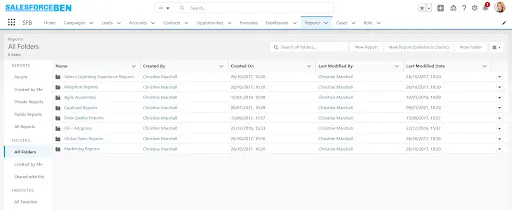
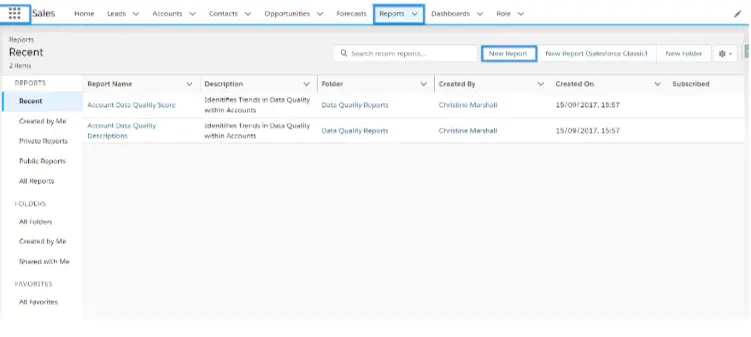
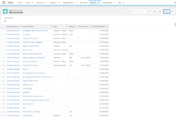
A report is a list of records that meet the criteria you define.
It’s displayed in Salesforce in rows and columns, and can be filtered,
grouped, or displayed in a graphical chart.
We can create reports in four formats
a. Tabular Report
b. Summary Report
C. Matrix Report
d. Joined Report
Tabular Reports :
– This will return you the list of records which are meeting the filter
criteria in the form of table
Ex : Create a report to get list of opportunities which are closed in this month
Ex :Create a report to get list of leads generated in this month
– In the tabular report we can perform the following operations :
1. Sorting Records
2. Summarizing the fields (Sum |Avg| Min |Max values of a given field)
3. Bucketing Field :
Creating a new field whose values are generated based on the
existing field in the report
Ex : Create a new buck field which shows Good if the probability is
more than 50 otherwise bad
4. Show Details |Hide Details
5. Printable view
6. Export Details :
Note : Records on which report is built those records are exported
To export the details user profile should have permission of
export reports
Note : Reports can be exported in the form of .csv |Excel
7. Schedule Reports
8.Limits : Maximum 200 rows
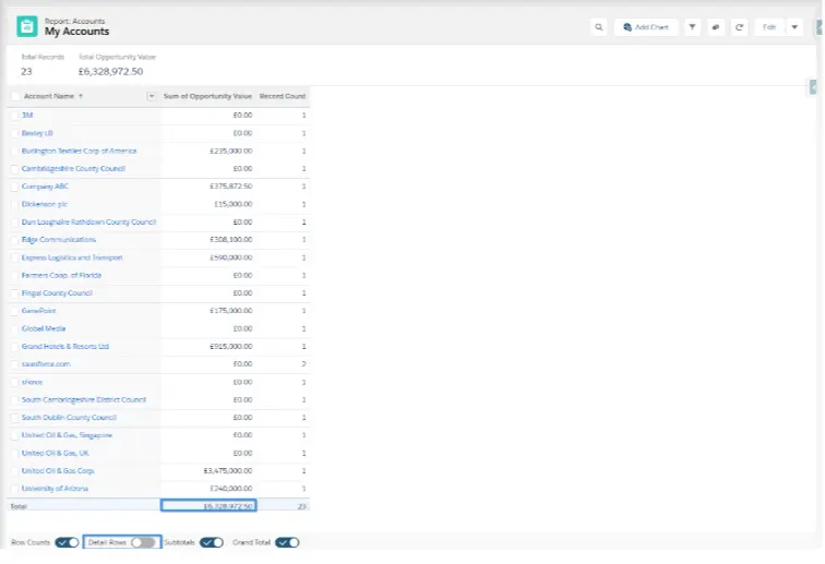
Summary Reports :
Row wise grouping of the records based on the field is called summary
Note : We can group up to three fields
Ex : Create report on opportunity based on stageName
Ex : Create report on opportunity which are created in last three month based on lead Source
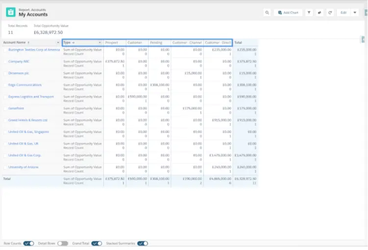
Matrix Reports :
– Column-wise and row-wise grouping of records is called matrix report
This is used to make B2B comparison
Ex: Create a report to about new Opportunities which are created in this month grouped based on Account write to Stagename
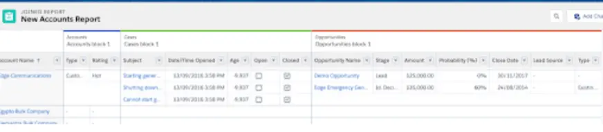
Joined Reports :
We can join two or more report types and form a single report which we call
it as joined report
Note : If we want to join two report types both of them should have same primary object.
Note 1: Reports always runs on user context user’s OWD ,Profile ,Field field level.
security is taken into account while running the report
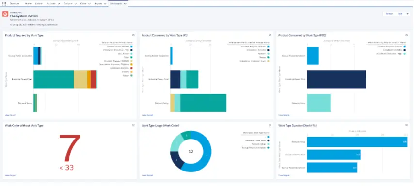
Dashboard:
What Is a Dashboard?
A dashboard is a visual display of key metrics and trends for records in your org. Each dashboard widget is based on a single source report. You can use the same or different source reports for the various widgets in a dashboard (for example, use the same report in a bar chart and pie chart). By adding multiple dashboard widgets to a single dashboard page, you can create a powerful visual display of data on a common theme, such as sales performance or customer support.
What’s in a Dashboard?
Dashboards offer a powerful visual display of your data around a common theme. For example, you can create a Sales Dashboard that shows you charts and graphs of your company’s sales performance with supporting metrics about your top accounts, top opportunities, win rates, and which account types perform the best.
Dashboard is a graphical representation of the report. A dashboard can be created on the Summary and Matrix reports.
We have eleven types of Dashboard components.
a. Horizontal Bar Chart b. Vertical Bar chart
c. Line Chart d. Pie Chart
e. Donut Chart f. Funnel Chart
g. Scattered Chart h. VF
i. Metrix j. Table
Course Video
Practices Tasks
1. Create a Summary report to show opportunities group by products.
2. Develop a report to display only accounts created in the current month.
3. Export one report to show the details only and download a snap of its chart.
4. Create a dashboard to display opportunity amount breakdown, by stage.
5. Use a funnel chart to display the highest to lowest priority opportunities.
YouTube Reference :
1) Reports and Dashboards in Hindi/Urdu
2) Reports and Dashboards in English
Salesforce Reports are customizable lists or summaries of data that allow users to analyze and interpret information stored within Salesforce. Dashboards are visual representations of report data, providing insights through charts, graphs, and tables to help monitor key performance indicators and business metrics.
Iqra Technology offers free online training tutorials on creating Reports and Dashboards in Salesforce, including content tailored for beginners and tutorials available in Hindi. These resources provide step-by-step guidance to help you master report and dashboard creation.
Salesforce has some limitations with Reports and Dashboards. Reports can display a maximum of 2,000 rows, but more rows can be viewed by exporting to Excel or using the printable view. Dashboards are limited to 20 components, and each filter can include up to 50 values. Additionally, reports processed via the API can include up to 100 fields as columns.
Salesforce Dashboards can be customized for various business needs. Examples include a Sales Performance Dashboard to track total sales, top products, and regional performance; a Service Manager Dashboard to monitor case volume, resolution times, and customer satisfaction; and a Marketing Campaign Dashboard to measure campaign success, lead generation, and conversion rates.
To create a new process in Process Builder, access it via Setup, click New, and name the process. Define its trigger (e.g., record creation or edit), add criteria to set conditions, and specify the actions to execute when the criteria are met. Finally, save and activate the process.
Best practices for dashboards include defining clear objectives to track key metrics, using appropriate chart types for effective visualization, limiting components to maintain clarity, ensuring data accuracy through regular updates, and optimizing performance by using filters and minimizing complex queries.
Iqra Technology offers tutorials on Reports and Dashboards in Salesforce in Hindi, providing step-by-step guidance for beginners. You can refer to their YouTube channel for video tutorials.
Dashboards cannot be directly exported, but reports used in the dashboard can be exported to Excel for further analysis.
Limitations include a maximum of 20 components per dashboard and up to 100 fields processed through the API.
