

CSS Display
The display property in CSS controls how an element is shown on the web page. It decides whether an element appears as a block (taking up the full width), inline (sitting next to other elements), or in another specific way. This property is essential for arranging the layout of your webpage.
Common display Values:
1. display: block;
Elements with display: block; take up the full width available and start on a new line. Common block elements include <div>, <h1>, <p>, and <section>.
Example:
Output:

In this example:
• display: block;: This makes the element a block-level element. Block-level elements take up the full width available and start on a new line.
• Both <div> elements will be block-level elements, each taking the full width of the container, with a light coral background, white text, and 10 pixels of padding.
2. display: inline;
Elements with display: inline; only take up as much width as needed and do not start on a new line. Common inline elements include <span>, <a>, and <img>.
Example:
<head>
<style>
.inline-example {
display: inline;
background-color: lightgreen;
color: black;
padding: 5px;
}
</style>
</head>
<body>
<span class=”inline-example”>This is an inline element.</span>
<span class=”inline-example”>Another inline element.</span>
</body>
Output:

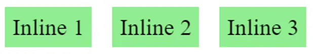
In this example:
• display: inline;: This makes the element an inline element. Inline elements only take up as much width as necessary and do not start on a new line. They sit within the flow of text.
• Both <span> elements will be inline elements, appearing next to each other without line breaks.
3. display: inline-block;
Elements with display: inline-block; behave like inline elements but can have a set width and height, unlike normal inline elements.
Example:
<head>
<style>
.inline-block-example {
display: inline-block;
width: 100px;
height: 100px;
background-color: lightblue;
color: black;
margin: 5px;
text-align: center;
vertical-align: middle;
line-height: 100px; /* Centering text vertically */
}
</style>
</head>
<body>
<div class=”inline-block-example”>Box 1</div>
<div class=”inline-block-example”>Box 2</div>
<div class=”inline-block-example”>Box 3</div>
</body>
Output:

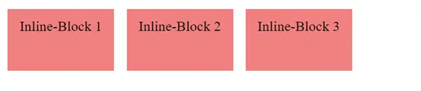
In this example:
• display: inline-block;: This makes the element an inline-block element. Inline-block elements sit inline with other elements but can have specified width and height, unlike pure inline elements. They also respect margins and padding.
• The elements will be displayed in a line next to each other (inline) but with a defined width and height (block-like properties).
4. display: none;
Elements with display: none; are not displayed at all on the page and do not take up any space.
Example:
<head>
<style>
.none-example {
display: none;
}
</style>
</head>
<body>
<div>This element is visible.</div>
<div class=”none-example”>This element is hidden.</div>
</body>
Output:

In this example:
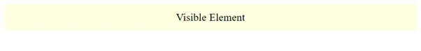
• display: none;: This property hides the element completely. It is not displayed on the page, and it does not take up any space in the layout. The element is effectively removed from the document flow.
• The first <div> has no class, so it will be displayed normally on the page with the text “This element is visible.”
• The second <div> has the class none-example, applying the display: none; style from the CSS. This means it will not be visible on the page, and it will not take up any space in the layout. The text “This element is hidden.” will not be shown.
5. display: flex;
display: flex; is used to create a flexible layout model, where children of the element (known as flex items) can be arranged dynamically, even if they grow or shrink. Flexbox is powerful for creating responsive designs.
Example:
<head>
<style>
.flex-example {
display: flex;
justify-content: space-around;
background-color: lightyellow;
padding: 10px;
}
.flex-item {
background-color: lightsalmon;
color: white;
padding: 20px;
margin: 5px;
}
</style>
</head>
<body>
<div class=”flex-example”>
<div class=”flex-item”>Flex Item 1</div>
<div class=”flex-item”>Flex Item 2</div>
<div class=”flex-item”>Flex Item 3</div>
</div>
</body>
Output:

In this example:
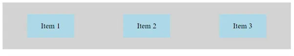
• display: flex;: This turns the container into a flex container, allowing its child elements to be laid out using Flexbox.
• justify-content: space-around;: Distributes the child elements (flex items) evenly with equal space around them. This means there will be equal space between each item and between the items and the container edges.
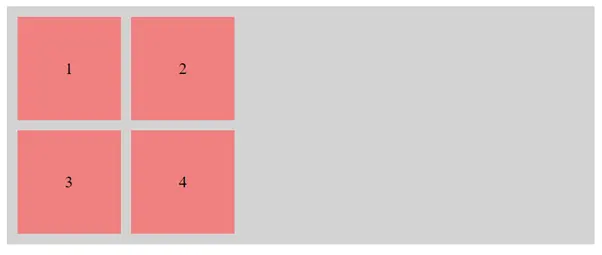
6. display: grid;
display: grid; is used to create a grid layout, where elements are arranged into rows and columns. It’s great for more complex layouts.
Example:
<head>
<style>
.grid-example {
display: grid;
grid-template- columns: 1fr 1fr 1fr;
grid-gap: 10px;
background-color: lightgray;
padding: 10px;
}
.grid-item { background-color: lightcoral; color: white; padding: 20px; text-align: center;}
</style>
</head>
<body>
<div class=”grid-example”>
<div class=”grid-item”>Grid Item 1</div>
<div class=”grid-item”>Grid Item 2</div>
<div class=”grid-item”>Grid Item 3</div>
<div class=”grid-item”>Grid Item 4</div>
<div class=”grid-item”>Grid Item 5</div>
<div class=”grid-item”>Grid Item 6</div>
</div>
</body>
Output:

In this example:
• display: grid;: This turns the container into a grid container, allowing its child elements to be laid out using CSS Grid.
• grid-template-columns: 1fr 1fr 1fr;: Defines three equal-width columns in the grid. The 1fr unit means each column takes up one fraction of the available space, dividing the container into three equal columns.
• grid-gap: 10px;: Sets a 10-pixel gap between the grid items, creating space between rows and columns.
Conclusion
The display property is essential for controlling how elements appear and behave in your web layout. Whether you want an element to be a block, inline, hidden, or part of a flexible or grid layout, understanding the display will help you create more effective and responsive designs.
Course Video
Course Video In English
YouTube Reference :
1) CSS Display in Hindi/Urdu
Practice Scenarios
Scenario 1: Display block
Objective: Style elements to be displayed as block-level elements.
Expected Output: Elements will take up the full width available and start on a new line.
Output:

Scenario 2: Display inline
Objective: Style elements to be displayed as inline elements.
Expected Output: Elements will not start on a new line and will only take up as much width as their content.
Output:
Scenario 3: Display inline-block
Objective: Style elements to be displayed as inline-block elements.
Expected Output: Elements will be displayed on the same line if there is enough space, but they can have width and height.
Output:
Scenario 4: Display none
Objective: Hide elements using display: none.
Expected Output: Elements will not be displayed on the page and will not take up any space.
Output:
Scenario 5: Display flex
Objective: Use display: flex to create a flex container and align its items.
Expected Output: The flex container will align its items according to the flexbox properties.
Output:
Scenario 6: Display grid
Objective: Use display: grid to create a grid layout for items.
Expected Output: The grid container will arrange its items according to the grid properties.
Output:
This module provides a comprehensive guide to the CSS display property, explaining how it controls the layout behavior of elements on a web page. It covers various display values such as block, inline, inline-block, flex, grid, and none, and their impact on element presentation.
Yes, it includes examples demonstrating how to apply various display properties to elements, illustrating how each value affects the layout and positioning of content.
Yes, exercises involve applying different display properties to HTML elements, helping to reinforce the concepts learned and providing hands-on experience in manipulating element layouts.
Yes, it’s designed for beginners with clear explanations and step-by-step examples, making it accessible to those new to CSS and web design.
Yes, it covers how to use display properties like flex and grid to create flexible and responsive layouts, enhancing the adaptability of web designs across different devices and screen sizes.
Yes, the training is self-paced and accessible online anytime, allowing learners to progress through the material at their convenience.
Yes, it explains the distinctions between block and inline elements, detailing how each behaves in the document flow and how the display property can be used to alter their default behaviors.
It typically takes a few hours to complete, depending on your learning pace and familiarity with CSS concepts.
Yes, this “CSS Display” training is completely free on Iqra Technology Academy’s website.
