

CSS Pseudo-class
A CSS pseudo-class is a keyword added to a selector that specifies a special state of the selected element. Pseudo-classes allow you to style elements based on their state, position, or interaction, such as when a user hovers over a link or clicks on a button.
Common CSS Pseudo-Classes:
1. :hover – When the user hovers over an element.
2. :active – When the element is being clicked.
3. :focus – When the element is focused, such as an input field selected by the user.
4. :nth-child() – To style elements based on their position in a parent element.
5. :first-child – To style the first child of a parent element.
6. :last-child – To style the last child of a parent element.
1. :hover Pseudo-Class
The :hover pseudo-class applies a style when the user moves the mouse over an element
Example:
Output:

In this example:
• The .hover-effect class styles the <div> with a light blue background, black text, and other layout properties.
• On hovering, the background color smoothly transitions to dark blue and the text color changes to white.
2. :active Pseudo-Class
The :active pseudo-class applies a style when the element is being clicked or activated.
Example:
<head>
<style>
.active-effect {
background-color: lightgreen;
color: black;
padding: 10px;
margin: 5px;
text-align: center;
}
.active-effect:active {
background-color: darkgreen;
color: white;
}
</style>
</head>
<body>
<div class=”active-effect”>Click me!</div>
</body>
Output:

In this example:
• The .active-effect class styles the <div> with light green background, black text, and additional layout properties.
• The :active pseudo-class changes the background color to dark green and the text color to white while the <div> is being clicked or pressed.
3. :focus Pseudo-Class
The :focus pseudo-class applies a style when an element, such as an input field, gains focus.
Example:
<head>
<style>
input {
padding: 10px;
margin: 5px;
border: 2px solid gray;
}
input:focus {
border-color: blue;
outline: none;
}
</style>
</head>
<body>
<input type=”text” placeholder=”Focus on me!”>
</body>
Output:

In this example:
• The input element is styled with padding, margin, and a gray border.
• When the input field is focused, its border color changes to blue and the default focus outline is removed.
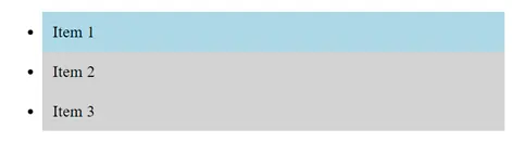
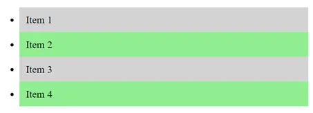
4. :nth-child() Pseudo-Class
The :nth-child() pseudo-class applies a style to one or more elements based on their position within a parent element.
Example:
<head>
<style>
.item:nth-child(odd) {
background-color: lightgray;
}
.item:nth-child(even) {
background-color: lightblue;
}
</style>
</head>
<body>
<div class=”item”>Item 1</div>
<div class=”item”>Item 2</div>
<div class=”item”>Item 3</div>
<div class=”item”>Item 4</div>
<div class=”item”>Item 5</div>
</body>
Output:

In this example:
• The :nth-child(odd) and :nth-child(even) pseudo-classes apply different background colors to odd and even items in a list or group of elements.
• Odd items have a light gray background, while even items have a light blue background.
5. :first-child Pseudo-Class
The :first-child pseudo-class applies a style to the first-child element of a parent.
Example:
<head>
<style>
.container p:first-child {
font-weight: bold;
color: red;
}
</style>
</head>
<body>
<div class=”container”>
<p>This is the first paragraph and will be bold and red.</p>
<p>This is the second paragraph.</p>
<p>This is the third paragraph.</p>
</div>
</body>
Output:

In this example:
• The :first-child pseudo-class style the first child element of a specified type within a parent element.
• In this case, the first <p> element inside the .container class is styled with bold text and red color.
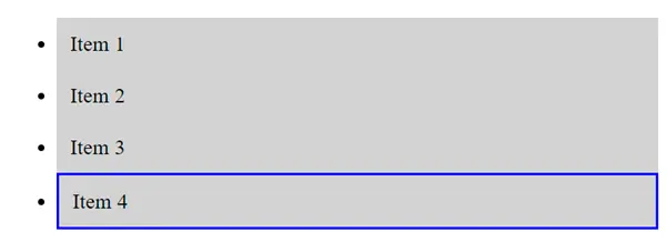
6. :last-child Pseudo-Class
The :last-child pseudo-class applies a style to the last-child element of a parent.
Example:
<head>
<style>
.container p:last-child {
font-style: italic;
color: green;
}
</style>
</head>
<body>
<div class=”container”>
<p>This is the first paragraph.</p>
<p>This is the second paragraph.</p>
<p>This is the last paragraph and will be italic and green.</p>
</div>
</body>
Output:

In this example:
• The :last-child pseudo-class is used to apply styles to the last-child element of a specified type within a parent element.
• In this case, the last <p> element inside the .container class is styled with italic text and green color.
Conclusion
CSS pseudo-classes are a powerful tool for adding interactivity and enhancing the design of your web pages. By using pseudo-classes, you can easily style elements based on user actions or their position in the document, making your website more dynamic and engaging.
Course Video
Course Video English
YouTube Reference :
Practice Scenarios
1. :hover Pseudo-Class
Scenario: Change the background color of a button when a user hovers over it.
Objective: Make the button background color change on hover.
Output:

2. :focus Pseudo-Class
Scenario: Change the border color of an input field when it receives focus.
Objective: Make the border color of the input field change when the user clicks on it.
Output:

3. :active Pseudo-Class
Scenario: Change the color of a link when it is being clicked.
Objective: Alter the text color of the link during an active state.
Output:

4. :first-child Pseudo-Class
Scenario: Style the first item in a list differently from the other items.
Objective: Apply a different style to the first <li> element in a list.
Output:
5. :nth-child(n) Pseudo-Class
Scenario: Style every second item in a list with a different background color.
Objective: Apply a background color to even-numbered list items.
Output:
6. :last-child Pseudo-Class
Scenario: Style the last element in a list differently from the other elements.
Objective: Apply a border to the last <li> element in a list.
Output:
This module provides a comprehensive guide to CSS pseudo-classes, explaining how to style elements based on their state, position, or user interactions, such as :hover, :active, :focus, :nth-child(), and more.
Yes, it includes examples demonstrating how to apply various pseudo-classes to elements, illustrating how each affects the styling based on different conditions or user interactions.
Yes, exercises involve applying different pseudo-classes to HTML elements, helping to reinforce the concepts learned and providing hands-on experience in dynamic styling.
Yes, it’s designed for beginners with clear explanations and step-by-step examples, making it accessible to those new to CSS and web design.
A code editor like Visual Studio Code or Sublime Text, along with a web browser, will suffice for practicing the exercises provided in the training.
Yes, it covers how to use pseudo-classes like :hover, :active, and :focus to style elements based on user interactions, enhancing the interactivity of your web pages.
Yes, the training is self-paced and accessible online anytime, allowing learners to progress through the material at their convenience.
Yes, it explains structural pseudo-classes like :first-child, :last-child, and :nth-child() to style elements based on their position within the DOM hierarchy.
It typically takes a few hours to complete, depending on your learning pace and familiarity with CSS concepts.
Yes, this “CSS Pseudo-Classes” training is completely free on Iqra Technology Academy’s website.
