

CSS Animations
CSS animations allow you to animate the changes of CSS properties over time, making elements move, change color, grow, shrink, or perform other visual effects. Unlike transitions, which are triggered by user actions like hovering or clicking, animations can run automatically when the page loads or at any time specified by the developer.
How Does CSS Animation Work?
To create a CSS animation, you need to define two things:
1. Keyframes: These define the start and end points (and any intermediate points) of the animation.
2. Animation Properties: These control how the animation is applied to an element, such as its duration, timing, and repetition.
Basic Syntax
@keyframes animation-name {
/* Define the animation states */
}
selector {
animation: animation-name duration timing-function delay iteration-count direction;
}
• animation-name: The name of the animation, linked to the @keyframes rule.
• duration: How long the animation takes to complete one cycle (e.g., 2s for 2 seconds).
• timing-function: The speed curve of the animation (e.g., ease, linear).
• delay: The time to wait before the animation starts (optional).
• iteration-count: How many times the animation should repeat (e.g., infinite for endless repetition).
• direction: Specifies whether the animation should alternate direction or restart from the beginning.
Example: Basic Animation
Let’s animate a box so that it moves from left to right across the screen.
Output:

In this example:
• Animation (animation Property): The animation property in the .box class specifies the moveRight animation with a duration of 3 seconds and an infinite repeat. This makes the box move from left to right repeatedly.
• Keyframes (@keyframes): The @keyframes rule defines how the animation progresses over time. In this case, the box moves horizontally from its starting position (left: 0) to the end position (left: 100%).
• Positioning: The position: absolute; property allows the box to be positioned independently of other elements. The top and left properties control its initial placement.
Animating Multiple Properties
You can animate multiple properties simultaneously by defining them within the @keyframes.
Example:
<head>
<style>
.box {
width: 100px;
height: 100px;
background-color: #4CAF50;
position: absolute;
top: 50px;
left: 0;
animation: animateBox 4s infinite;
}
@keyframes animateBox {
0% {
left: 0;
background-color: #4CAF50;
transform: rotate(0deg);
}
50% {
left: 50%;
background-color: #ff5733;
transform: rotate(180deg);
}
100% {
left: 100%;
background-color: #4CAF50;
transform: rotate(360deg);
}
}
</style>
</head>
<body>
<div class=”box”></div>
</body>
Output:

In this example:
• Animation Timing: The box animates over 4 seconds, moving horizontally from the left to the right edge of the containing element, changing color from green to orange, and rotating from 0 to 360 degrees.
• Animation Properties: animation: animateBox 4s infinite;: Applies the keyframes defined in animateBox and makes the animation loop indefinitely.
• Transformations:
– transform: rotate(): Applies rotation to the box.
– left: Moves the box horizontally.
Timing Functions and Delays
You can control the speed and delay of your animations using timing functions and delays.
Example:
<head>
<style>
.box {
width: 100px;
height: 100px;
background-color: #4CAF50;
position: absolute;
top: 50px;
left: 0;
animation: moveRight 5s ease-in-out 2s infinite;
}
@keyframes moveRight {
0% {
left: 0;
}
100% {
left: 100%;
}
}
</style>
</head>
<body>
<div class=”box”></div>
</body>
Output:

In this example:
Animation Timing:
• 5s: The box takes 5 seconds to move from the left edge to the right edge.
• ease-in-out: The movement starts slowly, speeds up, and then slows down towards the end.
• 2s: The animation starts 2 seconds after the page loads.
Animation Properties:
• animation: moveRight 5s ease-in-out 2s infinite;: Defines the animation, including its duration, timing function, delay, and repetition.
Animation Fill Modes
Animation-fill-mode determines the styles applied to the element before and after the animation runs.
• none: Default. The animation does not affect the element’s styles before or after it runs.
• forwards: The element will retain the styles from the last keyframe.
• backwards: The element will apply the styles from the first keyframe before the animation starts.
• both: Combines forwards and backwards.
Example:
<head>
<style>
.box {
width: 100px;
height: 100px;
background-color: #4CAF50;
position: absolute;
top: 50px;
left: 0;
animation: moveRight 4s infinite;
animation-fill-mode: both; /* Maintains the style before and after animation */
}
@keyframes moveRight {
0% {
left: 0;
}
100% {
left: 100%;
}
}
</style>
</head>
<body>
<div class=”box”></div>
</body>
Output:

In this example:
Animation Behavior:
• The .box element moves horizontally from the left to the right of its containing element over 4 seconds.
• The animation-fill-mode: both; property ensures that the box maintains the position specified in the 100% keyframe (the final state) even after the animation ends.
Browser Support
Most modern browsers support CSS animations, but for older browsers, consider adding vendor prefixes:
@-webkit-keyframes moveRight { /* Safari and Chrome */ }
@-moz-keyframes moveRight { /* Firefox */ }
@-o-keyframes moveRight { /* Opera */ }
@keyframes moveRight { /* Standard */ }
Conclusion
CSS animations bring your web pages to life by enabling elements to move, change, and interact in dynamic ways. Whether you’re creating simple hover effects or complex sequences, CSS animations are a powerful tool for enhancing user experience. They allow for smooth, engaging interactions without the need for JavaScript, making them a must-have skill for modern web development.
Course Video
YouTube Reference :
Practice Scenarios
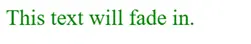
Scenario 1: Simple Fade In Animation
Objective: Create an element that fades in when the page loads.
Expected Output: An element that gradually becomes visible over 2 seconds.
Code:
<style>
@keyframes fadeIn {
from { opacity: 0; }
to { opacity: 1; }
}
.fade-in {
opacity: 0;
animation: fadeIn 2s ease-in forwards;
}
</style>
Output:
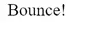
Scenario 2: Bounce Animation
Objective: Create an element that bounces up and down.
Expected Output: An element that performs a bouncing animation.
CSS Code:
<style>
@keyframes bounce {
0%, 20%, 50%, 80%, 100% {
transform: translateY(0);
}
40% {
transform: translateY(-30px);
}
60% {
transform: translateY(-15px);
}
}
.bounce {
display: inline-block;
animation: bounce 2s infinite;
}
</style>
Output:
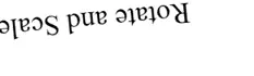
Scenario 3: Rotate and Scale Animation
Objective: Create an element that rotates and scales up.
Expected Output: An element that rotates 360 degrees and scales to 1.5 times its size over 3 seconds.
Output:
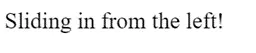
Scenario 4: Slide In from Left
Objective: Create an element that slides in from the left.
Expected Output: An element that moves from off-screen on the left to its position over 2 seconds.
Output:
Scenario 5: Pulsing Effect
Objective: Create an element with a pulsing animation effect.
Expected Output: An element that pulses by scaling up and down.
Output:
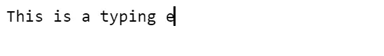
Scenario 7: Typing Animation
Objective: Create a text element that simulates typing effect.
Expected Output: Text that appears as if it is being typed out.
CSS Code:
<style>
.typing {
font-family: monospace;
border-right: 2px solid black;
white-space: nowrap;
overflow: hidden;
animation: typing 4s steps(40, end) infinite, blink-caret 0.75s step-end infinite;
}
@keyframes typing {
from { width: 0; }
to { width: 100%; }
}
@keyframes blink-caret {
from, to { border-color: transparent; }
50% { border-color: black; }
}
</style>
Output:
This module provides a comprehensive guide to CSS animations, explaining how to animate changes in CSS properties over time. It covers key concepts such as @keyframes, animation properties, and how to create engaging visual effects on web pages. horizontal and vertical alignment, centering elements, and aligning items within flex and grid layouts.
Yes, it includes practical examples demonstrating how to apply various animation techniques to elements, illustrating how to create movement, change colors, and implement other visual effects using CSS.
Yes, exercises involve applying different animation properties to HTML elements, helping to reinforce the concepts learned and providing hands-on experience in creating dynamic web designs.
Yes, it’s designed for beginners with clear explanations and step-by-step examples, making it accessible to those new to CSS and web design.
Yes, it covers how to use properties like animation-duration, animation-timing-function, and animation-delay to control the timing and pacing of animations, allowing for precise control over animation sequences.
Yes, the training is self-paced and accessible online anytime, allowing learners to progress through the material at their convenience.
Yes, it explains how to use properties like animation-iteration-count and animation-direction to create looping animations and control their direction, enabling more complex and engaging visual effects.
It typically takes a few hours to complete, depending on your learning pace and familiarity with CSS concepts.
Yes, this “CSS Animations” training is completely free on Iqra Technology Academy’s website.
