

CSS Transforms
CSS transform allows you to change the shape, size, and position of elements on your web page. It can rotate, scale, move, or skew elements, all without disturbing the normal document flow. This is useful for creating dynamic, visually engaging designs.
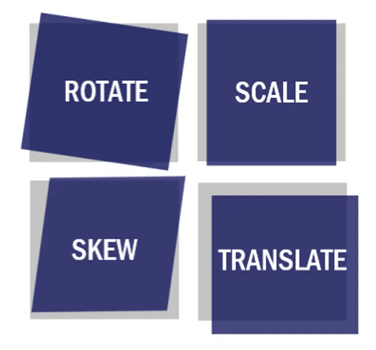
Common Transform Functions
1. translate(): Moves an element from its current position.
2. rotate(): Rotates an element clockwise or counterclockwise.
3. scale(): Changes the size of an element.
4. skew(): Skews an element along the X or Y axis.
5. matrix(): Combines all of the above functions in one.
1. translate()
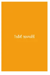
The translate() function moves an element from its original position. You can move it along the X-axis, Y-axis, or both.
Example:
Output:

After Transform
In this example:
• Transform Property: The transform property in CSS allows you to apply various transformations to an element, such as translation, rotation, scaling, and skewing. In this example, the translate function is used to move the element.
• Transition Effect: The transition property is used to create a smooth animation effect when the transform property changes. When the user hovers over the box, it smoothly transitions to its new position over 0.5 seconds.
• Visual Effect: On hover, the box will shift diagonally downwards and to the right. The transition creates a smooth movement effect, enhancing the interactivity and visual appeal of the element.
2. rotate()
The rotate() function rotates an element by a specified degree. Positive values rotate the element clockwise, and negative values rotate it counterclockwise.
Example
<head>
<style>
.box {
width: 100px;
height: 100px;
background-color: #4CAF50;
transition: transform 0.5s;
}
.box:hover {
transform: rotate(45deg); /* Rotates the box by 45 degrees */
}
</style>
</head>
<body>
<div class=”box”></div>
</body>
Output:

After Transform

In this example:
• Transform Property: The transform property in CSS allows for various transformations like rotation, scaling, translation, and skewing of an element. Here, the rotate function is used to rotate the box.
• Rotation Effect: When hovered, the box rotates 45 degrees clockwise, creating a dynamic and interactive visual effect. The rotate(45deg) value specifies a rotation by 45 degrees.
• Transition Effect: The transition property smoothly animates the rotation over 0.5 seconds, making the transformation visually pleasing.
3. scale()
The scale() function resizes an element. A value greater than 1 makes it larger, while a value less than 1 makes it smaller.
Example
<head>
<style>
.box {
width: 100px;
height: 100px;
background-color: #4CAF50;
transition: transform 0.5s;
}
.box:hover {
transform: scale(1.5); /* Scales the box to 150% of its original size */
}
</style>
</head>
<body>
<div class=”box”></div>
</body>
Output:

After Transform

In this example:
• Transform Property: The transform property allows you to apply various transformations to an element. Here, the scale function is used to resize the box.
• Scaling Effect: When the user hovers over the box, it scales up to 150% of its original size, creating a zoom-in effect. This is often used for buttons, images, or any UI elements that need to grab the user’s attention.
• Transition Effect: The transition property smooths the scaling effect over 0.5 seconds, making the interaction visually appealing.
4. skew()
The skew() function tilts an element along the X or Y axis.
Example
<head>
<style>
.box {
width: 100px;
height: 100px;
background-color: #4CAF50;
transition: transform 0.5s;
}
.box:hover {
transform: skew(20deg, 10deg); /* Skews the box 20 degrees along the X-axis and 10 degrees along the Y-axis */
}
</style>
</head>
<body>
<div class=”box”></div>
</body>
Output:

After Transform

In this example:
• Transform Property: The transform property allows you to apply various transformations to an element. Here, the skew function distorts the box by tilting it.
• Skewing Effect: When the user hovers over the box, it gets skewed, making it appear as though it’s leaning or tilted. The values 20deg and 10deg control the amount of skewing along the X-axis and Y-axis, respectively.
• Transition Effect: The transition property smooths the skewing effect over 0.5 seconds, providing a fluid visual change when hovering.
5. matrix()
The matrix() function combines multiple transformations into one. It’s less commonly used because it’s complex, but it’s powerful for advanced effects.
Example
<head>
<style>
.box {
width: 100px;
height: 100px;
background-color: #4CAF50;
transition: transform 0.5s;
}
.box:hover {
transform: matrix(1, 0.2, -0.2, 1, 0, 0); /* Applies a transformation matrix */
}
</style>
</head>
<body>
<div class=”box”></div>
</body>
Output:
After Transform

In this example:
Transform Property: The transform property allows you to apply various transformations to an element, such as scaling, rotating, and skewing. The matrix function provides a way to use a combination of these transformations.
Matrix Function: The matrix function takes six parameters:
• matrix(a, b, c, d, e, f):
• a (1): Horizontal scaling factor.
• b (0.2): Horizontal skewing factor.
• c (-0.2): Vertical skewing factor.
• d (1): Vertical scaling factor.
• e (0): Horizontal translation (moving) factor.
• f (0): Vertical translation (moving) factor.
• In this case, the matrix skews the box horizontally and vertically without scaling or translating it.
Transition Effect: The transition property smooths the transformation over 0.5 seconds, creating a fluid visual change when hovering.
Transform Origin
By default, transforms are applied from the center of an element, but you can change this using transform-origin.
Example
<head>
<style>
.box {
width: 100px;
height: 100px;
background-color: #4CAF50;
transition: transform 0.5s;
transform-origin: top right; /* Origin of transformation is at the top right corner */
}
.box:hover {
transform: rotate(45deg);
}
</style>
</head>
<body>
<div class=”box”></div>
</body>
Output:

After Transform

In this example:
• Transform-Origin Property: The transform-origin property allows you to change the point around which a transformation occurs. By default, this point is at the center of the element. In this example, the origin is moved to the top right corner.
• Rotate Transformation: The rotate(45deg) function rotates the box 45 degrees clockwise. Since the origin of the transformation has been set to the top right corner, the box rotates around this corner rather than its center.
• Transition Effect: The transition property ensures that the rotation occurs smoothly over 0.5 seconds when the box is hovered over.
Combining Transforms
You can combine multiple transforms by separating them with spaces.
Example
<head>
<style>
.box {
width: 100px;
height: 100px;
background-color: #4CAF50;
transition: transform 0.5s;
}
.box:hover {
transform: translate(50px, 50px) rotate(45deg) scale(1.2);
}
</style>
</head>
<body>
<div class=”box”></div>
</body>
Output:
After Transform

In this example:
• Combined Transformations: The transform property allows multiple transformations to be applied in sequence. In this case, the box moves (translation), rotates and scales simultaneously when hovered over.
• Translate Function: Moves the box 50px horizontally and vertically from its original position.
• Rotate Function: Rotates the box 45 degrees clockwise around its center.
• Scale Function: Enlarges the box to 120% of its original size.
• Transition Effect: The transition is smooth and occurs over 0.5 seconds, creating a visually engaging animation.
3D Transforms
3D transforms in CSS add depth to your elements. You can use properties like perspective, rotateX(), rotateY(), and translateZ() to create 3D effects. Remember to set perspective on a parent container to see the full effect.
Example
<head>
<style>
.container {
perspective: 500px; /* Provides a 3D perspective view */
}
.box {
width: 100px;
height: 100px;
background-color: #4CAF50;
transition: transform 0.5s;
transform-style: preserve-3d; /* Enables 3D transformations */
}
.box:hover {
transform: rotateY(45deg) translateZ(100px); /* Rotates and moves the box along the Z-axis */
}
</style>
</head>
<body>
<div class=”container”>
<div class=”box”></div>
</div>
</body>
Output:

After Transform

In this example:
• 3D Perspective (perspective): The perspective property in the .container element establishes a 3D space where the transformation occurs. It simulates depth by affecting how the transformed element appears to the viewer.
• 3D Transformation (transform-style: preserve-3d): This property ensures that any child elements maintain their 3D position relative to the parent, allowing for complex 3D animations.
• Hover Effect: When the user hovers over the .box element, it rotates around the Y-axis by 45 degrees and moves along the Z-axis towards the viewer, creating a dynamic and engaging 3D effect.
Conclusion
CSS transform is a powerful tool for creating dynamic effects on web pages. By manipulating elements in 2D space, you can rotate, move, resize, and skew them to create engaging designs. When combined with CSS transitions and animations, transforms can greatly enhance the interactivity and visual appeal of your website.
Course Video
Course Video English
YouTube Reference :
1) CSS Transform 2D Tutorial in Hindi / Urdu
2) CSS Transform 3D Tutorial in Hindi / Urdu
3) CSS Transform-Style Tutorial in Hindi / Urdu
Practice Scenarios
Scenario 1: Rotate an Image
Objective: Create an image that rotates when hovered over.
Expected Output: An image that rotates 45 degrees when the user hovers over it.
Output:
Before Hover
After Hover
Scenario 2: Scale Up a Box
Objective: Create a box that scales up when hovered over.
Expected Output: A box that increases in size when hovered.
Output:
Before Hover

After Hover

Scenario 3: Skew a Button
Objective: Create a button that skews when hovered over.
Expected Output: A button that becomes skewed horizontally when hovered.
Output:
Before Hover

After Hover

Scenario 4: Translate a Div
Objective: Create a div that moves horizontally when hovered over.
Expected Output: A div that moves 100 pixels to the right when hovered.
Output:
Before Hover
After Hover

Scenario 5: Rotate and Scale a Text
Objective: Create a text element that rotates and scales when hovered over.
Expected Output: Text that rotates 45 degrees and scales up when hovered.
Output:
Before Hover
After Hover

Scenario 6: 3D Rotate a Card
Objective: Create a card that rotates in 3D when hovered over.
Expected Output: A card that rotates 180 degrees along the Y-axis when hovered.
Output:
Before Hover
After Hover

Scenario 7: Combine Multiple Transforms
Objective: Create a div that rotates, scales, and moves when hovered over.
Expected Output: A div that rotates 30 degrees, scales to 1.2 times its size, and translates 50 pixels to the right when hovered.
Output:
Before Hover
After Hover
This module provides a comprehensive guide to CSS transforms, explaining how to manipulate elements in 2D and 3D space. It covers transformations such as rotation, scaling, translation, and skewing, enabling you to create dynamic and interactive web designs.
Yes, it includes practical examples demonstrating how to apply various transform functions to elements, illustrating how each function affects the appearance and positioning of content.
Yes, exercises involve applying different transform properties to HTML elements, helping to reinforce the concepts learned and providing hands-on experience in creating engaging designs.
Yes, it’s designed for beginners with clear explanations and step-by-step examples, making it accessible to those new to CSS and web design.
Yes, it covers how to integrate transforms with CSS transitions and animations to create smooth and visually appealing effects, enhancing user interaction on your website.
Yes, the training is self-paced and accessible online anytime, allowing learners to progress through the material at their convenience.
Yes, it explains how to apply 3D transformations to elements, including rotation and translation along the X, Y, and Z axes, enabling the creation of more complex and engaging visual effects.
It typically takes a few hours to complete, depending on your learning pace and familiarity with CSS concepts.
Yes, this “CSS Transforms” training is completely free on Iqra Technology Academy’s website.
