

CSS Media Queries
What are CSS Media Queries?

CSS Media Queries are a powerful feature introduced in CSS3 that allows you to apply different styles to a webpage based on the characteristics of the device or viewport, such as screen size, orientation, and resolution. This makes it possible to create responsive web designs that adapt to various screen sizes and devices.
Basic Syntax of a Media Query

1. Media Types
Media types specify the kind of device you want your CSS rules to target. The most common media types are:
• screen: For devices like computers, tablets, and smartphones.
• print: For printers.
• all: For all types of devices.
2. Media Features
Media features describe the device’s characteristics, such as the screen’s width or the device’s orientation (landscape or portrait).
Common Media Features:
• width and height: The width and height of the viewport.
• max-width and max-height: The maximum width and height of the viewport.
• min-width and min-height: The minimum width and height of the viewport.
• orientation: The direction in which the device is held (landscape or portrait).
• resolution: The sharpness of the display in dots per inch (dpi) or dots per pixel (dppx).
Styles for Screens Wider than 600px
You can use a media query to apply styles specifically for screens that are wider than 600px.
Example:
Output:
Screen Size Below 600px

Screen Size above 600px

In this example:
Initial Styling (.box):
• background-color: #4CAF50;: The initial background color of the box is green (#4CAF50).
• color: white;: The text inside the box is white.
• padding: 20px;: Adds 20px padding inside the box to create space around the text.
• text-align: center;: Centers the text within the box horizontally.
Media Query (@media (min-width: 600px)):
• @media (min-width: 600px): This media query targets screens with a width of 600 pixels or more.
• background-color: #ff5733;: When the screen width is 600 pixels or more, the background color of the box changes to orange-red (#ff5733).
Styles for Screens Smaller than 600px
Similarly, you can apply styles specifically for screens that are smaller than 600px.
Example:
<head>
<style>
.box {
background-color: #4CAF50;
color: white;
padding: 20px;
text-align: center;
}
@media (max-width: 600px) {
.box {
background-color: #3498db; /* Changes background color for screens smaller than 600px */
}
}
</style>
</head>
<body>
<div class=”box”>This box changes color on screens smaller than 600px.</div>
</body>
Output:
Screen Size above 600px

Screen Size Below 600px

In this example:
Initial Styling (.box):
• background-color: #4CAF50;: The initial background color of the box is green (#4CAF50).
• color: white;: The text inside the box is white.
• padding: 20px;: Adds 20px padding inside the box to create space around the text.
• text-align: center;: Centers the text within the box horizontally.
Media Query (@media (max-width: 600px)):
• @media (max-width: 600px): This media query targets screens with a width of 600 pixels or less.
• background-color: #3498db;: When the screen width is 600 pixels or less, the background color of the box changes to blue (#3498db).
Common Media Query Sizes
1. Small Screens (Smartphones)
@media screen and (max-width: 480px) { /* Styles for small screens */ }
2. Medium Screens (Tablets)
@media screen and (min-width: 481px) and (max-width: 768px) { /* Styles for tablets */ }
3. Large Screens (Laptops and Desktops)
@media screen and (min-width: 769px) and (max-width: 1024px) { /* Styles for laptops/desktops */ }
4. Extra Large Screens (Large Desktops)
@media screen and (min-width: 1025px) { /* Styles for large desktops */ }
5. Orientation – Portrait
@media screen and (orientation: portrait) { /* Styles for portrait orientation */ }
6. Orientation – Landscape
@media screen and (orientation: landscape) { /* Styles for landscape orientation */ }
Using Media Query Ranges
Media query ranges allow you to target specific screen widths or heights by combining min-width and max-width.
Example:
<head>
<style>
.box {
background-color: #4CAF50;
color: white;
padding: 20px;
text-align: center;
}
@media (min-width: 600px) and (max-width: 800px) {
.box {
background-color: #e74c3c; /* Applies between 600px and 800px */
}
}
</style>
</head>
<body>
<div class=”box”>This box changes color between 600px and 800px screen width.</div>
</body>
Output:
Normal Screen Width

Screen Width Between 600px to 800px

In this example:
Initial Styling (.box):
• background-color: #4CAF50;: The box initially has a green background color (#4CAF50).
• color: white;: The text inside the box is white.
• padding: 20px;: Adds 20px padding inside the box to create space around the text.
• text-align: center;: Centers the text within the box horizontally.
Media Query (@media (min-width: 600px) and (max-width: 800px)):
• @media (min-width: 600px) and (max-width: 800px): This media query targets screens with a width between 600 pixels and 800 pixels.
• background-color: #e74c3c;: When the screen width is between 600 pixels and 800 pixels, the background color of the box changes to red (#e74c3c).
Targeting Different Screen Sizes
You can use media queries to target a range of screen sizes. This is particularly useful for responsive designs.
Example:
<head>
<style>
.box {
background-color: #4CAF50;
color: white;
padding: 20px;
text-align: center;
}
@media (max-width: 600px) {
.box {
background-color: #3498db; /* Smaller screens */
}
}
@media (min-width: 601px) and (max-width: 1024px) {
.box {
background-color: #ff5733; /* Medium screens */
}
}
@media (min-width: 1025px) {
.box {
background-color: #f39c12; /* Larger screens */
}
}
</style>
</head>
<body>
<div class=”box”>This box changes color based on screen size.</div>
</body>
Output:
Smaller Screen Size

Medium Screen Size

Larger Screen Size

In this example:
Default Styling (.box):
• background-color: #4CAF50;: The box has a green background by default.
• color: white;: The text inside the box is white.
• padding: 20px;: Adds 20px of padding inside the box.
• text-align: center;: Centers the text within the box horizontally.
Media Query for Small Screens (@media (max-width: 600px)):
• background-color: #3498db;: The box changes to a blue background when the screen width is 600 pixels or less.
Media Query for Medium Screens (@media (min-width: 601px) and (max-width: 1024px)):
• background-color: #ff5733;: The box changes to an orange background when the screen width is between 601 pixels and 1024 pixels.
Media Query for Large Screens (@media (min-width: 1025px)):
• background-color: #f39c12;: The box changes to a yellow background when the screen width is 1025 pixels or more.
Hide Elements With Media Queries
You can use media queries to hide elements based on screen size.
Example:
<head>
<style>
.box {
background-color: #4CAF50;
color: white;
padding: 20px;
text-align: center;
margin-bottom: 10px;
}
@media (max-width: 600px) {
.box-hide {
display: none; /* Hides the element on screens smaller than 600px */
}
}
</style>
</head>
<body>
<div class=”box”>This box is always visible.</div>
<div class=”box box-hide”>This box is hidden on screens smaller than 600px.</div>
</body>
Output:
Screen Size above 600px

Screen Size Below 600px

In this example:
Default Styling (.box):
• background-color: #4CAF50;: The boxes have a green background by default.
• color: white;: The text inside the boxes is white.
• padding: 20px;: Adds 20px of padding inside each box.
• text-align: center;: Centers the text within each box horizontally.
• margin-bottom: 10px;: Adds a 10px space below each box.
Media Query for Small Screens (@media (max-width: 600px)):
• .box-hide { display: none; }: The .box-hide class applies display: none; to hide the element on screens with a width of 600 pixels or less.
Common Use Cases for Media Queries
1. Responsive Layouts: Adjust the layout based on screen size (e.g., changing grid columns, hiding elements).
2. Retina Displays: Serve high-resolution images to devices with high-density screens.
3. Print Styles: Apply specific styles when a page is printed.
4. Orientation Changes: Modify the layout based on whether the device is in portrait or landscape mode.
5. Accessibility: Adjust styles for larger text sizes or high-contrast themes.
Conclusion
CSS Media Queries are a key tool in making your website responsive, ensuring it looks great and works well on all devices. By using them effectively, you can provide a better experience for all your users, no matter how they access your site.
Course Video
Course Video in English
YouTube Reference :
Practice Scenarios
Scenario 1: Responsive Text Size
Objective: Create a web page where the text size of a paragraph changes based on the screen width.
Expected Output: The paragraph text is small on small screens and large on larger screens.
Output:
Large Screen

Small Screen

Scenario 2: Hide Elements on Small Screens
Objective: Create a web page where a sidebar is hidden on small screens but visible on larger screens.
Expected Output: The sidebar is hidden on screens smaller than 600px wide.
Output:
Large Screen
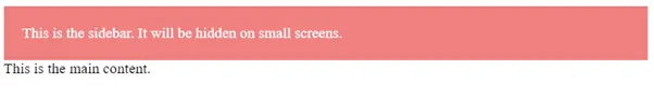
Small Screen

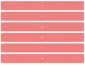
Scenario 3: Responsive Grid Layout
Objective: Create a grid layout that changes the number of columns based on screen size.
Expected Output: The grid has one column on small screens, two columns on medium screens, and three columns on large screens.
Output:
Large Screen
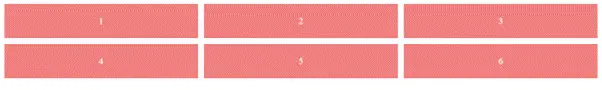
Medium Screen
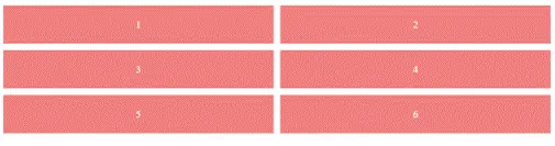
Small Screen
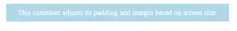
Scenario 4: Adjusting Padding and Margins
Objective: Create a web page where the padding and margin of a container change based on the screen size.
Expected Output: The container has small padding and margin on small screens, and larger padding and margin on larger screens.
Output:
Large Screen
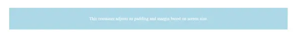
Small Screen
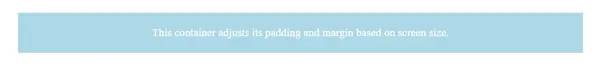
Default Styling
Scenario 5: Adjusting Image Size for Different Devices
Objective: Create a responsive image that adjusts its size based on the screen width.
Expected Output: The image scales down on small screens and remains full-size on larger screens.
Output:
Large Screen
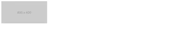
Medium Screen
Default Styling
Scenario 6: Responsive Layout with Two-Column Grid
Objective: Create a responsive two-column grid layout that switches to a single column on screens smaller than 600px.
Expected Output:
• On larger screens (600px and above), the layout displays two columns side by side.
• On smaller screens (below 600px), the layout switches to a single column.
Output:
Large Screen
Small Screen
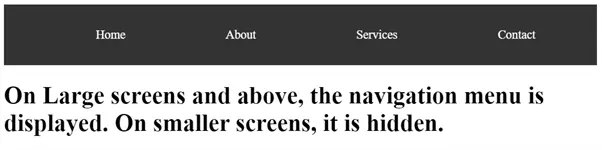
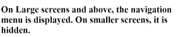
Scenario 7: Hiding Navigation Menu on Small Screens
Objective: Hide a navigation menu on screens smaller than 768px.
Expected Output:
• On screens 768px and above, the navigation menu is visible.
• On screens smaller than 768px, the navigation menu is hidden.
Output:
Large Screen
Small Screen
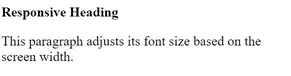
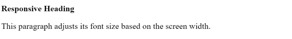
Scenario 8: Font Size Adjustment for Different Devices
Objective: Adjust the font size for different screen sizes to ensure readability.
Expected Output:
• On screens 1200px and above, the font size is large.
• On screens between 768px and 1199px, the font size is medium.
• On screens smaller than 768px, the font size is small.
Output:
Small Screen
Large Screen
It explains how to use CSS Media Queries for creating responsive designs based on device characteristics.
Yes, examples demonstrate applying styles for various screen sizes and resolutions.
Yes, exercises focus on using media queries to practice responsive design.
Yes, it’s beginner-friendly with step-by-step guidance.
A code editor like Visual Studio Code and a web browser.
Yes, it shows how to create mobile-friendly and adaptable layouts.
Yes, the training is self-paced and accessible anytime.
Yes, it covers features like width, height, orientation, and resolution.
A few hours, depending on your learning pace.
Yes, this training is completely free on Iqra Technology Academy’s website.
