

CSS Transition
CSS transitions allow you to change the style of an element smoothly over a specified duration. Instead of the style changing abruptly, transitions let the change happen gradually, creating a more polished and interactive user experience.
How Does a CSS Transition Work?
When you apply a CSS transition to an element, you define which properties should change and how long the transition should take. You can also control the timing and delay of the transition.
Basic Syntax:
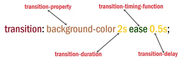
• property: The CSS property you want to animate (e.g., background-color, width).
• duration: The time it takes for the transition to complete (e.g., 2s for 2 seconds).
• timing-function: The speed curve of the transition (e.g., ease, linear).
• delay: The time to wait before starting the transition (optional, e.g., 0.5s for half a second).
Example of a Simple CSS Transition
Let’s say you want to change the background color of a button when the user hovers over it. Without a transition, the color would change instantly. With a transition, the color change will happen gradually.
Output:

In this example:
.button:
• background-color: #4CAF50;: Sets the button’s initial background color to green.
• transition: background-color 2s;: Applies a transition effect to the background-color property over 2 seconds, making the color change smooth when the button hovers.
.button:hover:
• background-color: #45a069;: Changes the button’s background color to a slightly different shade of green when hovered over.
Timing Functions
The timing function controls the speed of the transition throughout its duration. Some common timing functions are:
• ease: Starts slow, fast, then slow (default).
• linear: Maintains the same speed from start to finish.
• ease-in: Starts slow and then speeds up.
• ease-out: Starts fast and then slows down.
• ease-in-out: Slow start, fast middle, slow end.
Example:
<head>
<style>
.box {
width: 100px;
height: 70px;
margin: 20px;
background-color: #4CAF50;
transition: width 1s;
}
.ease { transition-timing-function: ease; }
.linear { transition-timing-function: linear; }
.ease-in { transition-timing-function: ease-in; }
.ease-out { transition-timing-function: ease-out; }
.ease-in-out { transition-timing-function: ease-in-out; }
.box:hover {
width: 200px;
}
</style>
</head>
<body>
<div class=”box ease”>ease</div>
<div class=”box linear”>linear</div>
<div class=”box ease-in”>ease-in</div>
<div class=”box ease-out”>ease-out</div>
<div class=”box ease-in-out”>ease-in-out</div>
</body>
Output:
In this example:
.box:
• transition: width 1s;: Specifies that the width property will transition over 1 second when changed.
.ease, .linear, .ease-in, .ease-out, .ease-in-out:
• transition-timing-function: Defines the pace of the transition for each box:
• ease: Starts slow, speeds up in the middle, and slows down at the end.
• linear: Maintains a constant speed throughout the transition.
• ease-in: Starts slow and then speeds up.
• ease-out: Starts fast and then slows down.
• ease-in-out: Starts slow, speeds up in the middle, and slows down again at the end.
.box:hover:
• width: 200px;: Increases the width of each box to 200px when hovered.
Multiple Properties Transition
You can apply transitions to multiple properties at once by separating them with commas.
Example:
<head>
<style>
.box {
width: 100px;
height: 100px;
margin: 20px;
background-color: #4CAF50;
border-radius: 0;
transition: width 1s, height 1s, background-color 1s, border-radius 1s;
}
.box:hover {
width: 150px;
height: 150px;
background-color: #ff5733;
border-radius: 50%;
}
</style>
</head>
<body>
<div class=”box”></div>
</body>
Output:
Before Transition

After Transition

In this example:
.box:
• width: 100px;: Sets the initial width of the box to 100px.
• height: 100px;: Sets the initial height of the box to 100px.
• margin: 20px;: Adds space around the box.
• background-color: #4CAF50;: Initially sets the background color to green.
• border-radius: 0;: Initially sets the box with sharp corners.
• transition: width 1s, height 1s, background-color 1s, border-radius 1s;: Specifies that the width, height, background-color, and border-radius properties will transition over 1 second when changed.
.box:hover:
• width: 150px;: Increases the width of the box to 150px when hovered.
• height: 150px;: Increases the height of the box to 150px when hovered.
• background-color: #ff5733;: Changes the background color to a reddish-orange when hovered.
• border-radius: 50%;: Changes the box to a circle by rounding the corners to 50% when hovered.
Conclusion:
CSS transitions enhance your website by making style changes smooth and visually appealing. Whether creating hover effects, animating buttons, or making elements change size or color, CSS transitions provide an easy way to add interactivity to your web pages.
Course Video
Course Video English
YouTube Reference :
Practice Scenarios
Scenario 1: Simple Hover Transition
Objective: Create a button that changes its background color smoothly when hovered over.
Expected Output: A button with an initial background color that changes to a different color when hovered, with a smooth transition.
Output:
Normal

After Hover
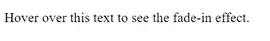
Scenario 2: Text Fade-In on Hover
Objective: Create a paragraph of text that fades in when hovered over.
Expected Output: A paragraph of text that starts slightly transparent and becomes fully opaque when hovered.
Output:
Normal

After Hover
Scenario 3: Transform and Rotate
Objective: Create a box that rotates smoothly when hovered over.
Expected Output: A box that rotates 45 degrees when hovered, with a smooth transition.
Example:
<!DOCTYPE html>
<html>
<head>
<style>
.box {
width: 100px;
height: 100px;
background-color: #e74c3c;
transition: transform 0.5s ease;
}
.box:hover {
transform: rotate(45deg);
}
</style>
<title>Transform and Rotate</title>
</head>
<body>
<div class=”box”></div>
</body>
</html>
Output:
Normal
After Hover
Scenario 4: Transition Multiple Properties
Objective: Create a button that changes both its background color and its width when hovered over.
Expected Output: A button that changes color and expands in width smoothly when hovered.
Output:
Normal

After Hover

Scenario 5: Background Color Transition
Objective: Create a div that changes its background color smoothly on hover.
Expected Output: A div that transitions from one background color to another when hovered.
Output:
Normal
After Hover
This module provides a comprehensive guide to CSS transitions, explaining how to create smooth and visually appealing changes between different states of an element. It covers properties such as transition-property, transition-duration, transition-timing-function, and transition-delay, enabling you to enhance user interactions on your website.
Yes, it includes practical examples demonstrating how to apply various transition effects to elements, such as changing colors, sizes, and positions, illustrating how each property affects the animation.
Yes, exercises involve applying different transition properties to HTML elements, helping to reinforce the concepts learned and providing hands-on experience in creating dynamic and interactive web pages.
Yes, it’s designed for beginners with clear explanations and step-by-step examples, making it accessible to those new to CSS and web design.
Yes, it covers how to use the transition-timing-function property to control the speed curve of the transition, allowing for effects like ease-in, ease-out, and linear transitions.
Yes, the training is self-paced and accessible online anytime, allowing learners to progress through the material at their convenience.
Yes, it explains how to apply transitions to multiple CSS properties at once, enabling complex animations that enhance user experience.
It typically takes a few hours to complete, depending on your learning pace and familiarity with CSS concepts.
Yes, this “CSS Transitions” training is completely free on Iqra Technology Academy’s website
