

Introduction to Bootstrap Dropdowns
Bootstrap dropdowns are small pop-up menus that display a list of options when you click or hover over a button. They are useful for creating navigation menus, user profile menus, and other compact lists of links.
Key Classes and Components of Bootstrap Dropdowns
Bootstrap provides special classes to create dropdown menus easily. Below is an example of a basic dropdown button.
Basic Dropdown
Example:
<!DOCTYPE html>
<html lang=”en”>
<head>
<meta charset=”UTF-8″>
<meta name=”viewport” content=”width=device-width, initial-scale=1.0″>
<title>Basic Dropdown</title>
<link rel=”stylesheet” href=”https://stackpath.bootstrapcdn.com/bootstrap/4.3.1/css/bootstrap.min.css”>
</head>
<body>
<div class=”dropdown”>
<button class=”btn btn-secondary dropdown-toggle” type=”button” data-toggle=”dropdown”>
Dropdown button
</button>
<div class=”dropdown-menu”>
<a class=”dropdown-item” href=”#”>Action</a>
<a class=”dropdown-item” href=”#”>Another action</a>
<a class=”dropdown-item” href=”#”>Something else</a>
</div>
</div>
<script src=”https://code.jquery.com/jquery-3.3.1.slim.min.js”></script>
<script src=”https://cdnjs.cloudflare.com/ajax/libs/popper.js/1.14.7/umd/popper.min.js”></script>
<script src=”https://stackpath.bootstrapcdn.com/bootstrap/4.3.1/js/bootstrap.min.js”></script>
</body>
</html>
Output:
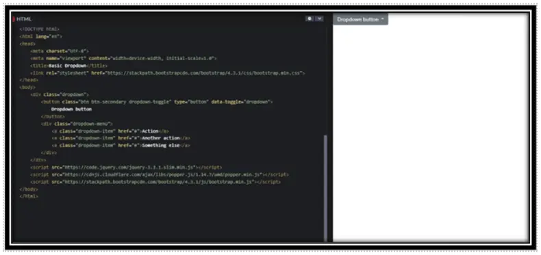
In this Example:
Bootstrap Setup: Includes Bootstrap CSS and required JS libraries (jQuery, Popper.js, Bootstrap JS).
Dropdown Structure:
• .dropdown: Wrapper for the dropdown.
• button: Uses .dropdown-toggle with data-toggle=”dropdown” to trigger the menu.
• .dropdown-menu: Contains clickable .dropdown-item links.
Script Placement: Ensures proper functionality by loading scripts at the end.
Dropdown with Headers and Dividers
You can add headers to group menu items and dividers to separate different sections.
Example:
<!DOCTYPE html>
<html lang=”en”>
<head>
<meta charset=”UTF-8″>
<meta name=”viewport” content=”width=device-width, initial-scale=1.0″>
<title>Basic Dropdown</title>
<link rel=”stylesheet” href=”https://stackpath.bootstrapcdn.com/bootstrap/4.3.1/css/bootstrap.min.css”>
</head>
<body>
<div class=”dropdown”>
<button class=”btn btn-primary dropdown-toggle” type=”button” data-toggle=”dropdown”>
Dropdown with Sections
</button>
<div class=”dropdown-menu”>
<h6 class=”dropdown-header”>Header 1</h6>
<a class=”dropdown-item” href=”#”>Action 1</a>
<a class=”dropdown-item” href=”#”>Action 2</a>
<div class=”dropdown-divider”></div>
<h6 class=”dropdown-header”>Header 2</h6>
<a class=”dropdown-item” href=”#”>Action 3</a>
</div>
</div>
</body>
</html>
Output:
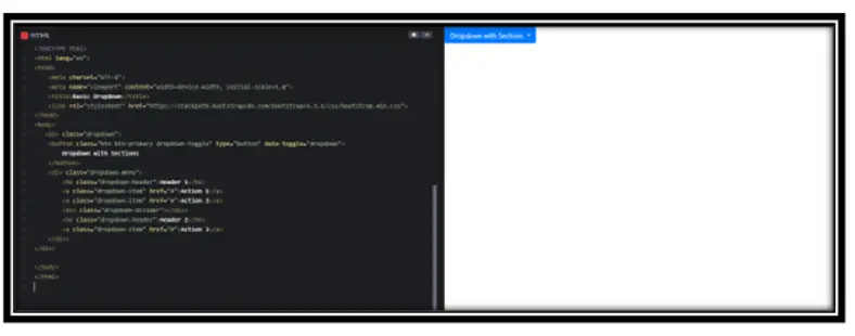
In this Example:
Dropdown Structure:
• .dropdown: Wrapper for the dropdown.
• button: Uses .dropdown-toggle with data-toggle=”dropdown” to trigger the menu.
• .dropdown-menu: Contains sections with headers and dividers.
Extra Features:
• .dropdown-header: Adds a title inside the dropdown.
• .dropdown-divider: Creates a separator between sections.
Right Aligned DropDown
If you want the dropdown menu to open on the right side, use the dropdown-menu-right class.
Example:
<!DOCTYPE html>
<html lang=”en”>
<head>
<meta charset=”UTF-8″>
<meta name=”viewport” content=”width=device-width, initial-scale=1.0″>
<title>Basic Dropdown</title>
<link rel=”stylesheet” href=”https://stackpath.bootstrapcdn.com/bootstrap/4.3.1/css/bootstrap.min.css”>
</head>
<div class=”dropdown”>
<button class=”btn btn-info dropdown-toggle” type=”button” data-toggle=”dropdown”>
Right-Aligned Dropdown
</button>
<div class=”dropdown-menu dropdown-menu-right”>
<a class=”dropdown-item” href=”#”>Link 1</a>
<a class=”dropdown-item” href=”#”>Link 2</a>
</div>
</div>
</body>
</html>
Output:
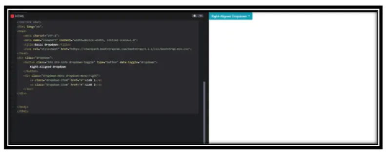
In this Example:
Dropdown Alignment:
• .dropdown-menu-right: Aligns the dropdown menu to the right.
Trigger Button:
• .dropdown-toggle with data-toggle=”dropdown” makes the menu functional.
Menu Items:
• .dropdown-item: Defines individual links inside the dropdown.
Important Points to Remember
1. Include Bootstrap Library: Always include Bootstrap CSS and JavaScript files in your project.
2. Use Correct Structure: Ensure your dropdown follows the Bootstrap structure with .dropdown, .dropdown-toggle, and .dropdown-menu.
3. Add Required Scripts: Load jQuery, Popper.js, and Bootstrap JavaScript files at the end of the body.
4. Version Compatibility: Ensure that your Bootstrap version supports the dropdown features you want to use.
Conclusion
Bootstrap dropdowns are a great way to show compact lists of links in a clean and interactive way. By using Bootstrap classes and attributes correctly, you can create different types of dropdowns, such as basic, sectioned, and right-aligned dropdowns.
Practice Scenarios
Scenario 1: Dropdown with Searchable Items
Objective: Create a dropdown where users can search for items in the menu. Use JavaScript to filter items dynamically.
Expected Output:

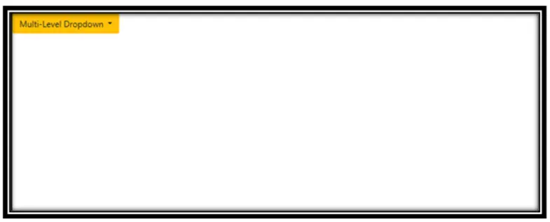
Scenario 2: Multi-Level Dropdown (Nested Dropdowns)
Objective: Create a dropdown with nested submenus.
Expected Output:
YouTube Reference :
A dropdown menu in Bootstrap is a toggleable menu that opens upon a user’s interaction, providing multiple choices under a single control.
Yes, this Bootstrap training is completely free. You can access all tutorials and learn Bootstrap at your own pace without any charges.
Follow our step-by-step guide to learn the basics of creating dropdown menus using Bootstrap.
Yes, with JavaScript or jQuery, you can create dynamic dropdowns. Learn how here.
Explore examples like multi-level dropdowns, forms in dropdowns, and customizable menus in our tutorial.
Basic HTML and CSS knowledge is recommended, but our guide is beginner-friendly.
Bootstrap offers various dropdown types like default dropdowns, split button dropdowns, and dropdowns within navigation menus.
Multi-level dropdown menus can be achieved using nested <ul> elements and custom styling. Learn how in our tutorial.
Advanced features include keyboard navigation, auto-close toggling, and using custom events to handle dropdown behavior programmatically.
