

Bootstrap List Groups
Bootstrap List Groups
A list group in Bootstrap is a way to display lists of items in a clean and organized manner. It is useful for menus, navigation, comments, or any list of content. You can also add colors, badges, and interactive features.
Bootstrap List Group Classes
Here are some important classes used in Bootstrap List Groups:
| Class Name | Discription |
|---|---|
| .list-group | Creates the list container. |
| .list-group-item | Styles each list item. |
| .list-group-item-action | Makes an item clickable. |
| .active | Highlights an active item. |
| .dissbled | Grays out an item (disabled). |
| .list-group-item-primary etc | Adds background colors. |
| .list-group-flush | Removes extra spacing. |
| .list-group-horizontal | Displays the list items side by side. |
1️. Basic List Group
A simple list group containing three items
Example:
<!DOCTYPE html>
<html lang=”en”>
<head>
<meta charset=”UTF-8″>
<meta name=”viewport” content=”width=device-width, initial-scale=1.0″>
<title>Dynamic Pagination</title>
<link rel=”stylesheet” href=”https://cdn.jsdelivr.net/npm/bootstrap@5.3.0/dist/css/bootstrap.min.css”>
<script src=”https://code.jquery.com/jquery-3.6.0.min.js”></script>
</head>
<body class=”p-4″>
<ul class=”list-group”>
<li class=”list-group-item”>First item</li>
<li class=”list-group-item”>Second item</li>
<li class=”list-group-item”>Third item</li>
</ul>
</body>
</html>
Output:
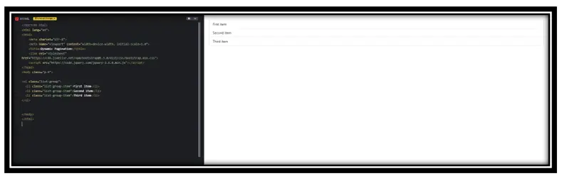
In this Example:
• .list-group: Adds Bootstrap styling to the unordered list (<ul>), making it a list group.
• .list-group-item: Styles each list item (<li>) with padding, borders, and a default background.
• Result: Creates a clean, structured list with Bootstrap’s default styling.
2️. Active and Disabled Items
You can highlight an active item or disable an item.
Example:
<!DOCTYPE html>
<html lang=”en”>
<head>
<meta charset=”UTF-8″>
<meta name=”viewport” content=”width=device-width, initial-scale=1.0″>
<title>Dynamic Pagination</title>
<link rel=”stylesheet” href=”https://cdn.jsdelivr.net/npm/bootstrap@5.3.0/dist/css/bootstrap.min.css”>
<script src=”https://code.jquery.com/jquery-3.6.0.min.js”></script>
</head>
<body class=”p-4″>
<ul class=”list-group”>
<li class=”list-group-item active”>Active item</li>
<li class=”list-group-item”>Regular item</li>
<li class=”list-group-item disabled”>Disabled item</li>
</ul>
</body>
</html>
Output:
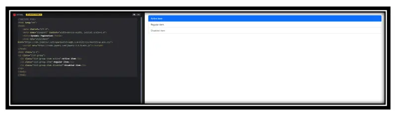
In this example:
.list-group: Defines the list as a Bootstrap-styled group.
.list-group-item: Styles each item with Bootstrap’s default list design.
.active: Highlights the first item to indicate it’s selected or currently active.
.disabled: Grays out the last item to indicate it’s unavailable or non-interactive.
3️. List Group with Colors
You can change the background color using Bootstrap’s color classes.
<!DOCTYPE html>
<html lang=”en”>
<head>
<meta charset=”UTF-8″>
<meta name=”viewport” content=”width=device-width, initial-scale=1.0″>
<title>Dynamic Pagination</title>
<link rel=”stylesheet” href=”https://cdn.jsdelivr.net/npm/bootstrap@5.3.0/dist/css/bootstrap.min.css”>
<script src=”https://code.jquery.com/jquery-3.6.0.min.js”></script>
</head>
<body class=”p-4″>
<ul class=”list-group”>
<li class=”list-group-item list-group-item-primary”>Primary</li>
<li class=”list-group-item list-group-item-secondary”>Secondary</li>
<li class=”list-group-item list-group-item-success”>Success</li>
<li class=”list-group-item list-group-item-danger”>Danger</li>
</ul>
</body>
</html>
Output:
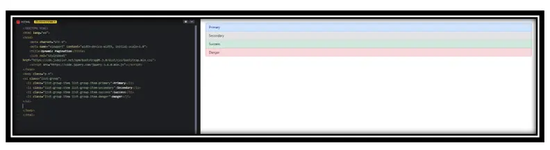
In this Example:
.list-group: Defines a Bootstrap-styled list group.
.list-group-item: Styles each item with Bootstrap’s list group design.
.list-group-item-primary: Adds a blue background to indicate primary content.
.list-group-item-secondary: Adds a gray background for secondary importance.
.list-group-item-success: Adds a green background, typically indicating success.
.list-group-item-danger: Adds a red background, usually indicating an error or warning.
4️. List Group Flush (Without Borders)
Removes extra spacing and borders for a cleaner look.
Example:
<!DOCTYPE html>
<html lang=”en”>
<head>
<meta charset=”UTF-8″>
<meta name=”viewport” content=”width=device-width, initial-scale=1.0″>
<title>Dynamic Pagination</title>
<link rel=”stylesheet” href=”https://cdn.jsdelivr.net/npm/bootstrap@5.3.0/dist/css/bootstrap.min.css”>
<script src=”https://code.jquery.com/jquery-3.6.0.min.js”></script>
</head>
<body class=”p-4″>
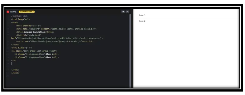
<ul class=”list-group list-group-flush”>
<li class=”list-group-item”>Item 1</li>
<li class=”list-group-item”>Item 2</li>
</ul
</body>
</html>
Output:
In this Example:
.list-group: Creates a Bootstrap-styled list group.
.list-group-flush: Removes outer borders and padding, making the list blend seamlessly with its parent container.
.list-group-item: Styles each list item with Bootstrap’s default list group styling.
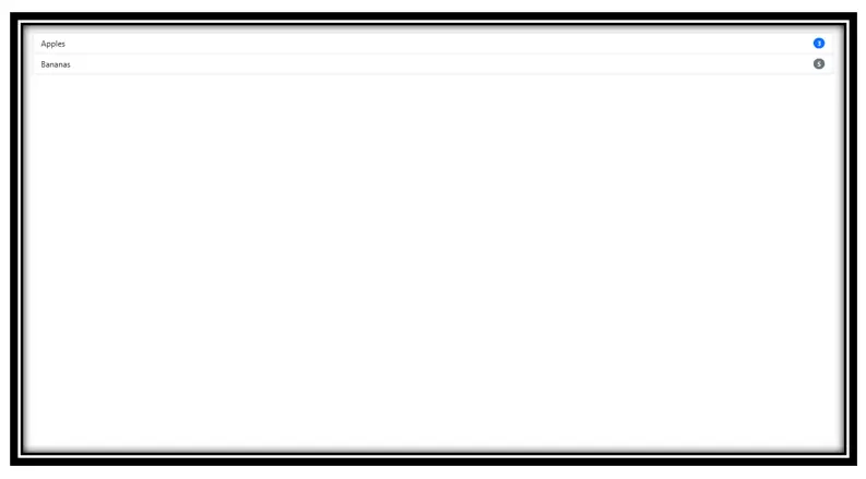
5️. List Group with Badges
Badges can be used to show numbers, notifications, or statuses.
Example:
<!DOCTYPE html>
<html lang=”en”>
<head>
<meta charset=”UTF-8″>
<meta name=”viewport” content=”width=device-width, initial-scale=1.0″>
<title>Dynamic Pagination</title>
<link rel=”stylesheet” href=”https://cdn.jsdelivr.net/npm/bootstrap@5.3.0/dist/css/bootstrap.min.css”>
<script src=”https://code.jquery.com/jquery-3.6.0.min.js”></script>
</head>
<body class=”p-4″>
<ul class=”list-group”>
<li class=”list-group-item d-flex justify-content-between align-items-center”>
Notifications
<span class=”badge bg-primary rounded-pill”>5</span>
</li>
</ul>
</body>
</html>
Output:
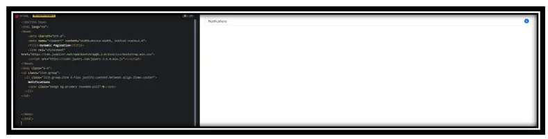
In this example:
.list-group: Creates a styled list.
.list-group-item: Styles individual list items.
Flexbox (d-flex justify-content-between align-items-center):
• Aligns text and badge properly.
Badge (.badge bg-primary rounded-pill):
• Displays a blue, rounded notification count.
Purpose: Shows a notification label with a count badge.
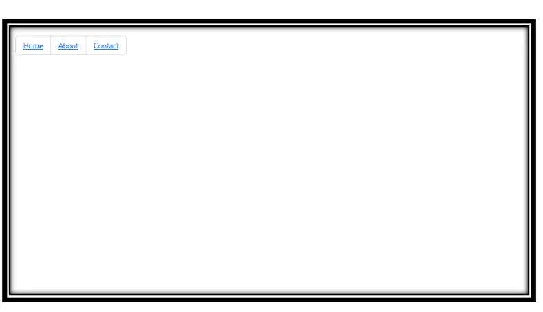
6️. Actionable List Items
Make the list items clickable using .list-group-item-action.
Example:
<!DOCTYPE html>
<html lang=”en”>
<head>
<meta charset=”UTF-8″>
<meta name=”viewport” content=”width=device-width, initial-scale=1.0″>
<title>Dynamic Pagination</title>
<link rel=”stylesheet” href=”https://cdn.jsdelivr.net/npm/bootstrap@5.3.0/dist/css/bootstrap.min.css”>
<script src=”https://code.jquery.com/jquery-3.6.0.min.js”></script>
</head>
<body class=”p-4″>
<div class=”list-group”>
<a href=”#” class=”list-group-item list-group-item-action”>Clickable Item 1</a>
<a href=”#” class=”list-group-item list-group-item-action”>Clickable Item 2</a>
</div>
</body>
</html>
Output:
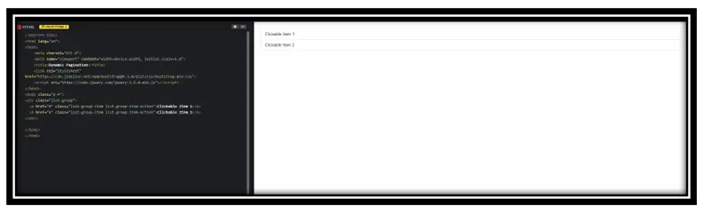
In this Example:
• Creates a list with clickable items
• Uses <a> for navigation
• .list-group-item-action makes items interactive
7️.Horizontal List Group
Display list items in a horizontal row.
Example:
<!DOCTYPE html>
<html lang=”en”>
<head>
<meta charset=”UTF-8″>
<meta name=”viewport” content=”width=device-width, initial-scale=1.0″>
<title>Dynamic Pagination</title>
<link rel=”stylesheet” href=”https://cdn.jsdelivr.net/npm/bootstrap@5.3.0/dist/css/bootstrap.min.css”>
<script src=”https://code.jquery.com/jquery-3.6.0.min.js”></script>
</head>
<body class=”p-4″>
<ul class=”list-group list-group-horizontal”>
<li class=”list-group-item”>Item 1</li>
<li class=”list-group-item”>Item 2</li>
</ul>
</body>
</html>
Output:
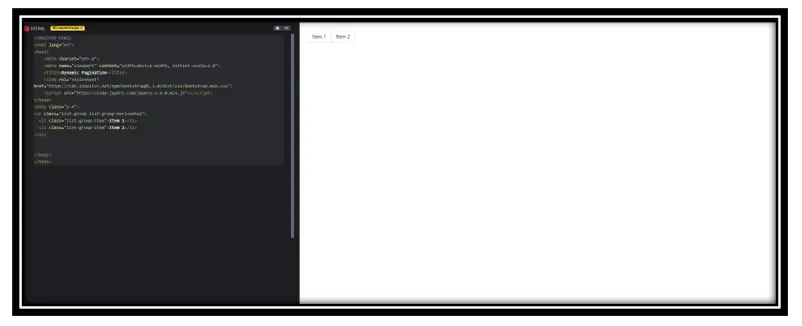
• Displays list items in a horizontal row
• Uses .list-group-horizontal for alignment
• Each item styled with .list-group-item
Conclusion
Bootstrap List Groups help organize content neatly.
You can add colors, badges, clickable items, and horizontal layouts.
active and disabled states make lists more interactive.
Practice Scenarios
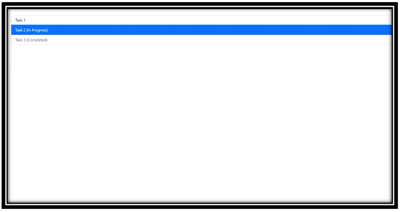
Scenario 1:
Create a list group for a to-do list where completed tasks are disabled and the current task is highlighted.
Expected Output:
Scenario 2:
Design a horizontal navigation menu using a list group.
Expected Output:
Scenario 3:
Display a shopping cart list with item names and quantity badges.
Expected Output:
Try these examples and experiment with different styles!
YouTube Reference :
Form Validation to Bootstrap in Hindi/Urdu
Bootstrap List Groups are versatile components used for displaying a series of content, such as links, text, or buttons, in a styled list format.
Yes, the Iqra Technology page provides a free, step-by-step tutorial on Bootstrap List Groups.
To create a list group, use the list-group class along with list-group-item for individual items. Example:
<ul class="list-group">
  <li class="list-group-item">Item 1</li>
  <li class="list-group-item">Item 2</li>
  <li class="list-group-item">Item 3</li>
</ul>Use Bootstrap’s grid system or flex utilities to ensure your list group adjusts to different screen sizes.
Examples include simple lists, lists with badges, active states, disabled items, and contextual classes for customization.
You can customize the appearance using contextual classes like list-group-item-primary, or by adding your own CSS.
Yes, images and icons can be added to list groups using standard HTML tags inside list items. Example:
<li class="list-group-item">
  <img src="icon.png" alt="icon" class="me-2"> Item with Icon
</li>Components include badges, headers, and active/disabled states that enhance the functionality of list groups.
Yes, Bootstrap List Groups are responsive and adapt to different screen sizes automatically.
