

Buttons
What are Bootstrap Buttons?
buttons are used to allow users to click and perform actions like submitting a form or navigating to another page. They come in different colors, sizes, and styles to fit different purposes Bootstrap.
Button Common Bootstrap Classes
| Class Name | Discription |
|---|---|
| .btn | The Base class for all Bootstrap button. |
| .btn-primary | Main action button, style with the primary color. |
| .btn-secondary | Less important than primary, usd for secondry action. |
| .btn-success | Shows a successful or positive action. |
| .btn-danger | Used for actions that need caution. |
| .btn-warning | Used for warning or alerts. |
| .btn-info | Used for informational purposes. |
| .btn-light | Light -colored button. |
| .btn-dark | Dark-colored button |
| .btn-outline-* | Creates an outlined (replace * with any color class). |
| .btn-lg, btn-sm | Creates large or small buttons. |
| .btn-block | Makes the button take the full width of its parent. |
| .disabled or disabled | Disables the button so users can’t click it. |
Code Examples with Explanation
1.Basic Button
<!DOCTYPE html>
<html lang=”en”>
<head>
<meta charset=”UTF-8″>
<meta name=”viewport” content=”width=device-width, initial-scale=1.0″>
<title>Bootstrap Button Example</title>
<!– Bootstrap CSS –>
<link href=”https://cdn.jsdelivr.net/npm/bootstrap@5.3.3/dist/css/bootstrap.min.css” rel=”stylesheet”>
</head>
<body>
<div class=”container text-center mt-5″>
<h2>Bootstrap Button Example</h2>
<button class=”btn btn-primary”>Click Me</button>
</div>
<!– Bootstrap JS –>
<script src=”https://cdn.jsdelivr.net/npm/bootstrap@5.3.3/dist/js/bootstrap.bundle.min.js”></script>
</body>
</html>
Output:
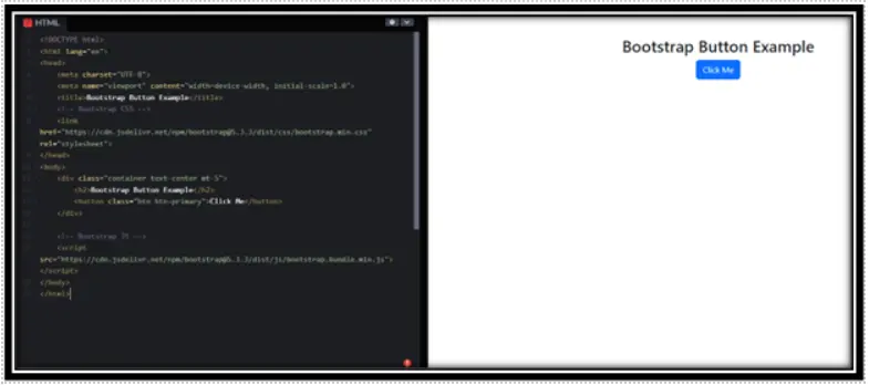
In this example:
Container & Centering → div with container text-center mt-5
Button → <button class=”btn btn-primary”>Click Me</button>
2. Outline Button
<!DOCTYPE html>
<html lang=”en”>
<head>
<meta charset=”UTF-8″>
<meta name=”viewport” content=”width=device-width, initial-scale=1.0″>
<title>Bootstrap Button Example</title>
<!– Bootstrap CSS –>
<link href=”https://cdn.jsdelivr.net/npm/bootstrap@5.3.3/dist/css/bootstrap.min.css” rel=”stylesheet”>
</head>
<body>
<div class=”container text-center mt-5″>
<h2>Bootstrap Button Example</h2>
<button class=”btn btn-outline-success”>Outline Button</button>
</div>
<!– Bootstrap JS –>
<script src=”https://cdn.jsdelivr.net/npm/bootstrap@5.3.3/dist/js/bootstrap.bundle.min.js”></script>
</body>
</html>
Output:
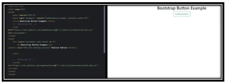
In this example:
Container & Centering → div with container text-center mt-5
Button → <button class=”btn btn-outline-success”>Outline Button</button>
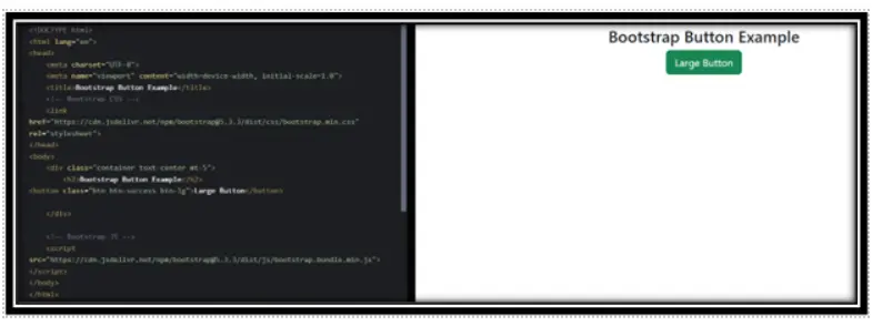
3. Large Success Button
<!DOCTYPE html>
<html lang=”en”>
<head>
<meta charset=”UTF-8″>
<meta name=”viewport” content=”width=device-width, initial-scale=1.0″>
<title>Bootstrap Button Example</title>
<!– Bootstrap CSS –>
<link href=”https://cdn.jsdelivr.net/npm/bootstrap@5.3.3/dist/css/bootstrap.min.css” rel=”stylesheet”>
</head>
<body>
<div class=”container text-center mt-5″>
<h2>Bootstrap Button Example</h2>
<button class=”btn btn-success btn-lg”>Large Button</button>
</div>
<!– Bootstrap JS –>
<script src=”https://cdn.jsdelivr.net/npm/bootstrap@5.3.3/dist/js/bootstrap.bundle.min.js”></script>
</body>
</html>
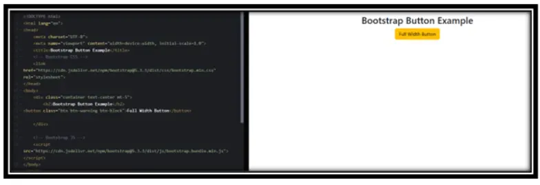
4. Block Level Button (Full Width)
<html lang=”en”>
<head>
<meta charset=”UTF-8″>
<meta name=”viewport” content=”width=device-width, initial-scale=1.0″>
<title>Bootstrap Button Example</title>
<!– Bootstrap CSS –>
<link href=”https://cdn.jsdelivr.net/npm/bootstrap@5.3.3/dist/css/bootstrap.min.css” rel=”stylesheet”>
</head>
<body>
<div class=”container text-center mt-5″>
<h2>Bootstrap Button Example</h2>
<button class=”btn btn-warning btn-block”>Full Width Button</button>
</div>
<!– Bootstrap JS –>
<script src=”https://cdn.jsdelivr.net/npm/bootstrap@5.3.3/dist/js/bootstrap.bundle.min.js”></script>
</body>
</html>
Output:
In this example:
Container & Centering → div with container text-center mt-5
Button → <button class=”btn btn-warning btn-block”>Full Width Button</button>
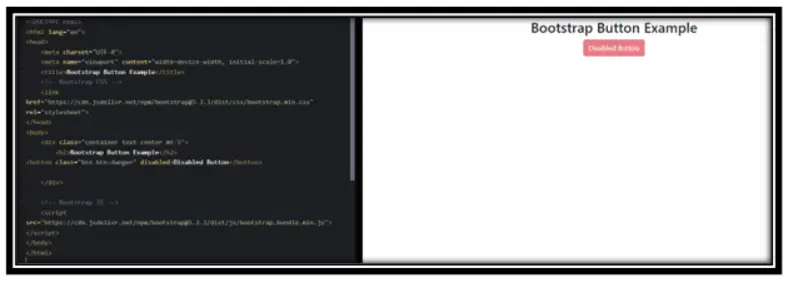
5. Disabled Button
<!DOCTYPE html>
<html lang=”en”>
<head>
<meta charset=”UTF-8″>
<meta name=”viewport” content=”width=device-width, initial-scale=1.0″>
<title>Bootstrap Button Example</title>
<!– Bootstrap CSS –>
<link href=”https://cdn.jsdelivr.net/npm/bootstrap@5.3.3/dist/css/bootstrap.min.css” rel=”stylesheet”>
</head>
<body>
<div class=”container text-center mt-5″>
<h2>Bootstrap Button Example</h2>
<button class=”btn btn-danger” disabled>Disabled Button</button>
</div>
<!– Bootstrap JS –>
<script src=”https://cdn.jsdelivr.net/npm/bootstrap@5.3.3/dist/js/bootstrap.bundle.min.js”></script>
</body>
</html>
Output:
In this example:
Container & Centering → div with container text-center mt-5
Button → <button class=”btn btn-danger” disabled>Disabled Button</button>
Conclusion
Bootstrap buttons help make web pages interactive with different styles and sizes. Using simple classes, you can easily design buttons that fit your website’s needs.
Practice Scenarios
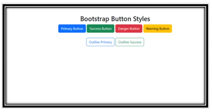
Scenario 1:
Objective:Create a Webpage with Different Button Styles Add at least four Bootstrap buttons (btn-primary, btn-success, btn-danger, btn-warning)
• Use btn-outline-* classes for at least two buttons.
• Center the buttons inside a Bootstrap container.
Expected Output:
Scenario 2 : Objective:
• Design a Form with a Submit and Reset Button
• Create a simple form with two input fields (name and email).
• Add a btn-primary submit button.
• Add a btn-secondary reset button.
• Ensure buttons are full-width (btn-block) on small screens.
Expected Output:
YouTube Reference :
1) Button in Hindi/Urdu Part-1
2) Button in Hindi/Urdu Part-2
The tutorial provides step-by-step guidance on creating and customizing buttons using Bootstrap, covering different styles, states, and responsive designs.
Yes, this Bootstrap training is completely free. You can access all tutorials and learn Bootstrap at your own pace without any charges.
This tutorial is suitable for beginners and developers looking to learn or refine their skills in Bootstrap button design and usage.
It includes button styles, states (active, disabled), button groups, and responsive button designs optimized for mobile and desktop.
Yes, it provides multiple examples of button styles and configurations for practical implementation.
Absolutely! All the code examples are free to use for personal and commercial purposes.
- Yes, Iqra Technology provides the tutorial in both English and Hindi for wider accessibility.
Visit the Bootstrap Button Tutorial Page to start learning.
Yes, the tutorial covers how to create responsive buttons that adapt seamlessly to different screen sizes.
