

Bootstrap Tables
Bootstrap makes tables look nice and easy to read. It also provides extra styles to make them more useful. Let’s see how we can style tables using Bootstrap.
1. Basic Table Styling
Bootstrap provides a simple way to make tables look better.
Using the .table Class
• Add the .table class to your table to improve spacing and readability.
Example:
<!DOCTYPE html>
<html lang=”en”>
<head>
<meta charset=”UTF-8″>
<meta name=”viewport” content=”width=device-width, initial-scale=1.0″>
<title>Bootstrap Table</title>
<!– Bootstrap CDN –>
<link href=”https://cdn.jsdelivr.net/npm/bootstrap@5.3.0/dist/css/bootstrap.min.css” rel=”stylesheet”>
</head>
<body>
<table class=”table”>
<tr>
<th>Name</th>
<th>Age</th>
</tr>
<tr>
<td>John</td>
<td>25</td>
</tr>
</table>
</body>
</html>
Output:

In This Example:
<table class=”table”> → Makes the table look better with default Bootstrap styles.
Headers (<th>) → Define column names.
Rows (<tr> with <td>) → Contain table data.
2. Table Structure
Use <thead> for the table header and <tbody> for the body. This keeps the structure clear and helps with styling.
Example:
<!DOCTYPE html>
<html lang=”en”>
<head>
<meta charset=”UTF-8″>
<meta name=”viewport” content=”width=device-width, initial-scale=1″>
<title>Bootstrap Table Example</title>
<link href=”https://cdn.jsdelivr.net/npm/bootstrap@5.3.0/dist/css/bootstrap.min.css” rel=”stylesheet”>
</head>
<body>
<div class=”container mt-4″>
<table class=”table table-bordered”>
<thead class=”table-dark”>
<tr>
<th>#</th>
<th>Name</th>
<th>Age</th>
<th>City</th>
</tr>
</thead>
<tbody>
<tr>
<td>1</td>
<td>Ali</td>
<td>25</td>
<td>Dubai</td>
</tr>
<tr>
<td>2</td>
<td>Fatima</td>
<td>22</td>
<td>Sharjah</td>
</tr>
<tr>
<td>3</td>
<td>Ahmed</td>
<td>28</td>
<td>Abu Dhabi</td>
</tr>
</tbody>
</table>
</div>
</body>
</html>
Output:

In This Example:
• The <table> element is given the Bootstrap .table class for styling.
• <thead> contains the table headers (column titles) and is styled with .table-dark for a dark background.
• <tbody> holds the main table content (rows of data).
• .table-bordered adds borders around the table and its cells.
3. Striped Rows
The .table-striped class adds alternating row colors to make tables easier to read.
<!DOCTYPE html>
<html lang=”en”>
<head>
<meta charset=”UTF-8″>
<meta name=”viewport” content=”width=device-width, initial-scale=1″>
<title>Bootstrap Striped Table</title>
<link href=”https://cdn.jsdelivr.net/npm/bootstrap@5.3.0/dist/css/bootstrap.min.css” rel=”stylesheet”>
</head>
<body>
<div class=”container mt-4″>
<h2 class=”mb-3″>Product List</h2>
<table class=”table table-striped table-bordered”>
<thead class=”table-primary”>
<tr>
<th>ID</th>
<th>Product</th>
<th>Price</th>
</tr>
</thead>
<tbody>
<tr>
<td>1</td>
<td>Perfume</td>
<td>$50</td>
</tr>
<tr>
<td>2</td>
<td>Oud</td>
<td>$80</td>
</tr>
<tr>
<td>3</td>
<td>Musk</td>
<td>$60</td>
</tr>
</tbody>
</table>
</div>
</body>
</html>
4. Bordered Table
The .table-bordered class adds borders to the table and cells.

In This Example:
• .table-striped → Adds alternating row colors.
• .table-bordered → Adds borders to the table.
• .table-primary → Gives a blue background to the header.
• .container mt-4 → Centers the table with top margin.
Effect:
The table gets clear borders around each cell.
5. Hover Effect on Rows
Use .table-hover to highlight rows when the mouse hovers over them.
<!DOCTYPE html>
<html lang=”en”>
<head>
<meta charset=”UTF-8″>
<meta name=”viewport” content=”width=device-width, initial-scale=1″>
<title>Bootstrap Hover Table</title>
<link href=”https://cdn.jsdelivr.net/npm/bootstrap@5.3.0/dist/css/bootstrap.min.css” rel=”stylesheet”>
</head>
<body>
<div class=”container mt-4″>
<h2 class=”mb-3″>Employee List</h2>
<table class=”table table-hover table-bordered”>
<thead class=”table-success”>
<tr>
<th>ID</th>
<th>Name</th>
<th>Department</th>
</tr>
</thead>
<tbody>
<tr>
<td>1</td>
<td>Ali</td>
<td>IT</td>
</tr>
<tr>
<td>2</td>
<td>Ahmed</td>
<td>HR</td>
</tr>
<tr>
<td>3</td>
<td>Fatima</td>
<td>Marketing</td>
</tr>
</tbody>
</table>
</div>
</body>
</html>
Effect:
When you move your mouse over a row, it gets highlighted
Output:

In This Example:
.table-hover → Highlights rows when hovered.
.table-bordered → Adds borders to the table.
.table-success → Gives a green background to the header.
.container mt-4 → Adds spacing around the table.
<!DOCTYPE html>
<html lang=”en”>
<head>
<meta charset=”UTF-8″>
<meta name=”viewport” content=”width=device-width, initial-scale=1″>
<title>Bootstrap Small Table</title>
<link href=”https://cdn.jsdelivr.net/npm/bootstrap@5.3.0/dist/css/bootstrap.min.css” rel=”stylesheet”>
</head>
<body>
<div class=”container mt-4″>
<h2 class=”mb-3″>Order List</h2>
<table class=”table table-sm table-bordered”>
<thead class=”table-warning”>
<tr>
<th>Order ID</th>
<th>Customer</th>
<th>Amount</th>
</tr>
</thead>
<tbody>
<tr>
<td>101</td>
<td>Ali</td>
<td>$150</td>
</tr>
<tr>
<td>102</td>
<td>Ahmed</td>
<td>$200</td>
</tr>
<tr>
<td>103</td>
<td>Fatima</td>
<td>$250</td>
</tr>
</tbody>
</table>
</div>
</body>
</html>
Effect:
The table looks more compact, making it useful for large data sets.

In This Example:
• .table-sm → Makes the table more compact by reducing padding.
• .table-bordered → Adds borders to cells for better separation.
• .table-warning → Gives a yellow background to the header.
• .container mt-4 → Centers the table and adds margin.
6. Responsive Tables
To make tables scrollable on small screens, wrap them in .table-responsive.
<!DOCTYPE html>
<html lang=”en”>
<head>
<meta charset=”UTF-8″>
<meta name=”viewport” content=”width=device-width, initial-scale=1″>
<title>Bootstrap Responsive Table</title>
<link href=”https://cdn.jsdelivr.net/npm/bootstrap@5.3.0/dist/css/bootstrap.min.css” rel=”stylesheet”>
</head>
<body>
<div class=”container mt-4″>
<h2 class=”mb-3″>Student Scores</h2>
<div class=”table-responsive”>
<table class=”table table-bordered”>
<thead class=”table-info”>
<tr>
<th>ID</th>
<th>Name</th>
<th>Subject</th>
<th>Score</th>
<th>Grade</th>
</tr>
</thead>
<tbody>
<tr>
<td>1</td>
<td>Ali</td>
<td>Math</td>
<td>85</td>
<td>A</td>
</tr>
<tr>
<td>2</td>
<td>Ahmed</td>
<td>Science</td>
<td>90</td>
<td>A+</td>
</tr>
<tr>
<td>3</td>
<td>Fatima</td>
<td>English</td>
<td>88</td>
<td>A</td>
</tr>
</tbody>
</table>
</div>
</div>
</body>
</html>
Effect:
The table gets a horizontal scrollbar on small screens, preventing content from getting cut off.

Explanation:
• .table-responsive → Makes the table scrollable on small screens.
• .table → Adds Bootstrap table styling.
• .table-bordered → Adds borders around cells.
• .table-info → Gives a light blue background to the header.
• .container mt-4 → Centers the table with a margin.
7. Colorful Tables
Bootstrap provides classes to change table row colors based on importance.
Available Classes:
• .table-success → Green (Success)
• .table-danger → Red (Error)
• .table-warning → Yellow (Warning)
• .table-info → Blue (Information)
• .table-light → Light Gray
• .table-dark → Dark Gray
<!DOCTYPE html>
<html lang=”en”>
<head>
<meta charset=”UTF-8″>
<meta name=”viewport” content=”width=device-width, initial-scale=1″>
<title>Bootstrap Table Row Colors</title>
<link href=”https://cdn.jsdelivr.net/npm/bootstrap@5.3.0/dist/css/bootstrap.min.css” rel=”stylesheet”>
</head>
<body>
<div class=”container mt-4″>
<h2 class=”mb-3″>Status Table</h2>
<table class=”table table-bordered”>
<tr class=”table-success”>
<td>Success</td>
</tr>
<tr class=”table-danger”>
<td>Error</td>
</tr>
<tr class=”table-warning”>
<td>Warning</td>
</tr>
<tr class=”table-info”>
<td>Information</td>
</tr>
</table>
</div>
</body>
</html>
Effect:
Different rows get different background colors to highlight data meaningfully.

In this Example:
• .table-success → Green row for success messages.
• .table-danger → Red row for error messages.
• .table-warning → Yellow row for warnings.
• .table-info → Blue row for informational messages.
• .table-bordered → Adds borders around cells.
Practice Scenarios for Bootstrap Tables:
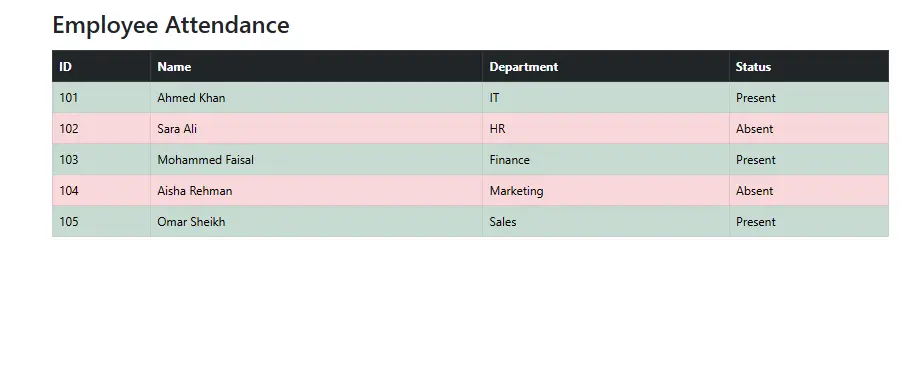
1.Employee Attendance Table
o Objective: Create a table to track employee attendance using .table-striped, .table-bordered, and .table-success for present employees and .table-danger for absentees.
Expected Output:
2.Product Price List
o Objective: Design a product list table with .table-hover, .table-sm, and .table-primary for discounted items. Ensure responsiveness using .table-responsive.
Expected Output:
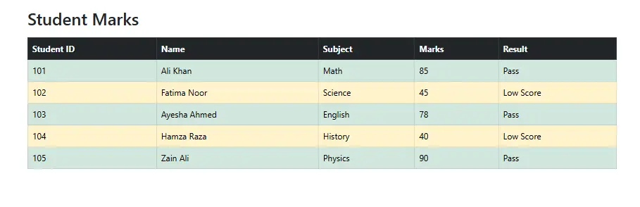
3.Student Exam Results
o Objective: Display student marks with .table-bordered, .table-dark for headers, and use .table-warning for low scores and .table-success for passing marks.
Expected Output:
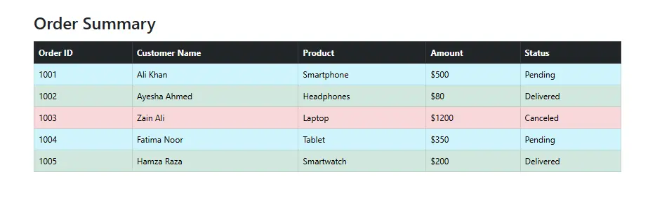
4.E-commerce Order Summary
o Objective: Build an order summary table with .table-hover, .table-info for pending orders, .table-success for delivered orders, and .table-danger for cancel orders.
Expected Output:
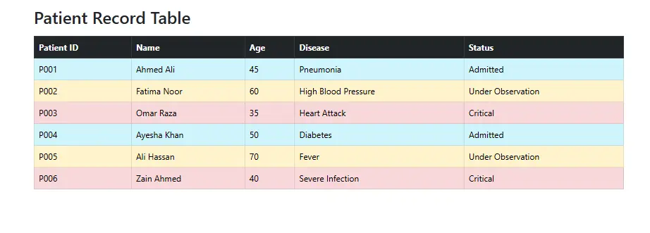
5.Hospital Patient Records
o Objective: colors like .table-info for admitted patients, .table-warning for under observation, and .table-danger for critical cases Create a patient record table with .table, .table-bordered, and row
Expected Output:
Conclusion
Bootstrap makes tables easy to read, stylish, and responsive with just a few classes. You can
The `.table-responsive` class makes the table horizontally scrollable on smaller devices, ensuring that the content is accessible without compromising the layout.
YouTube Reference :
1) Tables to Bootstrap in Hindi/Urdu Part 1
2) Tables to Bootstrap in Hindi/Urdu Part 2
A Bootstrap table is a styled HTML table using the Bootstrap framework, providing an elegant and responsive design out of the box.
Yes, Iqra Technology provides the Bootstrap table tutorial completely free of cost, allowing learners to access and benefit from the resources without any charges.
To create a table, use the <table> HTML element and apply the .table class from Bootstrap for basic styling.
Bootstrap tables offer features like striping, borders, hover effects, responsive design, and contextual row colors.
Add the .table-hover class to your table to highlight rows when users hover over them.
Yes, Bootstrap provides contextual classes like .table-primary, .table-success, and others to customize row or cell colors.
Absolutely! Bootstrap simplifies table styling with pre-built classes, so you don’t need to write custom CSS.
- Yes, Bootstrap tables are compatible with all major modern browsers, ensuring a consistent user experience.
