

Navbar
The Navbar in Bootstrap is a top menu bar that shows your website name (brand), page links (like Home, About), and other buttons or menus.
It works well on mobile phones, tablets, and desktops because it automatically adjusts to screen size (this is called responsive design).
Why Use Bootstrap Navbar?
• .It is ready-made and saves time.
• .It works well on all screen sizes.
• .You can add your logo, links, dropdown menus, and even buttons inside it.
• .It collapses on small screens into a menu button (like ☰), which opens the full menu when clicked.
✅ Important Classes in Bootstrap Navbar
| Class Name | Discription |
|---|---|
| .navbar | Main class to create a navbar |
| .navbar-brand | .navbar-brand Used to show your website name or logo |
| .navbar-nav | Wraps (holds) all your navigation links |
| .nav-item | Each menu item inside the navbar |
| .nav-link | The actual link inside a menu item |
| .navbar-toggler | Button that shows on small screens to toggle (open/close) the menu |
| .collapse | .collapse Hides the menu when the screen is small |
| .navbar-collapse | Used with .collapse to hide/show links depending on screen size |
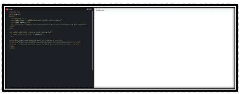
1. Basic Navbar Structure
A basic Bootstrap navbar is used to show your website’s brand name and navigation links (like Home, About, Contact). It adjusts automatically for mobile screens.
Example Code:
<!DOCTYPE html>
<html lang=”en”>
<head>
<meta charset=”UTF-8″>
<meta name=”viewport” content=”width=device-width, initial-scale=1.0″>
<title>Basic Navbar</title>
<link href=”https://stackpath.bootstrapcdn.com/bootstrap/4.3.1/css/bootstrap.min.css” rel=”stylesheet”>
</head>
<body>
<nav class=”navbar navbar-expand-lg navbar-light bg-light”>
<a class=”navbar-brand” href=”#”>MyWebsite</a>
</nav>
<script src=”https://code.jquery.com/jquery-3.3.1.slim.min.js”></script>
<script src=”https://cdnjs.cloudflare.com/ajax/libs/popper.js/1.14.7/umd/popper.min.js”></script>
<script src=”https://stackpath.bootstrapcdn.com/bootstrap/4.3.1/js/bootstrap.min.js”></script>
</body>
</html>
Output:
Explanation:
.navbar: Starts the navbar.
.navbar-expand-lg: Makes navbar responsive on large screens.
.navbar-light bg-light: Light theme and background.
.navbar-brand: Your brand/logo name.
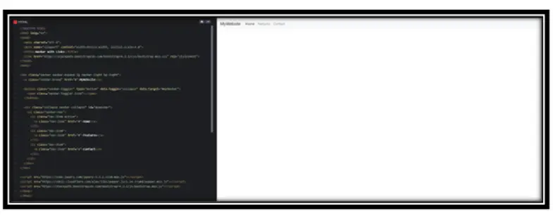
2. Navbar with Navigation Links
Now, we will add links like Home, Features, etc., inside the navbar.
Example :
<!DOCTYPE html>
<html lang=”en”>
<head>
<meta charset=”UTF-8″>
<meta name=”viewport” content=”width=device-width, initial-scale=1.0″>
<title>Navbar with Links</title>
<link href=”https://stackpath.bootstrapcdn.com/bootstrap/4.3.1/css/bootstrap.min.css” rel=”stylesheet”>
</head>
<body>
<nav class=”navbar navbar-expand-lg navbar-light bg-light”>
<a class=”navbar-brand” href=”#”>MyWebsite</a>
<button class=”navbar-toggler” type=”button” data-toggle=”collapse” data-target=”#myNavbar”>
<span class=”navbar-toggler-icon”></span>
</button>
<div class=”collapse navbar-collapse” id=”myNavbar”>
<ul class=”navbar-nav”>
<li class=”nav-item active”>
<a class=”nav-link” href=”#”>Home</a>
</li>
<li class=”nav-item”>
<a class=”nav-link” href=”#”>Features</a>
</li>
<li class=”nav-item”>
<a class=”nav-link” href=”#”>Contact</a>
</li>
</ul>
</div>
</nav>
<script src=”https://code.jquery.com/jquery-3.3.1.slim.min.js”></script>
<script src=”https://cdnjs.cloudflare.com/ajax/libs/popper.js/1.14.7/umd/popper.min.js”></script>
<script src=”https://stackpath.bootstrapcdn.com/bootstrap/4.3.1/js/bootstrap.min.js”></script>
</body>
</html>
Output:
Explanation:
.navbar-toggler: Button to show/hide menu on small screens.
.navbar-collapse: Contains the nav links.
.nav-item and .nav-link: For each menu item like Home, Features.
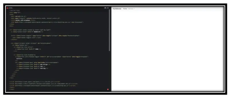
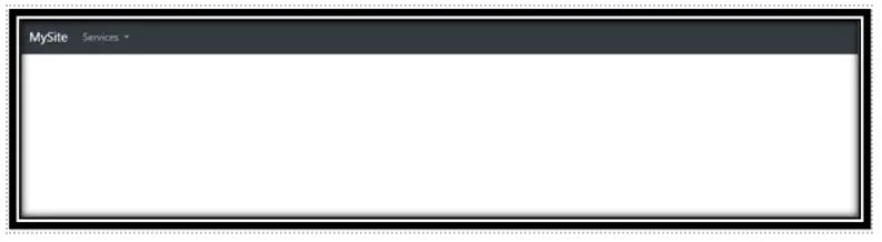
3. Navbar with Dropdown Menu
If you want to group links (like under “Services”), you can use a dropdown menu.
Example:
<!DOCTYPE html>
<html lang=”en”>
<head>
<meta charset=”UTF-8″>
<meta name=”viewport” content=”width=device-width, initial-scale=1.0″>
<title>Navbar with Dropdown</title>
<link href=”https://stackpath.bootstrapcdn.com/bootstrap/4.3.1/css/bootstrap.min.css” rel=”stylesheet”>
</head>
<body>
<nav class=”navbar navbar-expand-lg navbar-light bg-light”>
<a class=”navbar-brand” href=”#”>MyWebsite</a>
<button class=”navbar-toggler” type=”button” data-toggle=”collapse” data-target=”#navbarDropdown”>
<span class=”navbar-toggler-icon”></span>
</button>
<div class=”collapse navbar-collapse” id=”navbarDropdown”>
<ul class=”navbar-nav”>
<li class=”nav-item active”>
<a class=”nav-link” href=”#”>Home</a>
</li>
<li class=”nav-item dropdown”>
<a class=”nav-link dropdown-toggle” href=”#” id=”servicesDropdown” role=”button” data-toggle=”dropdown”>
Services
</a>
<div class=”dropdown-menu” aria-labelledby=”servicesDropdown”>
<a class=”dropdown-item” href=”#”>Web Design</a>
<a class=”dropdown-item” href=”#”>SEO</a>
<a class=”dropdown-item” href=”#”>Hosting</a>
</div>
</li>
</ul>
</div>
</nav>
<script src=”https://code.jquery.com/jquery-3.3.1.slim.min.js”></script>
<script src=”https://cdnjs.cloudflare.com/ajax/libs/popper.js/1.14.7/umd/popper.min.js”></script>
<script src=”https://stackpath.bootstrapcdn.com/bootstrap/4.3.1/js/bootstrap.min.js”></script>
</body>
</html>
Output:
Explanation:
.dropdown: Used to show multiple options inside one menu.
.dropdown-toggle: Makes the link open a dropdown menu.
.dropdown-menu: Contains dropdown items.
4. Responsive Navbar (Mobile-Friendly)
On small screens (like mobiles), navbar links are hidden and shown with a toggle button (hamburger icon).
Already used in all examples above using:
.navbar-expand-lg
.navbar-toggler
.collapse navbar-collapse
So no extra code needed here!
Conclusion:
The Bootstrap Navbar is one of the most useful and essential components for any website. It helps create a clean, responsive top menu where you can place:
.Your brand name or logo (.navbar-brand)
.Navigation links (.nav-link)
.Dropdown menus (.dropdown)
.Responsive toggle button for small screens (.navbar-toggler)
.With a few simple classes, you can build a navbar that works perfectly on mobile, tablet, and desktop. It’s fully customizable and works .great for both simple websites and complex web apps.
Practice Scenario:
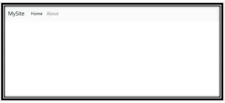
Scenario 1: Create a Responsive Navbar with Home and About Links
Objective:
Create a basic navbar with a brand and two links: Home and About.
Expected Output:
Scenario 2:
Add a Dropdown Menu to the Navbar
Objective:
Create a navbar with a brand and a dropdown menu with 2 items inside it.
Expected Output:
A Bootstrap navbar is a responsive, horizontal navigation bar that adapts to different screen sizes and includes support for dropdown menus.
Yes, this Bootstrap training is completely free. You can access all tutorials and learn Bootstrap at your own pace without any charges.
Use the .navbar class along with .navbar-expand-lg to create a responsive navbar that adjusts to various screen sizes.
Examples include fixed top navbars, sticky navbars, and navbars with dropdown menus. Check our examples section for code snippets.
The navbar-toggler class is used to create a toggle button for expanding and collapsing the navbar on smaller screens.
Use the .sticky-top class to make the navbar stick to the top of the page while scrolling.
A static navbar remains within the page flow, while a fixed navbar stays in a fixed position relative to the viewport.
Yes, our step-by-step Bootstrap navbar tutorial is available in Hindi.
Common issues include improper class usage, missing JavaScript files, and dropdown menus not functioning.
Yes, Bootstrap navbars are responsive by default and include a toggleable menu for mobile devices.
