

Bootstrap Spinners
What is a Spinner?
A spinner is a small animation used to show that something is loading or being processed in a webpage. Bootstrap provides easy-to-use spinner components.
Types of Bootstrap Spinners
1. Border Spinner
A border spinner is a circular loader with a spinning border.
Example :
<!DOCTYPE html>
<html lang=”en”>
<head>
<meta charset=”UTF-8″>
<meta name=”viewport” content=”width=device-width, initial-scale=1.0″>
<title>Bootstrap Border Spinner</title>
<link rel=”stylesheet” href=”https://cdn.jsdelivr.net/npm/bootstrap@5.3.0/dist/css/bootstrap.min.css”>
</head>
<body>
<div class=”spinner-border text-primary” role=”status”>
<span class=”visually-hidden”>Loading…</span>
</div>
</body>
</html>
Output:

In this Example:
• .spinner-border creates a circular spinning effect.
• .text-primary colors the spinner in blue.
• role=”status” and <span class=”visually-hidden”>Loading…</span> improve accessibility for screen readers.
2. Growing Spinner
A growing spinner gradually expands and shrinks, giving a smooth animation effect.
Example :
<!DOCTYPE html>
<html lang=”en”>
<head>
<meta charset=”UTF-8″>
<meta name=”viewport” content=”width=device-width, initial-scale=1.0″>
<title>Bootstrap Grow Spinner</title>
<link rel=”stylesheet” href=”https://cdn.jsdelivr.net/npm/bootstrap@5.3.0/dist/css/bootstrap.min.css”>
</head>
<body>
<div class=”spinner-grow text-success” role=”status”>
<span class=”visually-hidden”>Processing…</span>
</div>
</body>
</html>
Output:

In this Example:
• .spinner-grow creates a growing effect.
• .text-success colors the spinner in green.
3. Small Spinners
Bootstrap provides smaller versions of both border and grow spinners.
Example :
<!DOCTYPE html>
<html lang=”en”>
<head>
<meta charset=”UTF-8″>
<meta name=”viewport” content=”width=device-width, initial-scale=1.0″>
<title>Small Bootstrap Spinners</title>
<link rel=”stylesheet” href=”https://cdn.jsdelivr.net/npm/bootstrap@5.3.0/dist/css/bootstrap.min.css”>
</head>
<body>
<div class=”spinner-border spinner-border-sm text-danger” role=”status”>
<span class=”visually-hidden”>Loading…</span>
</div>
<div class=”spinner-grow spinner-grow-sm text-warning” role=”status”>
<span class=”visually-hidden”>Processing…</span>
</div>
</body>
</html>
Output:

In this Example:
• .spinner-border-sm makes a smaller border spinner.
• .spinner-grow-sm makes a smaller grow spinner.
• .text-danger colors the spinner red.
• .text-warning colors the spinner yellow.
Conclusion
Bootstrap spinners are useful for showing loading states in web applications. They come in two main types:
1. Border Spinner (Circular spinning effect)
1. Growing Spinner (Expanding effect)
They can also be customized in:
• Size (.spinner-border-sm, .spinner-grow-sm)
• Color (.text-primary, .text-success, .text-danger, etc.)
• Accessibility (role=”status”, visually-hidden text)
Practice Scenario
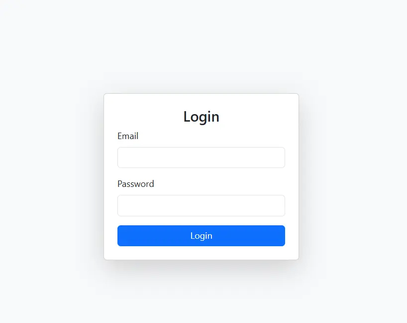
Scenario 1:
Objective: Add a Bootstrap spinner to your website’s login page while the user waits for authentication.
Expected Output:
Scenario 2:
1. Objective: Use different colors and sizes to match your website’s theme.
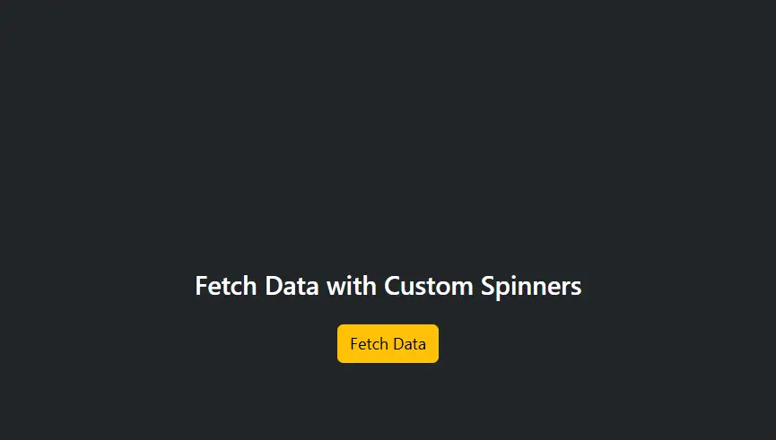
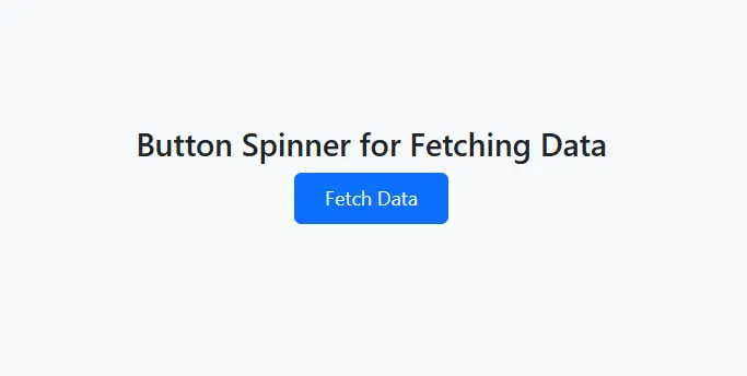
Scenario 3:
Objective:Try placing the spinner inside a button to indicate a process is running.
YouTube Reference :
1) Spininer in Hindi/Urdu Part-1
2) Spininer in Hindi/Urdu Part-2
A Bootstrap spinner is a component that indicates loading or ongoing processes, often used to improve user experience during wait times.
Yes, this tutorial is offered completely free on the Iqra Technology Academy platform.
Use the spinner-border or spinner-grow classes in Bootstrap 4 or 5 for creating simple and visually appealing spinners.
Responsive spinners can be achieved by using Bootstrap’s grid system to ensure proper scaling across different screen sizes.
Yes, Iqra Technology offers a comprehensive Bootstrap spinner tutorial, including content in Hindi for native learners.
Bootstrap provides two types of spinners:
- Border Spinner: A circular spinner created with the
spinner-borderclass. - Grow Spinner: A pulsating spinner created with the
spinner-growclass.
Bootstrap spinners work on all modern browsers, including Chrome, Firefox, Safari, Edge, and IE11.
Visit Iqra Technology for tutorials, including videos in Hindi that cover practical spinner examples.
Visit the Bootstrap Badges Tutorial Page to get started.
Bootstrap spinners are accessible and include role="status" and aria-label="Loading" for screen readers. Example:
<div class="spinner-border" role="status" aria-label="Loading"></div>