

Forms
Bootstrap provides stylish and easy-to-use form controls.This module covers different form components in Bootstrap and shows how to create and customize them for various uses.
Objectives
Learn Bootstrap’s form components. – Create responsive forms that work well on different devices. – Customize form layouts for unique designs.
Here’s a table of common Bootstrap form classes and their descriptions:
| Bootstrap Class | Description |
|---|---|
| .form-group | Wraps labels and inputs, ensuring proper spacing and alignment. |
| .form-control | elements. Makes them full width. |
| .form-row | Groups form elements more closely than a regular .row. |
| .col-md-* | Defines responsive column widths for form elements. |
| .form-control-plaintext | Styles an as plain text. |
| .form-check, .form-check-input, .form-check-label | Styles checkboxes and radio buttons for better appearance. |
| .form-inline | Displays form elements in a single row, useful for compact forms. |
| .form-text | Adds small help text below form inputs. |
| .is-invalid, .is-valid | Shows validation states for form inputs. |
| .invalid-feedback, .valid-feedback | Displays validation messages. |
| .form-check-inline | Aligns checkboxes or radio buttons horizontally. |
These classes help create attractive and user-friendly forms that look great on all devices.
1. Bootstrap Form Basics
Bootstrap Form Basics Bootstrap forms provide a uniform look across browsers and devices. Key elements include:
– Form Controls: Inputs, selects, checkboxes, and radios.
– Input Groups: Adds text or buttons before/after inputs.
– Form Layout: Options for inline and horizontal forms.
– Validation States: Shows feedback on user input.
Detailed Explanation of Bootstrap Form Elements
1-Form Controls
Form controls include inputs, selects, checkboxes, and radios. Bootstrap ensures they look consistent across browsers.
• Text Inputs: Used for user input like text, passwords, emails, etc.
<!DOCTYPE html>
<html lang=”en”>
<head>
<meta charset=”UTF-8″>
<meta name=”viewport” content=”width=device-width, initial-scale=1.0″>
<title>Bootstrap Form Example</title>
<link href=”https://stackpath.bootstrapcdn.com/bootstrap/4.3.1/css/bootstrap.min.css” rel=”stylesheet”>
</head>
<body>
<div class=”container mt-5″>
<h2>Simple Bootstrap Form</h2>
<form>
<div class=”form-group”>
<label for=”name”>Full Name</label>
<input type=”text” class=”form-control” id=”name” placeholder=”Enter your full name”>
</div>
<div class=”form-group”>
<label for=”email”>Email Address</label>
<input type=”email” class=”form-control” id=”email” placeholder=”Enter your email”>
</div>
<div class=”form-group”>
<label for=”message”>Message</label>
<textarea class=”form-control” id=”message” rows=”3″ placeholder=”Enter your message”></textarea>
</div>
<button type=”submit” class=”btn btn-primary”>Submit</button>
</form>
</div>
<script src=”https://code.jquery.com/jquery-3.3.1.slim.min.js”></script>
<script src=”https://stackpath.bootstrapcdn.com/bootstrap/4.3.1/js/bootstrap.min.js”></script>
</body>
</html>
Output:

In this example:
• The form contains Full Name, Email Address, and Message fields.
• Each input field uses class=”form-control” to apply Bootstrap styling.
• The form is placed inside a container with mt-5 for margin-top spacing.
• A submit button is added with class=”btn btn-primary”.
• Selects: Dropdown menus.
<!DOCTYPE html>
<html lang=”en”>
<head>
<meta charset=”UTF-8″>
<meta name=”viewport” content=”width=device-width, initial-scale=1.0″>
<title>Bootstrap Dropdown Example</title>
<link href=”https://stackpath.bootstrapcdn.com/bootstrap/4.3.1/css/bootstrap.min.css” rel=”stylesheet”>
</head>
<body>
<div class=”container mt-5″>
<h2>Form with Dropdown</h2>
<form>
<div class=”form-group”>
<label for=”name”>Full Name</label>
<input type=”text” class=”form-control” id=”name” placeholder=”Enter your full name”>
</div>
<div class=”form-group”>
<label for=”gender”>Select Gender</label>
<select class=”form-control” id=”gender”>
<option>Male</option>
<option>Female</option>
<option>Other</option>
</select>
</div>
<div class=”form-group”>
<label for=”email”>Email Address</label>
<input type=”email” class=”form-control” id=”email” placeholder=”Enter your email”>
</div>
<button type=”submit” class=”btn btn-primary”>Submit</button>
</form>
</div>
<script src=”https://code.jquery.com/jquery-3.3.1.slim.min.js”></script>
<script src=”https://stackpath.bootstrapcdn.com/bootstrap/4.3.1/js/bootstrap.min.js”></script>
</body>
</html>
Output:

In this Example:
• The form includes fields for Full Name, Email Address, and Gender Selection.
• The Gender field is a <select> dropdown with three options.
• The .form-control class is applied to each input and select element for Bootstrap styling.
• A submit button is included for form submission.
• Checkboxes and Radios:
<!DOCTYPE html>
<html lang=”en”>
<head>
<meta charset=”UTF-8″>
<meta name=”viewport” content=”width=device-width, initial-scale=1.0″>
<title>Bootstrap Form with Checkbox</title>
<link href=”https://stackpath.bootstrapcdn.com/bootstrap/4.3.1/css/bootstrap.min.css” rel=”stylesheet”>
</head>
<body>
<div class=”container mt-5″>
<h2>Form with Checkbox</h2>
<form>
<div class=”form-group”>
<label for=”name”>Full Name</label>
<input type=”text” class=”form-control” id=”name” placeholder=”Enter your full name”>
</div>
<div class=”form-group”>
<label for=”email”>Email Address</label>
<input type=”email” class=”form-control” id=”email” placeholder=”Enter your email”>
</div>
<div class=”form-check”>
<input class=”form-check-input” type=”checkbox” id=”termsCheck”>
<label class=”form-check-label” for=”termsCheck”>
I agree to the terms and conditions
</label>
</div>
<button type=”submit” class=”btn btn-primary mt-3″>Submit</button>
</form>
</div>
<script src=”https://code.jquery.com/jquery-3.3.1.slim.min.js”></script>
<script src=”https://stackpath.bootstrapcdn.com/bootstrap/4.3.1/js/bootstrap.min.js”></script>
</body>
</html>
Output:

In this Example:
Checkbox for Terms & Conditions using .form-check
Bootstrap Styling applied with .form-control and .form-check-input
2. Input Groups
Input groups allow adding text or buttons before or after inputs.
<!DOCTYPE html>
<html lang=”en”>
<head>
<meta charset=”UTF-8″>
<meta name=”viewport” content=”width=device-width, initial-scale=1.0″>
<title>Bootstrap Input Group Example</title>
<link href=”https://stackpath.bootstrapcdn.com/bootstrap/4.3.1/css/bootstrap.min.css” rel=”stylesheet”>
</head>
<body>
<div class=”container mt-5″>
<h2>Bootstrap Form with Input Group</h2>
<form>
<div class=”form-group”>
<label for=”username”>Username</label>
<div class=”input-group mb-3″>
<div class=”input-group-prepend”>
<span class=”input-group-text”>@</span>
</div>
<input type=”text” class=”form-control” id=”username” placeholder=”Enter username”>
</div>
</div>
<button type=”submit” class=”btn btn-primary”>Submit</button>
</form>
</div>
<script src=”https://code.jquery.com/jquery-3.3.1.slim.min.js”></script>
<script src=”https://stackpath.bootstrapcdn.com/bootstrap/4.3.1/js/bootstrap.min.js”></script>
</body>
</html>
Output:

In this Example:
Input Group: The @ symbol is added before the input field using .input-group-prepend and .input-group-text.
Text Input Field: A username input with Bootstrap styling (.form-control).
Submit Button: A button to submit the form.
3. Form Layout
Bootstrap offers different form layouts:
• Inline Forms: Aligns elements in a row.
<!DOCTYPE html>
<html lang=”en”>
<head>
<meta charset=”UTF-8″>
<meta name=”viewport” content=”width=device-width, initial-scale=1.0″>
<title>Bootstrap Inline Form</title>
<link href=”https://stackpath.bootstrapcdn.com/bootstrap/4.3.1/css/bootstrap.min.css” rel=”stylesheet”>
</head>
<body>
<div class=”container mt-5″>
<h2>Bootstrap Inline Form</h2>
<form class=”form-inline”>
<input type=”text” class=”form-control mb-2 mr-sm-2″ placeholder=”Name”>
<input type=”email” class=”form-control mb-2 mr-sm-2″ placeholder=”Email”>
<button type=”submit” class=”btn btn-primary mb-2″>Submit</button>
</form>
</div>
<script src=”https://code.jquery.com/jquery-3.3.1.slim.min.js”></script>
<script src=”https://stackpath.bootstrapcdn.com/bootstrap/4.3.1/js/bootstrap.min.js”></script>
</body>
</html>
Output:

In this Example:
Inline Form: The form-inline class makes all form elements appear in a single horizontal row.
Input Fields: A text input for “Name” and an email input.
Spacing: mb-2 mr-sm-2 ensures spacing between inputs and maintains responsiveness.
Submit Button: A Bootstrap-styled button.
• Horizontal Forms: Uses a grid system.
<!DOCTYPE html>
<html lang=”en”>
<head>
<meta charset=”UTF-8″>
<meta name=”viewport” content=”width=device-width, initial-scale=1.0″>
<title>Bootstrap Horizontal Form</title>
<link href=”https://stackpath.bootstrapcdn.com/bootstrap/4.3.1/css/bootstrap.min.css” rel=”stylesheet”>
</head>
<body>
<div class=”container mt-5″>
<h2>Bootstrap Horizontal Form</h2>
<form>
<div class=”form-group row”>
<label for=”email” class=”col-sm-2 col-form-label”>Email</label>
<div class=”col-sm-10″>
<input type=”email” class=”form-control” id=”email” placeholder=”Enter your email”>
</div>
</div>
<div class=”form-group row”>
<label for=”password” class=”col-sm-2 col-form-label”>Password</label>
<div class=”col-sm-10″>
<input type=”password” class=”form-control” id=”password” placeholder=”Enter your password”>
</div>
</div>
<div class=”form-group row”>
<div class=”col-sm-10 offset-sm-2″>
<button type=”submit” class=”btn btn-primary”>Sign In</button>
</div>
</div>
</form>
</div>
<script src=”https://code.jquery.com/jquery-3.3.1.slim.min.js”></script>
<script src=”https://stackpath.bootstrapcdn.com/bootstrap/4.3.1/js/bootstrap.min.js”></script>
</body>
</html>
Output:

In this Example:
form-group row: Groups label and input fields in a horizontal layout.
col-sm-2 and col-sm-10: Labels take 2 columns, inputs take 10 columns (on small screens and larger).
Offset class: offset-sm-2 ensures the submit button aligns properly under inputs.
Responsive Form Layouts
Bootstrap’s grid system makes forms responsive.
• Grid System: Controls form element layouts.
• Flex Utilities: Aligns form elements as needed.
Form Validation
Bootstrap provides built-in validation styles for form inputs.
• Client-side Validation: Uses HTML5 and CSS for real-time feedback.
• Server-side Validation: Styles forms based on server feedback.
Example: Bootstrap Registration Form
<!DOCTYPE html>
<html lang=”en”>
<head>
<meta charset=”UTF-8″>
<meta name=”viewport” content=”width=device-width, initial-scale=1.0″>
<title>Registration Form</title>
<link href=”https://stackpath.bootstrapcdn.com/bootstrap/4.3.1/css/bootstrap.min.css” rel=”stylesheet”>
</head>
<body>
<div class=”container mt-5″>
<form>
<div class=”form-group”>
<label for=”name”>Full Name</label>
<input type=”text” class=”form-control” id=”name” placeholder=”Enter full name”>
</div>
<div class=”form-group”>
<label for=”email”>Email</label>
<input type=”email” class=”form-control” id=”email” placeholder=”Enter email”>
</div>
<button type=”submit” class=”btn btn-primary”>Register</button>
</form>
</div>
</body>
</html>
In this Example:
Bootstrap Included: Uses Bootstrap 4 for styling.
Container (.container mt-5): Adds margin and centers the form.
Form Structure:
• Full Name Field: <input type=”text”> with Bootstrap’s .form-control for styling.
• Email Field: <input type=”email”> with .form-control for consistency.
Submit Button: <button type=”submit”> with .btn btn-primary for a styled button.
Conclusion
Bootstrap provides powerful, responsive, and well-designed form components that ensure consistency across different devices and browsers. By using Bootstrap classes like .form-group, .form-control, .form-check, .form-inline, and validation states, developers can create clean, professional, and user-friendly forms. It also offers flexible layout options such as inline, horizontal, and grid-based forms.
Practice Scenario:
Scenario 1: Create a Registration Form
• Include fields for Name, Email, Password, and Confirm Password.
• Add a checkbox for “Agree to Terms & Conditions”.
• Implement validation for required fields.
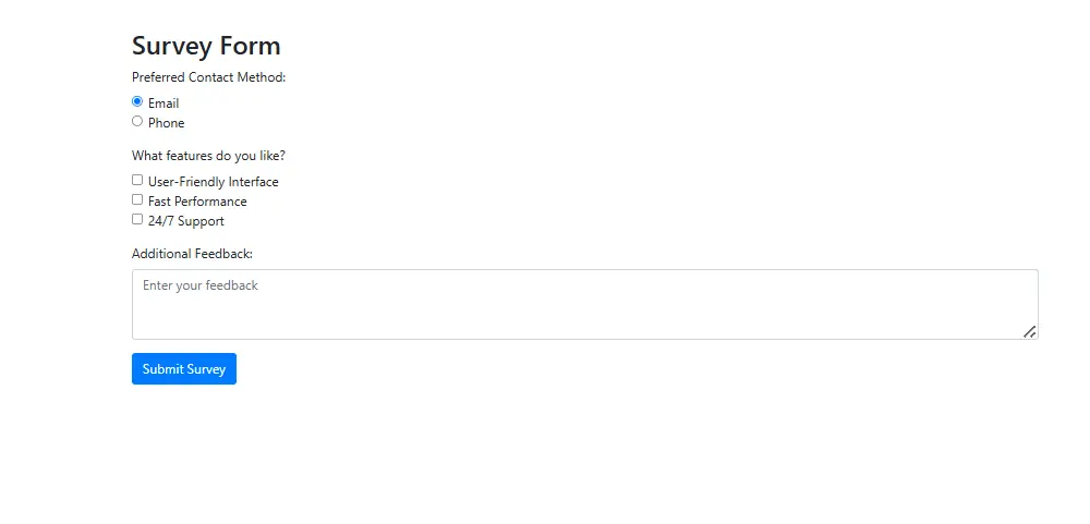
Expected Output:

Scenario 2: Survey Form with Multiple Choices
• Use radio buttons for selecting a preferred option.
• Use checkboxes for multiple selections.
• Include a textarea for feedback.
Expected Output:
Scenario 3: Login Form with Input Groups
• Add an email input field with an icon before it.
• Add a password field with a “Show Password” toggle button.
Expected Output:

YouTube Reference :
1) Forms to Bootstrap in Hindi/Urdu Part-1
2) Forms to Bootstrap in Hindi/Urdu Part-2
3) Forms to Bootstrap in Hindi/Urdu Part-3
4) Forms to Bootstrap in Hindi/Urdu Part-4
The tutorial covers everything from creating simple forms to building complex responsive forms with Bootstrap, including examples and best practices.
Yes, this tutorial is available for free on the Iqra Technology Academy website.
Topics include form controls, validation, input groups, checkboxes, radio buttons, and more, all explained step-by-step.
Yes, the tutorial provides guidance on building fully responsive forms optimized for all screen sizes, including mobile devices.
This tutorial is perfect for beginners, web developers, and anyone who wants to learn how to create forms using Bootstrap.
Yes, the tutorial includes multiple form examples, ranging from basic to advanced designs.
Yes, Iqra Technology offers the Bootstrap Forms tutorial in both English and Hindi.
Yes, the examples provided are free to use in personal and commercial projects.
Visit the Bootstrap Forms Tutorial Page to start learning.
