

Bootstrap Jumbotron
The Bootstrap Jumbotron is a special section used to highlight important content on a webpage. It is great for making announcements, marketing messages, or showing featured content. In this guide, we will learn how to use and customize Jumbotrons.
Objectives
• Understand what a Jumbotron is and how to use it.
• Learn how to change its style to fit your design.
• Make it responsive so it looks good on all screen sizes.
• Add different types of content like text, images, and videos inside a Jumbotron.
1. Understanding Jumbotron
A Jumbotron is a large box that makes the content inside it look bigger and more noticeable. It helps in grabbing the user’s attention.
Example: Basic Jumbotron
<!DOCTYPE html>
<html lang=”en”>
<head>
<meta charset=”UTF-8″>
<meta name=”viewport” content=”width=device-width, initial-scale=1.0″>
<title>Bootstrap Jumbotron</title>
<link href=”https://cdn.jsdelivr.net/npm/bootstrap@5.3.0/dist/css/bootstrap.min.css” rel=”stylesheet”>
</head>
<body>
<div class=”container mt-4″>
<div class=”jumbotron bg-light p-5″>
<h1 class=”display-4″>Welcome to My Website!</h1>
<p class=”lead”>This is a simple Jumbotron example.</p>
<hr class=”my-4″>
<p>Learn more about our services below.</p>
<a class=”btn btn-primary btn-lg” href=”#” role=”button”>Learn More</a>
</div>
</div>
</body>
</html>
Output:
In this Example:
• Bootstrap Jumbotron – Highlights key content.
• Container – Adds spacing.
• Heading – Big title (h1).
• Subheading – Short description.
• Divider – hr for separation.
• Button – Call-to-action link.
2. Customizing the Jumbotron
You can change the background color, add images, and adjust text styles to match your website design.
Example: Jumbotron with Custom Styles
<!DOCTYPE html>
<html lang=”en”>
<head>
<meta charset=”UTF-8″>
<meta name=”viewport” content=”width=device-width, initial-scale=1.0″>
<title>Bootstrap Jumbotron</title>
<link href=”https://cdn.jsdelivr.net/npm/bootstrap@5.3.0/dist/css/bootstrap.min.css” rel=”stylesheet”>
</head>
<body>
<div class=”container mt-4″>
<div class=”jumbotron text-white p-5″ style=”background-color: #007bff; border-radius: 10px;”>
<h1>Special Offer!</h1>
<p>Get 50% off on all products this weekend.</p>
<a class=”btn btn-light” href=”#”>Shop Now</a>
</div>
</div>
</body>
</html>
Output:
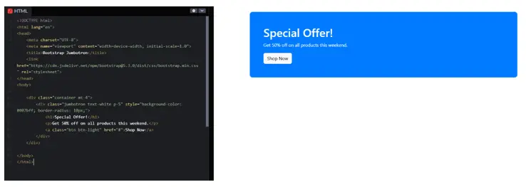
In this Exmaple:
• Bootstrap Included – Adds Bootstrap styles for responsive design.
• Container (div.container) – Provides proper spacing around content.
• Jumbotron (div.jumbotron) – Highlights important content.
• Background Color – Custom blue (#007bff) for styling.
• Rounded Corners – border-radius: 10px; for smooth edges.
• Heading (h1) – Displays the main message (“Special Offer!”).
• Description (p) – Provides offer details.
• Button (a.btn-light) – Call-to-action button (“Shop Now”).
3. Responsive Jumbotron
Jumbotrons automatically adjust to different screen sizes. You can use Bootstrap’s grid system to organize the content inside a Jumbotron.
Example: Responsive Jumbotron with Grid
<!DOCTYPE html>
<html lang=”en”>
<head>
<meta charset=”UTF-8″>
<meta name=”viewport” content=”width=device-width, initial-scale=1.0″>
<title>Responsive Jumbotron</title>
<link href=”https://cdn.jsdelivr.net/npm/bootstrap@5.3.0/dist/css/bootstrap.min.css” rel=”stylesheet”>
</head>
<body>
<div class=”container mt-4″>
<div class=”jumbotron bg-secondary text-white p-5″>
<div class=”row”>
<div class=”col-md-6″>
<h1>Responsive Design</h1>
<p>This Jumbotron works on all screen sizes.</p>
</div>
<div class=”col-md-6″>
<img src=”https://via.placeholder.com/300″ class=”img-fluid” alt=”Example Image”>
</div>
</div>
</div>
</div>
</body>
</html>
Output:
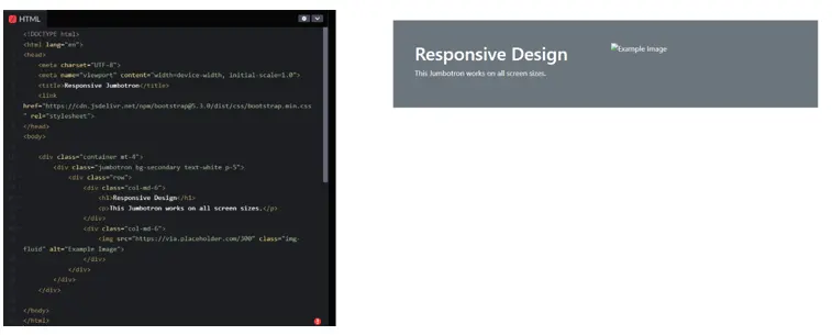
In this Example:
• Bootstrap Added – Enables responsive design.
• Container – Adds spacing.
• Jumbotron – Highlights content.
• Row & Columns – Organizes text and image.
• Responsive (img-fluid) – Image adjusts to screen size.
4. Adding Different Content Types
You can add various types of content inside a Jumbotron, such as text, images, videos, and buttons.
Example: Jumbotron with a Video
<!DOCTYPE html>
<html lang=”en”>
<head>
<meta charset=”UTF-8″>
<meta name=”viewport” content=”width=device-width, initial-scale=1.0″>
<title>Jumbotron with Video</title>
<link href=”https://cdn.jsdelivr.net/npm/bootstrap@5.3.0/dist/css/bootstrap.min.css” rel=”stylesheet”>
</head>
<body>
<div class=”container mt-4″>
<div class=”jumbotron bg-dark text-white p-5 text-center”>
<h1>Watch Our New Video</h1>
<p>Learn how to use Bootstrap in just 5 minutes.</p>
<div class=”ratio ratio-16×9″>
<iframe src=”https://www.youtube.com/embed/dQw4w9WgXcQ” allowfullscreen></iframe>
</div>
</div>
</div>
</body>
</html>
Output:
In this example:
• Bootstrap Added – Enables responsive design.
• Container – Adds spacing.
• Jumbotron – Dark background with centered text.
• Heading & Text – Highlights video topic.
• Responsive Video (ratio-16×9) – Embeds YouTube video.
Conclusion
• The Jumbotron is great for highlighting important content.
• You can customize it with colors, images, and different styles.
• It works well on all screen sizes and can include text, images, videos, and buttons.
• Try using Jumbotrons on your website to make your content stand out!
Practice Scenarios:
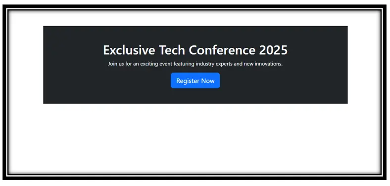
Scenario 1: Promotional Event Banner
Create a Jumbotron to promote a special event on your website. The banner should:
Hint: Use .text-center for alignment and a btn-primary for the button.
Expected Output:
Scenario 2: Product Feature Section
Design a Jumbotron showcasing a new product. The section should:
Hint: Use Bootstrap’s .row, .col-md-6, and .img-fluid for a responsive layout.
Expected Output:
YouTube Reference :
A Jumbotron in Bootstrap is a lightweight, flexible component designed to showcase key content and information attractively, typically used for headers or call-to-actions.
Yes, Iqra Technology offers this tutorial free of cost for all learners.
The tutorial includes creating Jumbotrons, customizing styles, making them responsive, and using Jumbotron variations in web design.
Absolutely! The tutorial is beginner-friendly and progresses to advanced-level concepts, making it suitable for learners of all skill levels.
Yes, Iqra Technology provides the tutorial in both English and Hindi to cater to a diverse audience.
Yes, the provided examples and templates are free to use for personal and commercial projects.
The tutorial explains how to use Bootstrap’s responsive utilities and layout classes to ensure Jumbotrons adapt seamlessly to different screen sizes.
Yes, the tutorial includes multiple design examples, from basic implementations to advanced customizations.
You can access the tutorial on the Iqra Technology Bootstrap Jumbotron Tutorial Page.
