

Bootstrap Toast
A Toast is a small notification box in Bootstrap that pops up temporarily on the screen. It is used to show simple messages like “Task Completed” or “Settings Saved”. It does not block user interaction. It simply informs the user.
It does not block user interaction. It simply informs the user.
Basic Toast Implementation
A Basic Toast is the simplest form of toast message with a title, time, and message body. It shows automatically using JavaScript.
Example Code:
<!DOCTYPE html>
<html lang=”en”>
<head>
<meta charset=”UTF-8″>
<title>Bootstrap Toast Example</title>
<!– Bootstrap 5 CSS –>
<link href=”https://cdn.jsdelivr.net/npm/bootstrap@5.3.3/dist/css/bootstrap.min.css” rel=”stylesheet”>
</head>
<body>
<!– Button to Trigger Toast –>
<button type=”button” class=”btn btn-primary m-3″ id=”showToastBtn”>
Show Toast
</button>
<!– Toast Container (Positioned in Top-Right) –>
<div class=”position-fixed top-0 end-0 p-3″ style=”z-index: 1055″>
<div class=”toast” id=”myToast” role=”alert” aria-live=”assertive” aria-atomic=”true”>
<div class=”toast-header”>
<strong class=”me-auto”>Toast Title</strong>
<small class=”text-muted”>11 mins ago</small>
<button type=”button” class=”btn-close” data-bs-dismiss=”toast” aria-label=”Close”></button>
</div>
<div class=”toast-body”>
Hello, world! This is a toast message.
</div>
</div>
</div>
<!– Bootstrap Bundle JS (includes Popper) –>
<script src=”https://cdn.jsdelivr.net/npm/bootstrap@5.3.3/dist/js/bootstrap.bundle.min.js”></script>
<script>
// Show toast on button click
document.getElementById(‘showToastBtn’).addEventListener(‘click’, function () {
const toastEl = document.getElementById(‘myToast’);
const toast = new bootstrap.Toast(toastEl);
toast.show();
});
</script>
</body>
</html>
Output:
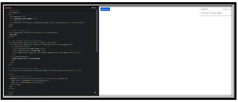
Explanation:
• .toast: Container for the message
• .toast-header: Top part with title and time
• .toast-body: Main message
• $(‘.toast’).toast(‘show’): Makes it appear
Autohide and Delay Options
These options control how long the toast stays visible and whether it hides automatically or needs to be closed by the user.
Example Code:
<!DOCTYPE html>
<html lang=”en”>
<head>
<meta charset=”UTF-8″>
<title>Manual Close Toast</title>
<!– Bootstrap 5 CSS –>
<link href=”https://cdn.jsdelivr.net/npm/bootstrap@5.3.3/dist/css/bootstrap.min.css” rel=”stylesheet”>
</head>
<body>
<!– Button to Show Toast –>
<button class=”btn btn-warning m-3″ id=”showManualToast”>Show Manual Toast</button>
<!– Toast Container –>
<div class=”position-fixed top-0 end-0 p-3″ style=”z-index: 1055″>
<div class=”toast” id=”manualToast” role=”alert” aria-live=”assertive” aria-atomic=”true” data-bs-autohide=”false”>
<div class=”toast-header”>
<strong class=”me-auto”>Manual Close</strong>
<small class=”text-muted”>Now</small>
<button type=”button” class=”btn-close” data-bs-dismiss=”toast” aria-label=”Close”></button>
</div>
<div class=”toast-body”>
This toast won’t hide automatically.
</div>
</div>
</div>
<!– Bootstrap 5 Bundle JS –>
<script src=”https://cdn.jsdelivr.net/npm/bootstrap@5.3.3/dist/js/bootstrap.bundle.min.js”></script>
<!– JavaScript to Show Toast –>
<script>
document.getElementById(‘showManualToast’).addEventListener(‘click’, function () {
const manualToastEl = document.getElementById(‘manualToast’);
const manualToast = new bootstrap.Toast(manualToastEl, {
autohide: false
});
manualToast.show();
});
</script>
</body>
</html>
Output:
Explanation:
• data-autohide=”false”: Disables auto-close
• delay: 2000: Stays for 2 seconds (2000ms)
• can still be closed manually by the button
Custom Placement of Toasts
Toasts can be positioned anywhere on the screen like top-right, bottom-left, etc., using CSS positioning inside a container.
Example Code:
<!DOCTYPE html>
<html lang=”en”>
<head>
<meta charset=”UTF-8″>
<title>Custom Positioned Toast</title>
<!– Bootstrap 5 CSS –>
<link href=”https://cdn.jsdelivr.net/npm/bootstrap@5.3.3/dist/css/bootstrap.min.css” rel=”stylesheet”>
</head>
<body>
<!– Toast Container with Custom Position –>
<div style=”position: relative; min-height: 200px;”>
<div class=”position-absolute top-0 end-0 p-3″ style=”z-index: 1055;”>
<!– Toast –>
<div id=”customToast” class=”toast” role=”alert” aria-live=”assertive” aria-atomic=”true”>
<div class=”toast-header”>
<strong class=”me-auto”>Custom Position</strong>
<button type=”button” class=”btn-close” data-bs-dismiss=”toast” aria-label=”Close”></button>
</div>
<div class=”toast-body”>
I’m at the top-right corner!
</div>
</div>
</div>
</div>
<!– Bootstrap 5 Bundle JS –>
<script src=”https://cdn.jsdelivr.net/npm/bootstrap@5.3.3/dist/js/bootstrap.bundle.min.js”></script>
<!– Script to Show Toast –>
<script>
const customToastEl = document.getElementById(‘customToast’);
const customToast = new bootstrap.Toast(customToastEl, {
delay: 3000 // 3 seconds
});
customToast.show();
</script>
</body>
</html>
Output:
Explanation:
• Outer container uses position: relative
• Inner div uses absolute to set position
• Toast appears in the chosen corner
Conclusion
• Toasts are non-blocking alerts used to show messages.
• Can be customized for timing, hiding, and position.
• Easy to trigger with jQuery or JavaScript.
• Very useful for showing success, warning, or info alerts without interrupting user flow.
Practice Scenarios :
Scenario1. Toast that shows for 5 seconds
Expected Output:
Scenario 2. Toast without Close Button
Expected Output:
Scenario 3. Toast in Bottom Left Corner
Objective:
Toast in Bottom Left Corner (Auto Hide after 3s)
Expected Output:
A Bootstrap Toast is a lightweight, customizable notification pop-up that displays temporary messages or alerts to users.
Yes, this Bootstrap training is completely free. You can access all tutorials and learn Bootstrap at your own pace without any charges.
You can customize a Toast’s appearance using Bootstrap’s classes or custom CSS to modify colors, layout, and animation.
Yes, we offer Bootstrap Toast tutorial in Hindi to help Hindi-speaking students understand the concepts easily. Whether you’re a beginner or intermediate, this course is tailored to your needs.
Yes, Bootstrap Toasts are inherently responsive, but you can enhance their layout with additional Bootstrap utility classes.
Examples include:
- Success or error messages.
- Live updates.
- Persistent notifications.
To implement Toasts, include the Bootstrap library, use the .toast class, and configure the necessary JavaScript to trigger events.
Yes, use Bootstrap’s animation classes like .fade or custom CSS for smooth animations when showing or hiding a Toast.
Bootstrap Toasts can be triggered by JavaScript events such as button clicks, form submissions, or custom scripts.
By default, Bootstrap Toasts include ARIA roles and attributes for accessibility, but you should verify with screen readers for full compliance.
