

Form Validation in Bootstrap
Form validation ensures users enter the correct information before submitting a form.
Types of Validation
.Client-side Validation: Checks inputs using HTML5 and CSS before sending data to the server.
.Server-side Validation: The server processes and verifies the data before accepting it.
Example: Required First Name Field
<!DOCTYPE html>
<html lang=”en”>
<head>
<meta charset=”UTF-8″>
<meta name=”viewport” content=”width=device-width, initial-scale=1.0″>
<title>Bootstrap Form Validation</title>
<link href=”https://stackpath.bootstrapcdn.com/bootstrap/4.3.1/css/bootstrap.min.css” rel=”stylesheet”>
</head>
<body>
<div class=”container mt-5″>
<h2>Bootstrap Form with Validation</h2>
<form class=”needs-validation” novalidate>
<!– First Name Field –>
<div class=”form-group”>
<label for=”validationCustom01″>First Name</label>
<input type=”text” class=”form-control” id=”validationCustom01″ required>
<div class=”invalid-feedback”>
Please provide a valid first name.
</div>
</div>
<!– Email Field –>
<div class=”form-group”>
<label for=”validationCustom02″>Email</label>
<input type=”email” class=”form-control” id=”validationCustom02″ required>
<div class=”invalid-feedback”>
Please enter a valid email.
</div>
</div>
<!– Password Field –>
<div class=”form-group”>
<label for=”validationCustom03″>Password</label>
<input type=”password” class=”form-control” id=”validationCustom03″ required>
<div class=”invalid-feedback”>
Please enter a password.
</div>
</div>
<!– Submit Button –>
<button class=”btn btn-primary” type=”submit”>Submit</button>
</form>
</div>
<!– Bootstrap JS and Validation Script –>
<script src=”https://code.jquery.com/jquery-3.3.1.slim.min.js”></script>
<script src=”https://cdnjs.cloudflare.com/ajax/libs/popper.js/1.14.7/umd/popper.min.js”></script>
<script src=”https://stackpath.bootstrapcdn.com/bootstrap/4.3.1/js/bootstrap.min.js”></script>
<script>
// JavaScript for disabling form submission if there are invalid fields
(function() {
‘use strict’;
window.addEventListener(‘load’, function() {
var forms = document.getElementsByClassName(‘needs-validation’);
Array.prototype.filter.call(forms, function(form) {
form.addEventListener(‘submit’, function(event) {
if (form.checkValidity() === false) {
event.preventDefault();
event.stopPropagation();
}
form.classList.add(‘was-validated’);
}, false);
});
}, false);
})();
</script>
</body>
</html>
In this Example:
If the user does not enter a first name, an error message appears.
Bootstrap Registration Form Example
Example: Simple Registration Form
<!DOCTYPE html>
<html lang=”en”>
<head>
<meta charset=”UTF-8″>
<meta name=”viewport” content=”width=device-width, initial-scale=1.0″>
<title>Bootstrap Form Example</title>
<link href=”https://stackpath.bootstrapcdn.com/bootstrap/4.3.1/css/bootstrap.min.css” rel=”stylesheet”>
</head>
<body>
<div class=”container mt-5″>
<h2>Bootstrap Form</h2>
<form class=”needs-validation” novalidate>
<!– Name Field –>
<div class=”form-group”>
<label for=”name”>Name</label>
<input type=”text” class=”form-control” id=”name” placeholder=”Enter your name” required>
<div class=”invalid-feedback”>
Please enter your name.
</div>
</div>
<!– Submit Button –>
<button type=”submit” class=”btn btn-primary”>Submit</button>
</form>
</div>
<!– Bootstrap JS and Validation Script –>
<script src=”https://code.jquery.com/jquery-3.3.1.slim.min.js”></script>
<script src=”https://cdnjs.cloudflare.com/ajax/libs/popper.js/1.14.7/umd/popper.min.js”></script>
<script src=”https://stackpath.bootstrapcdn.com/bootstrap/4.3.1/js/bootstrap.min.js”></script>
<script>
// JavaScript for Bootstrap Validation
(function() {
‘use strict’;
window.addEventListener(‘load’, function() {
var forms = document.getElementsByClassName(‘needs-validation’);
Array.prototype.filter.call(forms, function(form) {
form.addEventListener(‘submit’, function(event) {
if (form.checkValidity() === false) {
event.preventDefault();
event.stopPropagation();
}
form.classList.add(‘was-validated’);
}, false);
});
}, false);
})();
</script>
</body>
</html>
Output:
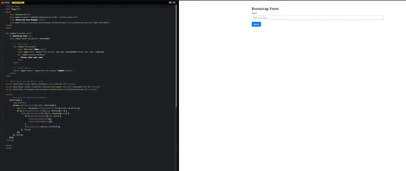
In this Example:
This form collects the user’s name and has a submit button.
Responsive Two-Column Bootstrap Form
This form adjusts its layout based on screen size.
Example: Name and Email Fields in Two Columns
<!DOCTYPE html>
<html lang=”en”>
<head>
<meta charset=”UTF-8″>
<meta name=”viewport” content=”width=device-width, initial-scale=1.0″>
<title>Bootstrap Form Validation</title>
<link href=”https://cdn.jsdelivr.net/npm/bootstrap@5.3.0/dist/css/bootstrap.min.css” rel=”stylesheet”>
</head>
<body>
<div class=”container mt-5″>
<h2 class=”mb-4″>Bootstrap Form with Validation</h2>
<form class=”needs-validation” novalidate>
<div class=”row”>
<!– First Name Field –>
<div class=”col-md-6 mb-3″>
<label for=”firstName” class=”form-label”>First Name</label>
<input type=”text” class=”form-control” id=”firstName” placeholder=”Enter your first name” required>
<div class=”invalid-feedback”>
Please enter your first name.
</div>
</div>
<!– Email Field –>
<div class=”col-md-6 mb-3″>
<label for=”email” class=”form-label”>Email</label>
<input type=”email” class=”form-control” id=”email” placeholder=”Enter your email” required>
<div class=”invalid-feedback”>
Please enter a valid email address.
</div>
</div>
</div>
<!– Password Field –>
<div class=”mb-3″>
<label for=”password” class=”form-label”>Password</label>
<input type=”password” class=”form-control” id=”password” placeholder=”Enter password” required>
<div class=”invalid-feedback”>
Please enter a password.
</div>
</div>
<!– Submit Button –>
<button class=”btn btn-primary” type=”submit”>Submit</button>
</form>
</div>
<script>
// Bootstrap 5 form validation script
(() => {
‘use strict’
const forms = document.querySelectorAll(‘.needs-validation’)
Array.from(forms).forEach(form => {
form.addEventListener(‘submit’, event => {
if (!form.checkValidity()) {
event.preventDefault()
event.stopPropagation()
}
form.classList.add(‘was-validated’)
}, false)
})
})();
</script>
<script src=”https://cdn.jsdelivr.net/npm/bootstrap@5.3.0/dist/js/bootstrap.bundle.min.js”></script>
</body>
</html>
Output:
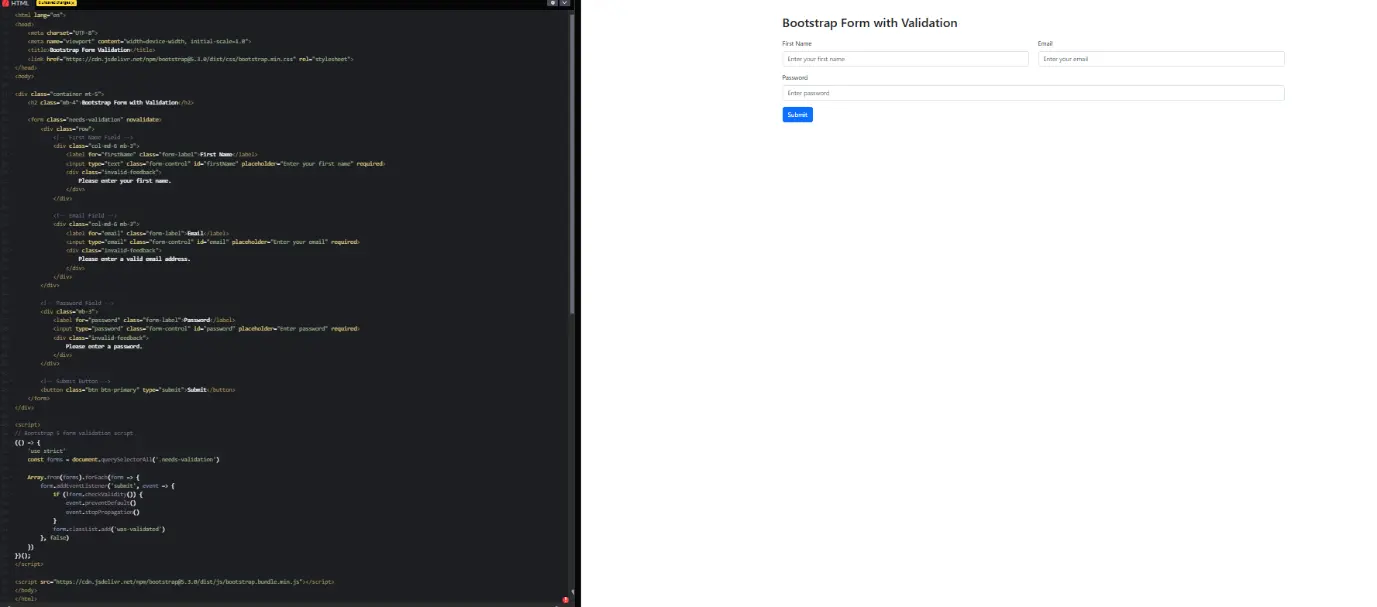
In this Example:
On larger screens, the fields appear side by side. On small screens, they stack vertically.
Bootstrap Form with Validation
This form prevents submission if any required field is empty.
Example: Form with JavaScript Validation
<!DOCTYPE html>
<html lang=”en”>
<head>
<meta charset=”UTF-8″>
<meta name=”viewport” content=”width=device-width, initial-scale=1.0″>
<title>Bootstrap 5 Form Validation</title>
<link href=”https://cdn.jsdelivr.net/npm/bootstrap@5.3.0/dist/css/bootstrap.min.css” rel=”stylesheet”>
</head>
<body>
<div class=”container mt-5″>
<h2 class=”mb-4″>Form Validation Example</h2>
<form class=”needs-validation” novalidate>
<div class=”mb-3″>
<label for=”validationCustom01″ class=”form-label”>Name</label>
<input type=”text” class=”form-control” id=”validationCustom01″ placeholder=”Enter your name” required>
<div class=”invalid-feedback”>
Please enter a name.
</div>
</div>
<button class=”btn btn-primary” type=”submit”>Submit</button>
</form>
</div>
<script>
document.addEventListener(“DOMContentLoaded”, () => {
const forms = document.querySelectorAll(‘.needs-validation’);
forms.forEach(form => {
form.addEventListener(‘submit’, event => {
if (!form.checkValidity()) {
event.preventDefault();
event.stopPropagation();
}
form.classList.add(‘was-validated’);
});
});
});
</script>
<script src=”https://cdn.jsdelivr.net/npm/bootstrap@5.3.0/dist/js/bootstrap.bundle.min.js”></script>
</body>
</html>
Output:
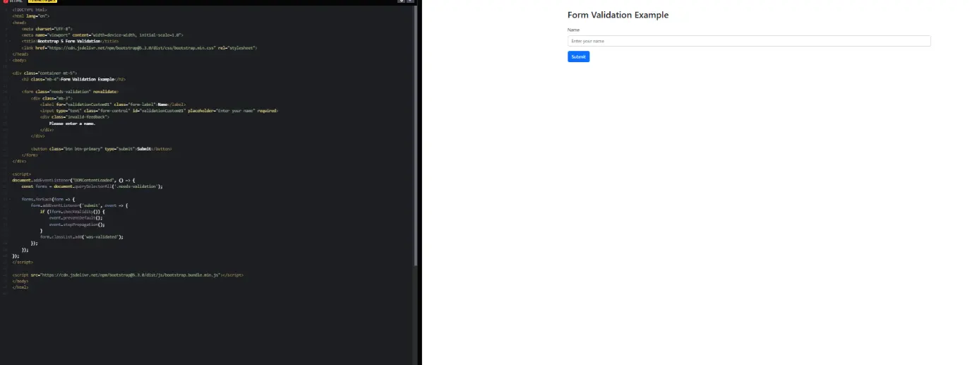
In this Example:
If a required field is empty, the form will not submit and will show an error message.
Text Alignment in Bootstrap
Example: Aligning Text
<!DOCTYPE html>
<html lang=”en”>
<head>
<meta charset=”UTF-8″>
<meta name=”viewport” content=”width=device-width, initial-scale=1.0″>
<title>Bootstrap Text Alignment</title>
<link href=”https://cdn.jsdelivr.net/npm/bootstrap@5.3.0/dist/css/bootstrap.min.css” rel=”stylesheet”>
</head>
<body>
<div class=”container mt-5″>
<h2 class=”mb-4″>Text Alignment in Bootstrap</h2>
<p class=”text-start”>Left-aligned text</p>
<p class=”text-center”>Center-aligned text</p>
<p class=”text-end”>Right-aligned text</p>
<hr>
<h4>Responsive Text Alignment</h4>
<p class=”text-sm-start text-md-center text-lg-end”>
This text is left-aligned on small screens, center-aligned on medium screens, and right-aligned on large screens.
</p>
</div>
<script src=”https://cdn.jsdelivr.net/npm/bootstrap@5.3.0/dist/js/bootstrap.bundle.min.js”></script>
</body>
</html>
Output:
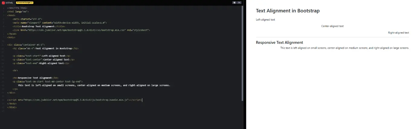
In this Example:
Use .text-start, .text-center, and .text-end to align text.
Text Formatting
Example: Changing Text Case
<!DOCTYPE html>
<html lang=”en”>
<head>
<meta charset=”UTF-8″>
<meta name=”viewport” content=”width=device-width, initial-scale=1.0″>
<title>Bootstrap Text Case Example</title>
<link href=”https://cdn.jsdelivr.net/npm/bootstrap@5.3.0/dist/css/bootstrap.min.css” rel=”stylesheet”>
</head>
<body>
<div class=”container mt-5″>
<h2 class=”mb-4″>Bootstrap Text Case Example</h2>
<p class=”text-uppercase”>Uppercase Text</p>
<p class=”text-lowercase”>Lowercase Text</p>
<p class=”text-capitalize”>capitalized text</p>
<hr>
<h4>Responsive Text Case</h4>
<p class=”text-sm-uppercase text-md-lowercase text-lg-capitalize”>
This text changes case based on screen size.
</p>
</div>
<script src=”https://cdn.jsdelivr.net/npm/bootstrap@5.3.0/dist/js/bootstrap.bundle.min.js”></script>
</body>
</html>
Output:
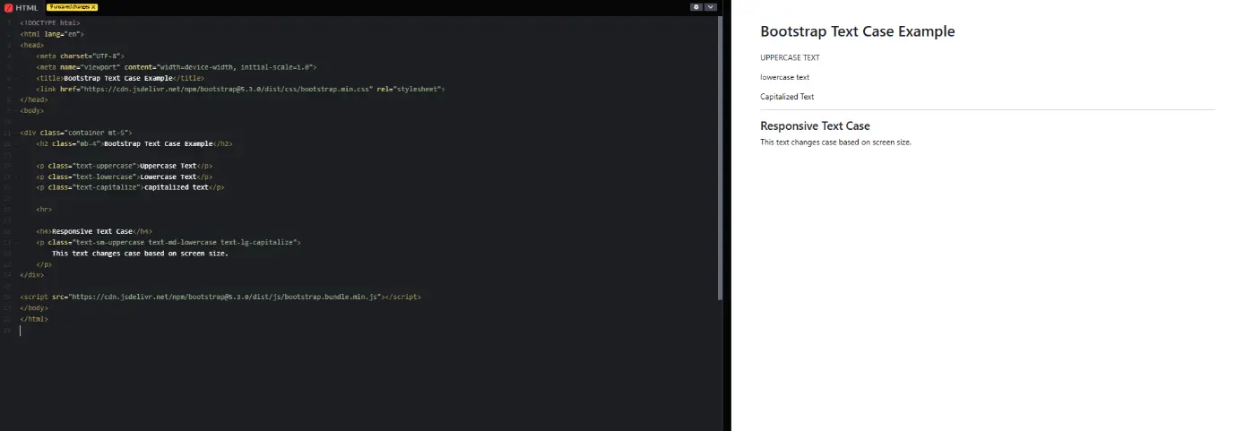
In this Example:
These classes change how text appears.
Font Styling
Example: Bold and Italic Text
<!DOCTYPE html>
<html lang=”en”>
<head>
<meta charset=”UTF-8″>
<meta name=”viewport” content=”width=device-width, initial-scale=1.0″>
<title>Bootstrap Font Styles Example</title>
<link href=”https://cdn.jsdelivr.net/npm/bootstrap@5.3.0/dist/css/bootstrap.min.css” rel=”stylesheet”>
</head>
<body>
<div class=”container mt-5″>
<h2 class=”mb-4″>Bootstrap Font Styles Example</h2>
<p class=”fw-bold”>Bold Text</p>
<p class=”fst-italic”>Italic Text</p>
<p class=”fw-bold fst-italic”>Bold and Italic Text</p>
<p class=”fw-light”>Light Weight Text</p>
<p class=”text-decoration-underline”>Underlined Text</p>
<p class=”text-decoration-line-through”>Strikethrough Text</p>
</div>
<script src=”https://cdn.jsdelivr.net/npm/bootstrap@5.3.0/dist/js/bootstrap.bundle.min.js”></script>
</body>
</html>
Output:
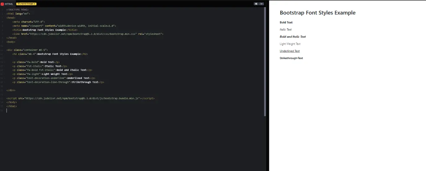
In this Example:
fw-bold → Makes the text bold.
fst-italic → Makes the text italic.
fw-bold fst-italic → Combines bold and italic styles.
fw-light → Makes the text lighter in weight.
text-decoration-underline → Underlines the text.
text-decoration-line-through → Adds a strikethrough effect to the text.
Full-Width Container
Example: Using .container-fluid
<!DOCTYPE html>
<html lang=”en”>
<head>
<meta charset=”UTF-8″>
<meta name=”viewport” content=”width=device-width, initial-scale=1.0″>
<title>Bootstrap Container Fluid Example</title>
<link rel=”stylesheet” href=”https://cdn.jsdelivr.net/npm/bootstrap@5.3.3/dist/css/bootstrap.min.css”>
<style>
.container-fluid {
background-color: lightblue; /* Background color added */
padding: 20px; /* Padding added for spacing */
}
</style>
</head>
<body>
<div class=”container-fluid”>
<p>This content takes the full width of the screen.</p>
</div>
</body>
</html>
Output:
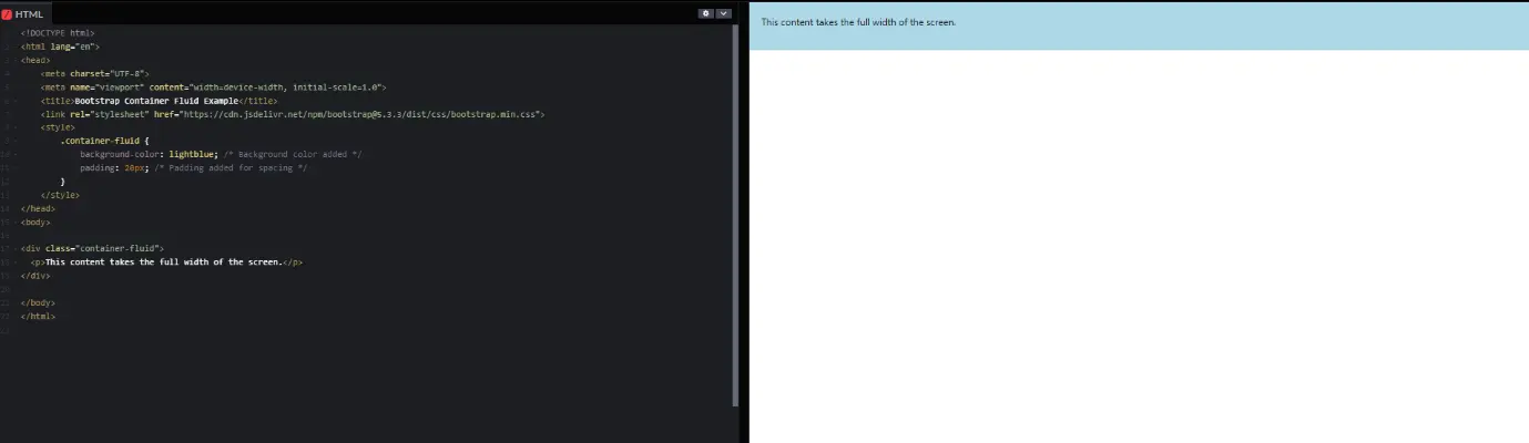
In this Example:
container-fluid – This class makes the container take the full width of the screen.
CSS Styling – A light blue background and 20px padding are added to make the container visible.
p Tag – Displays text that stretches across the full screen width.
Inline Elements and Abbreviations
Example: Styling Inline Text
<!DOCTYPE html>
<html lang=”en”>
<head>
<meta charset=”UTF-8″>
<meta name=”viewport” content=”width=device-width, initial-scale=1.0″>
<title>Bootstrap Text Formatting Example</title>
<link rel=”stylesheet” href=”https://cdn.jsdelivr.net/npm/bootstrap@5.3.3/dist/css/bootstrap.min.css”>
</head>
<body class=”p-4″>
<a href=”#” class=”btn btn-primary”>This is a hyperlink</a>
<!– Styled link as a Bootstrap button –>
<br><br>
<p class=”text-muted”><em>This is emphasized text</em></p>
<!– Bootstrap muted text with emphasis –>
<p class=”fw-bold”>This is strong text</p>
<!– Bootstrap bold text –>
<p><abbr title=”Hypertext Markup Language” class=”initialism”>HTML</abbr></p>
<!– Bootstrap abbreviation with a tooltip effect –>
<script src=”https://cdn.jsdelivr.net/npm/bootstrap@5.3.3/dist/js/bootstrap.bundle.min.js”></script>
</body>
</html>
Output:
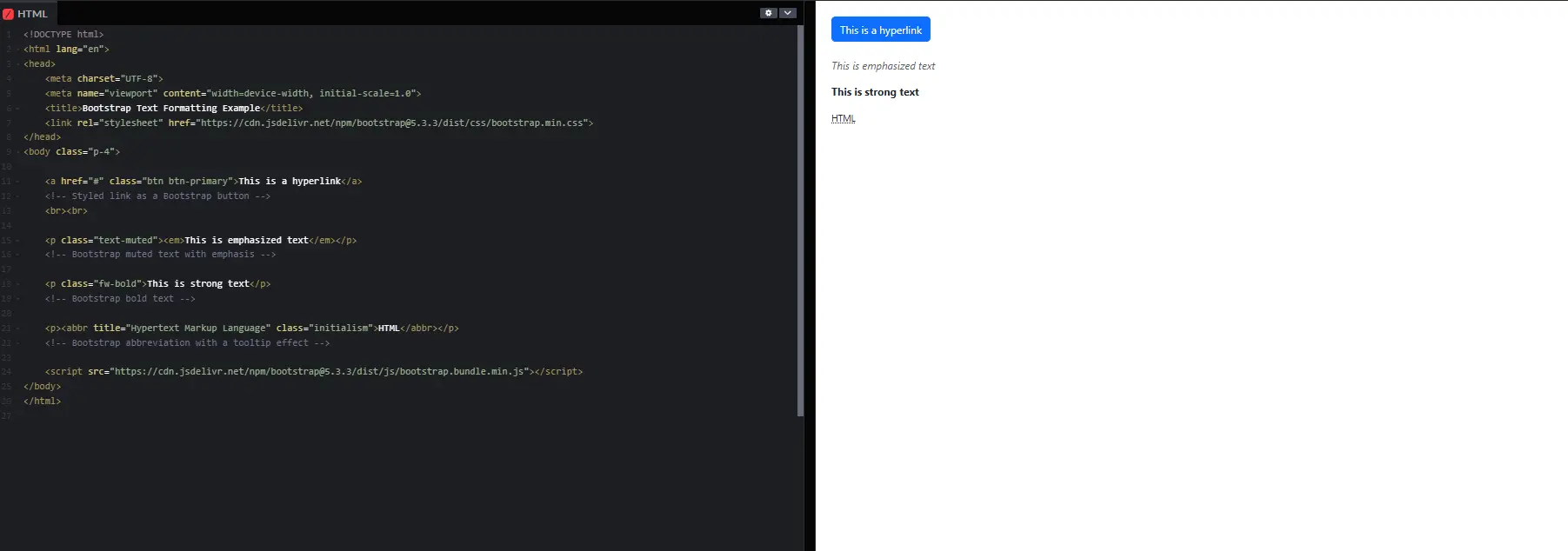
In this Example:
Hyperlink Styled – Used btn btn-primary to link look like a button.
Text Formatting – Used Bootstrap classes like text-muted, fw-bold, and initialism for better styling.
Abbreviation Tooltip – Bootstrap’s initialism class makes abbreviations look more professional.
Blockquotes (For Quotes and Citations)
Example: Using Blockquotes
<!DOCTYPE html>
<html lang=”en”>
<head>
<meta charset=”UTF-8″>
<meta name=”viewport” content=”width=device-width, initial-scale=1.0″>
<title>Bootstrap Blockquote Example</title>
<link rel=”stylesheet” href=”https://cdn.jsdelivr.net/npm/bootstrap@5.3.3/dist/css/bootstrap.min.css”>
</head>
<body class=”p-4″>
<blockquote class=”blockquote border-start border-4 ps-3″>
<p class=”mb-0″>This is a sample quote.</p>
<footer class=”blockquote-footer”>Someone famous in <cite title=”Source Title”>Source Title</cite></footer>
</blockquote>
</body>
</html>
Output:
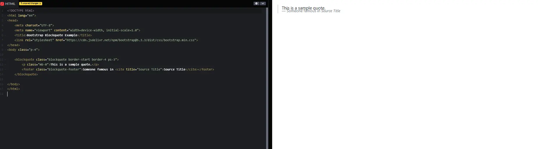
In this Example:
blockquote – Used for displaying quotes in Bootstrap.
border-start border-4 ps-3 – Adds a left border to highlight the quote.
blockquote-footer – Used for citing the source of the quote.
cite – Highlights the source title in italics.
Lists in Bootstrap
Example: Styling Lists
<!DOCTYPE html>
<html lang=”en”>
<head>
<meta charset=”UTF-8″>
<meta name=”viewport” content=”width=device-width, initial-scale=1.0″>
<title>Bootstrap List Example</title>
<link rel=”stylesheet” href=”https://cdn.jsdelivr.net/npm/bootstrap@5.3.3/dist/css/bootstrap.min.css”>
</head>
<body class=”p-4″>
<!– Unstyled List –>
<h5>Unstyled List</h5>
<ul class=”list-unstyled”>
<li>Item 1</li>
<li>Item 2</li>
</ul>
<!– Inline List –>
<h5>Inline List</h5>
<ul class=”list-inline”>
<li class=”list-inline-item”>Item 1</li>
<li class=”list-inline-item”>Item 2</li>
</ul>
</body>
</html>
Output:
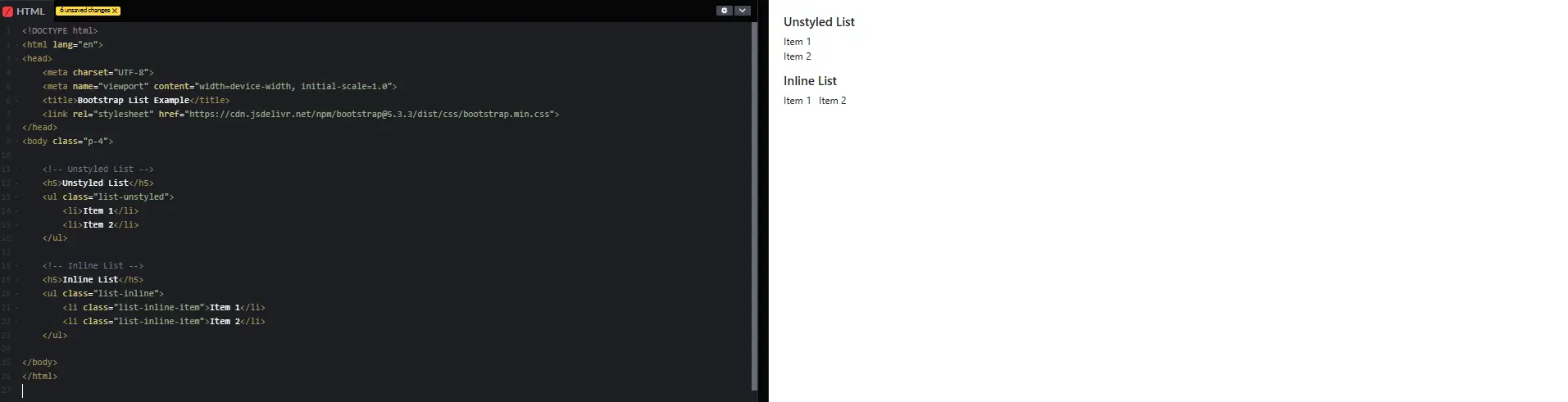
In this Example:
list-unstyled – Removes default bullet points and margins from the list.
list-inline – Displays list items horizontally (inline) instead of vertically.
list-inline-item – Ensures each list item stays inline.
Conclusion
Bootstrap Form Validation is essential for ensuring users enter correct data before submitting a form. It allows client-side validation using HTML5 and JavaScript, making it easy to implement. Through various examples, we have learned how:
• Required fields prevent invalid input.
• Two-column layouts help create responsive forms.
• Text formatting and alignment can be controlled.
• Full-width containers and other Bootstrap classes enhance the design.
Using Bootstrap validation, we can create user-friendly interfaces and ensure data is submitted correctly
Practice Scenarios:
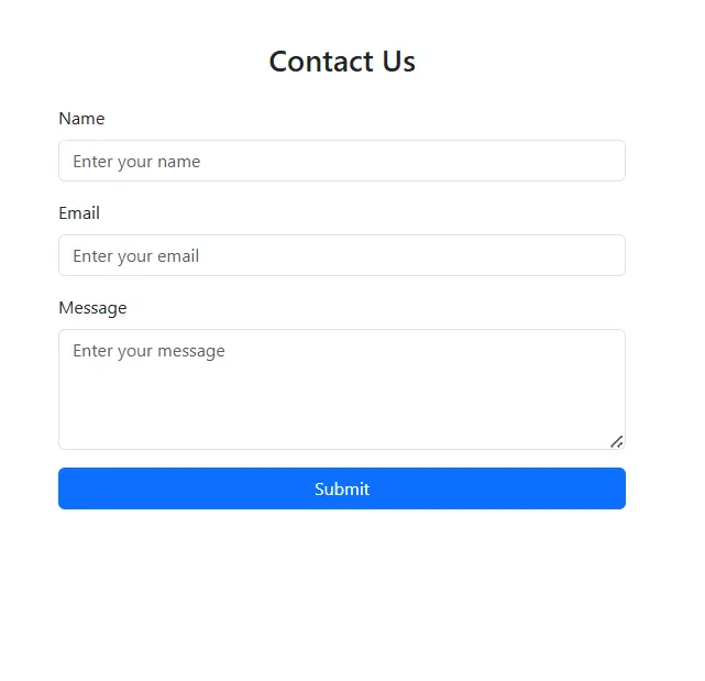
Scenario 1:
Objective:
Create a simple contact form using Bootstrap.
Requirements:
1. Use Bootstrap classes to style the form.
2. Include Name, Email, and Message fields.
3. Add a Submit button with Bootstrap styling.
4. Ensure the form is responsive on all screen sizes.
Expected Output:
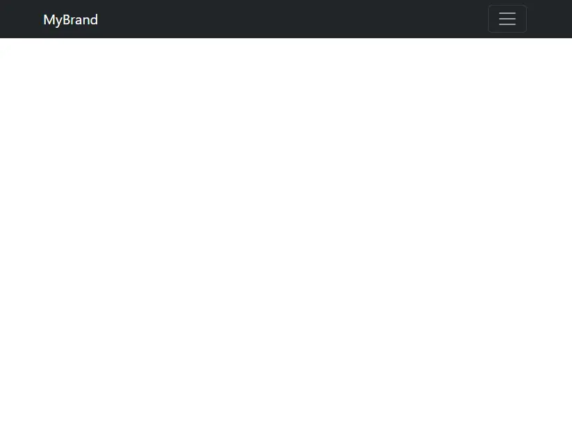
Scenario 2: Responsive Navigation Bar
Objective:
Create a responsive navigation bar using Bootstrap that includes a logo, navigation links (Home, About, Services, Contact), and a toggle button for mobile screens.
Expected Output:
Bootstrap form validation ensures input data in forms meets specific requirements, enhancing user experience and data accuracy.
Yes, Iqra Technology provides this comprehensive tutorial free of charge.
The tutorial includes real-world examples of form validation, using validation classes, implementing JavaScript-based validation, and best practices for error handling.
It is designed for beginners and developers who want to learn or enhance their skills in Bootstrap form validation.
Yes, the tutorial offers multiple examples for different form types and validation techniques.
Yes, the tutorial highlights industry best practices to create secure and user-friendly form validations.
Absolutely! The code examples are free to use in both personal and commercial projects.
Visit the Bootstrap Form Validation Tutorial Page to get started.
Yes, it is available in both English and Hindi for a wider audience.
Yes, it demonstrates how to make form validations work seamlessly on mobile and desktop devices.
