

Bootstrap Alerts
Bootstrap Alerts are used to show important messages on a webpage, such as success messages, warnings, errors, or general information. They help users understand what’s happening on the site.
Objectives:
Learn different types of alerts in Bootstrap.
Understand how to customize alerts.
Make alerts interactive using JavaScript.
1. Bootstrap Alert Classes (Types of Alerts)
Bootstrap provides different pre-designed alerts for various types of messages. Each type has a different color and meaning.
Alert Types & Their Uses:
| Class Name | Discription |
|---|---|
| .alert-primary | General information |
| .alert-secondary | Less important message |
| .alert-success | Shows success (e.g., “Form submitted successfully!”) |
| .alert-danger | Shows errors or warnings (e.g., “Login failed!”) |
| .alert-warning | Shows a warning (e.g., “Low battery!”) |
| .alert-info | Extra information (e.g., “New updates available!”) |
| .alert-light | Light-colored alert (less attention) |
| .alert-dark | Dark alert (strong message) |
Example: Basic Bootstrap Alerts
<!DOCTYPE html>
<html lang=”en”>
<head>
<meta charset=”UTF-8″>
<meta name=”viewport” content=”width=device-width, initial-scale=1.0″>
<title>Bootstrap Alerts</title>
<link href=”https://cdn.jsdelivr.net/npm/bootstrap@5.3.0/dist/css/bootstrap.min.css” rel=”stylesheet”>
</head>
<body>
<div class=”container mt-3″>
<div class=”alert alert-primary”>This is a primary alert.</div>
<div class=”alert alert-success”>Success! Your data has been saved.</div>
<div class=”alert alert-danger”>Error! Something went wrong.</div>
<div class=”alert alert-warning”>Warning! Check your settings.</div>
</div>
</body>
</html>
Output:
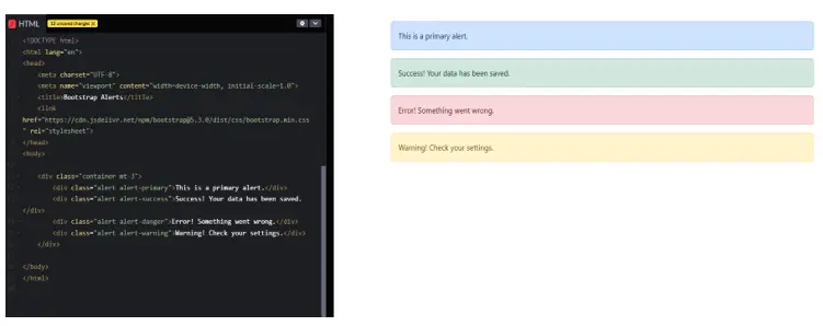
In this Example:
alert-primary – Normal info alert.
alert-success – Green message for successful actions.
alert-danger – Red alert for errors.
alert-warning – Yellow alert for warnings.
2. Customizing Alerts
You can change the style, size, and colors of alerts using CSS.
Example: Custom Styled Alert
<!DOCTYPE html>
<html lang=”en”>
<head>
<meta charset=”UTF-8″>
<meta name=”viewport” content=”width=device-width, initial-scale=1.0″>
<title>Custom Alert</title>
<link href=”https://cdn.jsdelivr.net/npm/bootstrap@5.3.0/dist/css/bootstrap.min.css” rel=”stylesheet”>
<style>
.custom-alert {
background-color: #ffcc00;
color: black;
font-weight: bold;
padding: 15px;
border-radius: 10px;
}
</style>
</head>
<body>
<div class=”container mt-3″>
<div class=”alert custom-alert”>Custom Styled Warning Alert!</div>
</div>
</body>
</html>
Output:
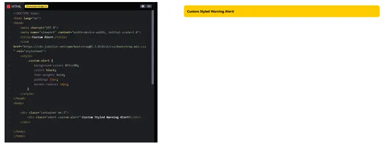
In this Example:
background-color: #ffcc00; – Sets yellow background.
color: black; – Sets text color to black.
border-radius: 10px; – Makes corners rounded.
3. Dismissible Alerts (Close Button)
You can add a close button to dismiss an alert.
Example: Alert with Close Button
<!DOCTYPE html>
<html lang=”en”>
<head>
<meta charset=”UTF-8″>
<meta name=”viewport” content=”width=device-width, initial-scale=1.0″>
<title>Dismissible Alert</title>
<link href=”https://cdn.jsdelivr.net/npm/bootstrap@5.3.0/dist/css/bootstrap.min.css” rel=”stylesheet”>
</head>
<body>
<div class=”container mt-3″>
<div class=”alert alert-warning alert-dismissible fade show” role=”alert”>
This is a warning alert with a close button!
<button type=”button” class=”btn-close” data-bs-dismiss=”alert”></button>
</div>
</div>
<script src=”https://cdn.jsdelivr.net/npm/bootstrap@5.3.0/dist/js/bootstrap.bundle.min.js”></script>
</body>
</html>
Output:
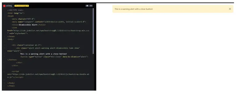
In this Example:
alert-dismissible – Makes alert closable
.btn-close – Close button to remove alert.
Bootstrap JS is needed to make the button work.
4. Auto-Close Alerts (Using JavaScript)
You can make an alert disappear after a few seconds automatically.
Example: Auto-Dismiss Alert
<!DOCTYPE html>
<html lang=”en”>
<head>
<meta charset=”UTF-8″>
<meta name=”viewport” content=”width=device-width, initial-scale=1.0″>
<title>Auto Dismiss Alert</title>
<link href=”https://cdn.jsdelivr.net/npm/bootstrap@5.3.0/dist/css/bootstrap.min.css” rel=”stylesheet”>
</head>
<body>
<div class=”container mt-3″>
<div id=”autoDismissAlert” class=”alert alert-info”>
This alert will disappear in 3 seconds.
</div>
</div>
<script>
setTimeout(function () {
document.getElementById(“autoDismissAlert”).style.display = “none”;
}, 3000);
</script>
</body>
</html>
Output:
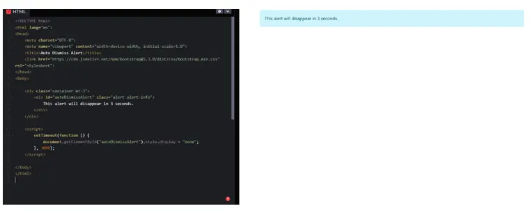
In this Example:
setTimeout() – Hides alert after 3 seconds.
style.display = “none” – Makes the alert disappear.
Conclusion
Bootstrap Alerts are useful for showing important messages.
Different alert types highlight different kinds of messages.
You can customize alerts using CSS.
Alerts can be closed manually or automatically dismissed.
Practice Scenarios
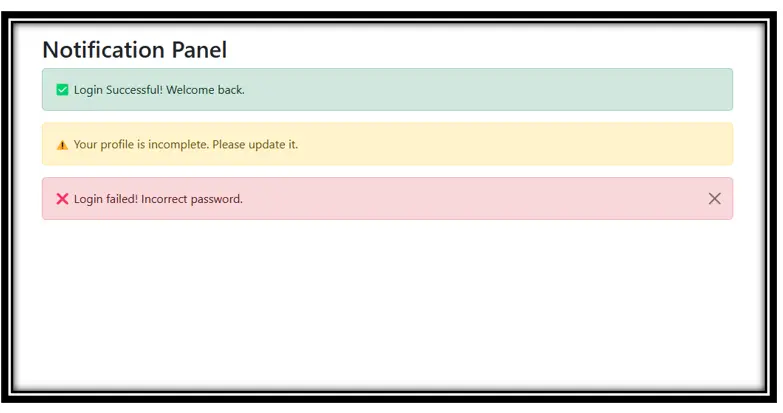
Scenario 1: Notification Panel
Create a notification section that includes:
• A success message for login.
• A warning if the profile is incomplete.
• A dismissible error alert for login failure.
Expected Output:
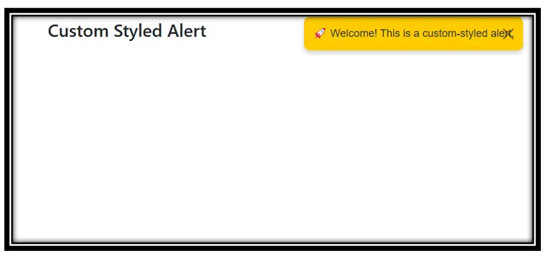
Scenario 2: Custom Styled Alerts
Create an alert box with a unique design:
• Rounded corners
• Custom font & colors
• A close button
• Auto-hide after 5 seconds
Expected Output:
Bootstrap alerts are feedback messages displayed to users, typically used to provide information, warnings, or confirm actions in web applications.
Yes, Iqra Technology provides a free online tutorial for learning Bootstrap alerts.
The tutorial includes interactive examples, different alert classes (success, warning, error), and how to create responsive alerts for mobile-friendly designs.
Basic knowledge of HTML and CSS is helpful, but the tutorial is beginner-friendly and easy to follow.
Yes, the tutorial covers various alert classes, such as .alert-success, .alert-warning, .alert-danger, and more, with practical examples.
The tutorial explains how to use dismissible alerts with the .alert-dismissible class and includes examples with JavaScript integration.
- Yes, the tutorial is available in both English and Hindi to cater to a wider audience.
You can access the tutorial on the Iqra Technology Bootstrap Alerts Page.
Yes, all examples and snippets provided in the tutorial are free for personal and commercial use.
