

Bootstrap Badges
What are Badges?
Bootstrap Badges are small labels used to show extra information next to text, buttons, or other elements. They are commonly used for:
• Notification counts
• Status indicators (like success, warning, or error messages)
• Highlighting important information
Bootstrap Badge Classes
Here are some important classes for using badges in Bootstrap:
| Class Name | Discription |
|---|---|
| .badge | The base class for all badges. |
| .badge-primary, .badge-success, etc. | Adds different colors to badges for different meanings. |
| .badge-pill | Makes the badge rounded like a pill shape. |
| Badges in <a> tags | Badges can also be used inside links to make them interactive. |
1. Basic Badge Example
<!DOCTYPE html>
<html lang=”en”>
<head>
<meta charset=”UTF-8″>
<meta name=”viewport” content=”width=device-width, initial-scale=1.0″>
<title>Basic Badge</title>
<link href=”https://cdn.jsdelivr.net/npm/bootstrap@5.3.0/dist/css/bootstrap.min.css” rel=”stylesheet”>
</head>
<body>
<h1>Welcome to My Website <span class=”badge bg-secondary”>New</span></h1>
</body>
</html>
Output:
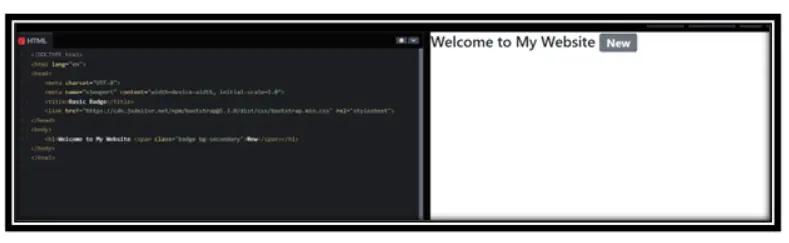
In this Example:
• The <span> tag with class=”badge bg-secondary” creates a gray badge next to the text.
• The badge makes the word “New” stand out.
2. Contextual Badges (Colored Badges)
<!DOCTYPE html>
<html lang=”en”>
<head>
<meta charset=”UTF-8″>
<meta name=”viewport” content=”width=device-width, initial-scale=1.0″>
<title>Contextual Badges</title>
<link href=”https://cdn.jsdelivr.net/npm/bootstrap@5.3.0/dist/css/bootstrap.min.css” rel=”stylesheet”>
</head>
<body>
<p>Status: <span class=”badge bg-success”>Active</span></p>
<p>Message: <span class=”badge bg-danger”>Error</span></p>
</body>
</html>
Output:
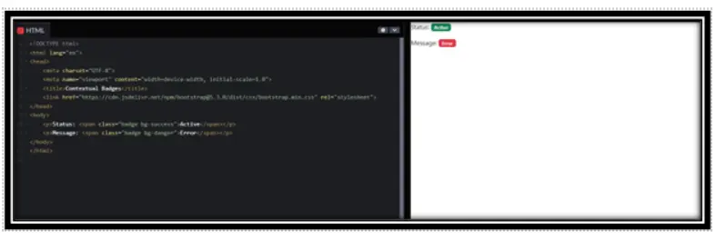
In this example:
• bg-success (green) shows success or active status.
• bg-danger (red) indicates an error or warning.
3. Pill-Shaped Badges
<!DOCTYPE html>
<html lang=”en”>
<head>
<meta charset=”UTF-8″>
<meta name=”viewport” content=”width=device-width, initial-scale=1.0″>
<title>Pill Badges</title>
<link href=”https://cdn.jsdelivr.net/npm/bootstrap@5.3.0/dist/css/bootstrap.min.css” rel=”stylesheet”>
</head>
<body>
<ul class=”list-group”>
<li class=”list-group-item”>Item 1 <span class=”badge rounded-pill bg-primary”>12</span></li>
<li class=”list-group-item”>Item 2 <span class=”badge rounded-pill bg-secondary”>8</span></li>
</ul>
</body>
</html>
Output:
In this example:
• The rounded-pill class makes the badges pill-shaped.
• The numbers inside badges show counts for each item.
4. Badges in Buttons
<!DOCTYPE html>
<html lang=”en”>
<head>
<meta charset=”UTF-8″>
<meta name=”viewport” content=”width=device-width, initial-scale=1.0″>
<title>Badge in Button</title>
<link href=”https://cdn.jsdelivr.net/npm/bootstrap@5.3.0/dist/css/bootstrap.min.css” rel=”stylesheet”>
</head>
<body>
<button type=”button” class=”btn btn-primary”>
Notifications <span class=”badge bg-light text-dark”>4</span>
</button>
</body>
</html>
Output:
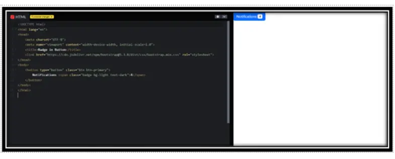
In this example
• The badge inside the button shows the number of notifications.
• bg-light makes the badge white, and text-dark makes the text dark.
Conclusion
Bootstrap Badges are useful for displaying notifications, counts, and labels. They can be used with different colors, shapes, and inside various elements like headings, buttons, and lists.
Practice Scenarios
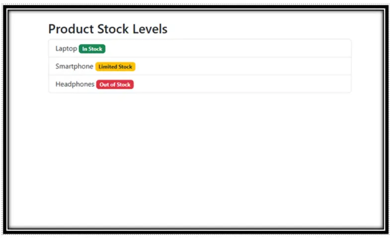
Scenario 1 :
Objective: Use different badge colors to indicate stock levels in an e-commerce product list.
Scenario 2 :
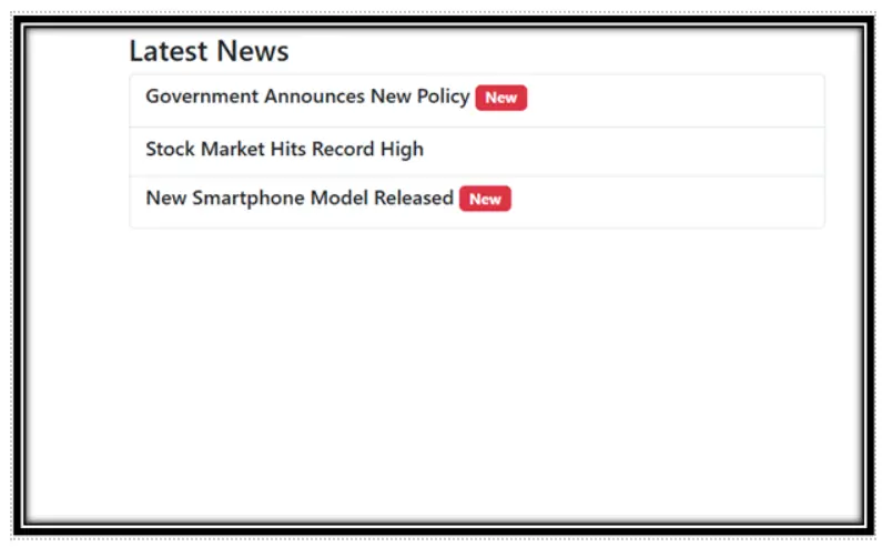
Objective: Add a “New” badge next to the latest news article title.
Expected Output:
YouTube Reference :
1) Badges to Bootstrap in Hindi/Urdu Part-1
2) Badges to Bootstrap in Hindi/Urdu Part-2
Bootstrap badges are small, customizable elements used to display counts, statuses, or additional context within a user interface.
Yes, this tutorial is offered completely free on the Iqra Technology Academy platform.
The tutorial includes how to create and style badges, examples for Bootstrap 5 badges, and best practices for using badges in web design.
The tutorial is perfect for beginners and web developers looking to learn or refine their skills in using Bootstrap badges.
Yes, the tutorial provides multiple examples, including badge styles, colors, and integration into buttons, navigation menus, and other components.
Yes, the tutorial explains how to make badges responsive for mobile and desktop environments.
Absolutely! All code snippets and examples are free for personal and commercial use.
Yes, Iqra Technology provides tutorials in both English and Hindi.
Visit the Bootstrap Badges Tutorial Page to get started.
Bootstrap badges enhance user interface design by providing a simple way to convey additional information, counts, or statuses clearly.