

Bootstrap Cards
What is a Bootstrap Card?
A Bootstrap card is like a small box where you can put text, images, buttons, and more. It is used to show different types of content clean and organized. You can use it for blog posts, product details, user profiles, etc.
1. Basic Card
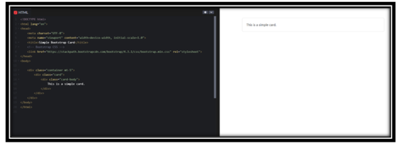
A simple card only has a body where we put some text.
Example:
<!DOCTYPE html>
<html lang=”en”>
<head>
<meta charset=”UTF-8″>
<meta name=”viewport” content=”width=device-width, initial-scale=1.0″>
<title>Simple Bootstrap Card</title>
<!– Bootstrap CSS –>
<link href=”https://stackpath.bootstrapcdn.com/bootstrap/4.3.1/css/bootstrap.min.css” rel=”stylesheet”>
</head>
<body>
<div class=”container mt-5″>
<div class=”card”>
<div class=”card-body”>
This is a simple card.
</div>
</div>
</div>
</body>
</html>
<div class=”card”>
<div class=”card-body”>
This is some text within a card body.
</div>
</div>
Output:
In this Example:
• card is the main box.
• card-body is the inside area where we write text.
2. Card with Header and Footer
This card has a title at the top (header) and extra information at the bottom (footer).
Example:
<!DOCTYPE html>
<html lang=”en”>
<head>
<meta charset=”UTF-8″>
<meta name=”viewport” content=”width=device-width, initial-scale=1.0″>
<title>Simple Bootstrap Card</title>
<!– Bootstrap CSS –>
<link href=”https://stackpath.bootstrapcdn.com/bootstrap/4.3.1/css/bootstrap.min.css” rel=”stylesheet”>
</head>
<body>
<div class=”card”>
<div class=”card-header”>Featured</div>
<div class=”card-body”>
<h5 class=”card-title”>Special Title</h5>
<p class=”card-text”>This is some text inside the card.</p>
<a href=”#” class=”btn btn-primary”>Click Me</a>
</div>
</body>
</html>
Output:
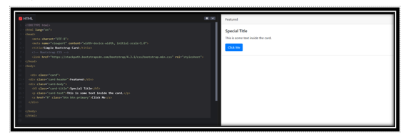
In this Example:
• card-header adds a title at the top.
• card-footer adds a note at the bottom.
• btn adds a button inside the card.
3. Card with Image
You can add an image on top of a card to make it more attractive.
Example:
<!DOCTYPE html>
<html lang=”en”>
<head>
<meta charset=”UTF-8″>
<meta name=”viewport” content=”width=device-width, initial-scale=1.0″>
<title>Simple Bootstrap Card</title>
<!– Bootstrap CSS –>
<link href=”https://stackpath.bootstrapcdn.com/bootstrap/4.3.1/css/bootstrap.min.css” rel=”stylesheet”>
</head>
<body>
<div class=”card”>
<div class=”card-header”>Featured</div>
<div class=”card-body”>
<h5 class=”card-title”>Special Title</h5>
<p class=”card-text”>This is some text inside the card.</p>
<a href=”#” class=”btn btn-primary”>Click Me</a>
</div>
</body>
</html>
<div class=”card” style=”width: 18rem;”>
<img src=”image.jpg” class=”card-img-top” alt=”Card image cap”>
<div class=”card-body”>
<p class=”card-text”>Some quick example text to build on the card and make up the bulk of the card’s content.</p>
</div>
</div>
Output:
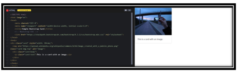
In this Example:
• card-img-top places an image at the top.
4. Grouping Multiple Cards
If you have multiple cards, you can group them together.
Example:
<!DOCTYPE html>
<html lang=”en”>
<head>
<meta charset=”UTF-8″>
<meta name=”viewport” content=”width=device-width, initial-scale=1.0″>
<title>Simple Bootstrap Card</title>
<!– Bootstrap CSS –>
<link href=”https://stackpath.bootstrapcdn.com/bootstrap/4.3.1/css/bootstrap.min.css” rel=”stylesheet”>
</head>
<body>
<div class=”card-group”>
<div class=”card”>
<div class=”card-body”>
<h5 class=”card-title”>Card 1</h5>
<p class=”card-text”>This is the first card.</p>
</div>
</div>
<div class=”card”>
<div class=”card-body”>
<h5 class=”card-title”>Card 2</h5>
<p class=”card-text”>This is the second card.</p>
</div>
</div>
</div>
</body>
</html>
Output:
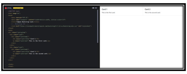
In this Example:
• card-group places multiple cards in a row.
5. Horizontal Card
AI horizontal card shows an image on one side and text on the other
Example:
<!DOCTYPE html>
<html lang=”en”>
<head>
<meta charset=”UTF-8″>
<meta name=”viewport” content=”width=device-width, initial-scale=1.0″>
<title>Simple Bootstrap Card</title>
<!– Bootstrap CSS –>
<link href=”https://stackpath.bootstrapcdn.com/bootstrap/4.3.1/css/bootstrap.min.css” rel=”stylesheet”>
</head>
<body>
<div class=”card mb-3″ style=”max-width: 540px;”>
<div class=”row no-gutters”>
<div class=”col-md-4″>
<img src=” <img src=”https://images.pexels.com/photos/414612/pexels-photo-414612.jpeg?cs=srgb&dl=pexels-souvenirpixels-414612.jpg&fm=jpg” class=”card-img” alt=”…”>” class=”card-img” alt=”…”>
</div>
<div class=”col-md-8″>
<div class=”card-body”>
<h5 class=”card-title”>Card Title</h5>
<p class=”card-text”>This is a horizontal card.</p>
</div>
</div>
</div>
</div>
</body>
</html>
Output:
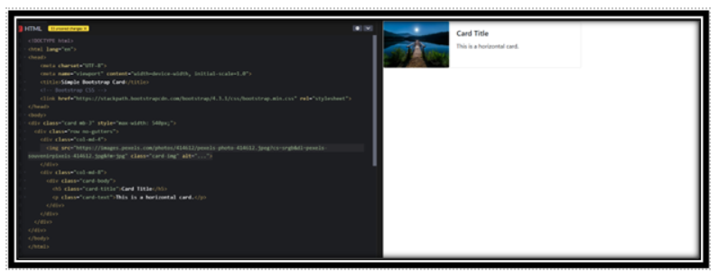
In this Example:
• row and .col-md-* help create a side-by-side layout
6. Responsive Cards
We use Bootstrap’s grid system to adjust cards based on screen size.
Example:
<!DOCTYPE html>
<html lang=”en”>
<head>
<meta charset=”UTF-8″>
<meta name=”viewport” content=”width=device-width, initial-scale=1.0″>
<title>Responsive Cards</title>
<link href=”https://stackpath.bootstrapcdn.com/bootstrap/4.3.1/css/bootstrap.min.css” rel=”stylesheet”>
</head>
<body>
<div class=”container”>
<div class=”row”>
<div class=”col-sm-12 col-md-6 col-lg-4″>
<div class=”card”>
<div class=”card-body”>
<h5 class=”card-title”>Card 1</h5>
<p class=”card-text”>This card is responsive.</p>
</div>
</div>
</div>
<div class=”col-sm-12 col-md-6 col-lg-4″>
<div class=”card”>
<div class=”card-body”>
<h5 class=”card-title”>Card 2</h5>
<p class=”card-text”>It adjusts with screen size.</p>
</div>
</div>
</div>
</div>
</div>
</body>
</html>
Output:
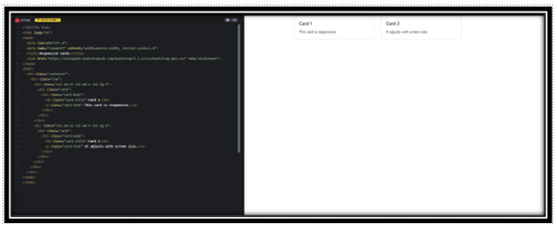
In this Example:
• col-sm-12 col-md-6 col-lg-4 makes the card size adjust for different devices.
• On small screens, each card takes full width; on medium, they take half; on large, they take one-third.
Conclusion
• Bootstrap cards help organize content neatly. You can:
• Add headers and footers.
• Include images.
• Group multiple cards.
• Make them responsive for different screen sizes.
Practice Scenarios
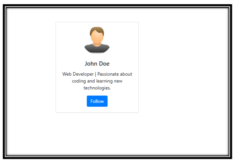
Scenario 1.
Objective: Create a card for a user profile with an image, name, and bio.
Expected Output:
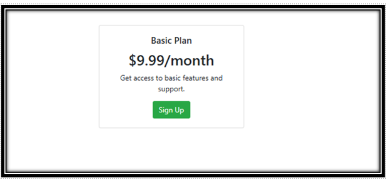
Scenario 2.
Objective: Make a pricing card that includes a title, price, and a signup button.
Expected Output:
Scenario 3.
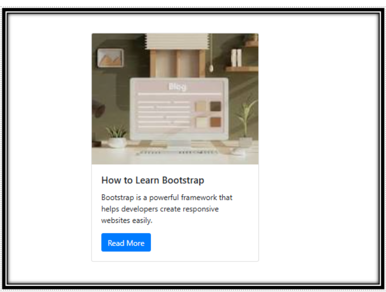
Objective: Design a blog post preview card with an image, title, and short description.
Expected Output:
YouTube Reference :
1) Cards to Bootstrap in Hindi/Urdu Part-1
2) Cards to Bootstrap in Hindi/Urdu Part-2
A Bootstrap card is a flexible and extensible content container with multiple options for headers, footers, content, colors, and much more. It can be used to create simple or complex card-based layouts. Bootstrap cards allow you to group various elements, such as images, links, text, and buttons, in a modular format.
Yes, the Iqra Technology page provides a free, step-by-step tutorial on Bootstrap Card.
Creating a Bootstrap card is easy! You simply use the .card class to structure your card container. Inside the card, you can include .card-header for the title, .card-body for the content, and .card-footer for additional information. Bootstrap’s grid system makes it simple to adjust the card’s width and layout.
To create a responsive card layout, you can utilize the Bootstrap 5 grid system. For example, you can set different card column widths depending on the screen size (like col-md-4 for medium screens, col-lg-3 for large screens, etc.). This ensures that the cards adjust to various screen sizes.
Yes, Bootstrap cards are versatile and can be used for a variety of content types, including images, text, lists, and buttons. Whether you’re designing a product listing, team member profiles, or blog excerpts, cards can neatly encapsulate your content.
You can make your Bootstrap cards interactive by adding links or buttons within the card. Use the .card-link or .card-btn classes to create clickable elements that lead to additional pages or actions. Additionally, you can add a hover effect to change the card’s appearance when the user hovers over it.
While both Bootstrap 4 and 5 offer similar card functionality, Bootstrap 5 has improved utilities and simplified the layout system. Some new features include expanded support for grid classes and enhanced customization options for spacing and alignment. Additionally, Bootstrap 5 removed jQuery, making cards lighter and faster.
.card: The outer container of the card..card-header: The top section, usually for the title or icon..card-body: The main content section of the card, where you add text, images, or other elements..card-footer: The bottom section, useful for additional information or actions like buttons or links.
Adding icons inside a Bootstrap card is straightforward. You can include icons in the card’s header or body using font libraries like Font Awesome or Bootstrap Icons. Simply add the <i> tag with the appropriate icon class inside your card.