

Top 10 Power BI Dashboards for Business Insights in 2026
Explore real, live Power BI dashboards to understand how sales, finance, operations, and SEO data is analyzed using interactive visuals.
There is a clear difference between collecting data and using it effectively. While organizations generate more data than ever, many still struggle to turn it into meaningful insights.
With increasing data volumes and evolving technologies, building a data-driven strategy requires clear and engaging reporting. Power BI dashboards simplify this by presenting data through interactive visuals, charts, reports, and graphs that make insights easier to understand.
Power BI dashboards provide a consolidated view of key metrics, helping users analyze performance, identify trends, and make faster, data-driven decisions.
What Is a Power BI Dashboard?
A Power BI dashboard is a single-page visual canvas that displays the most important business metrics in one place. It provides a high-level overview of performance and allows users to monitor key indicators at a glance.
Power BI dashboards use interactive tiles and visuals to highlight insights from one or multiple data sources. They refresh automatically as data updates, helping organizations track trends, identify issues, and make informed, data-driven decisions.
How Businesses Use Power BI Dashboards for Better Decision-Making
Power BI dashboards are widely used by executives, managers, analysts, and operational teams to support strategic and day-to-day decision-making. Many organizations adopt dashboards through Power BI implementation services to ensure proper data integration, governance, and long-term scalability.
Organizations commonly use Power BI dashboards to:
- Track sales and revenue performance
- Monitor budgets, profitability, and financial forecasts
- Improve customer and CRM insights
- Optimize inventory, operations, and projects
- Analyze digital performance through marketing and SEO dashboards
By transforming raw data into actionable insights, Power BI dashboards help businesses make faster and smarter decisions.
Top 10 Power BI Dashboards for Business Insights in 2026
1. Sales Dashboard
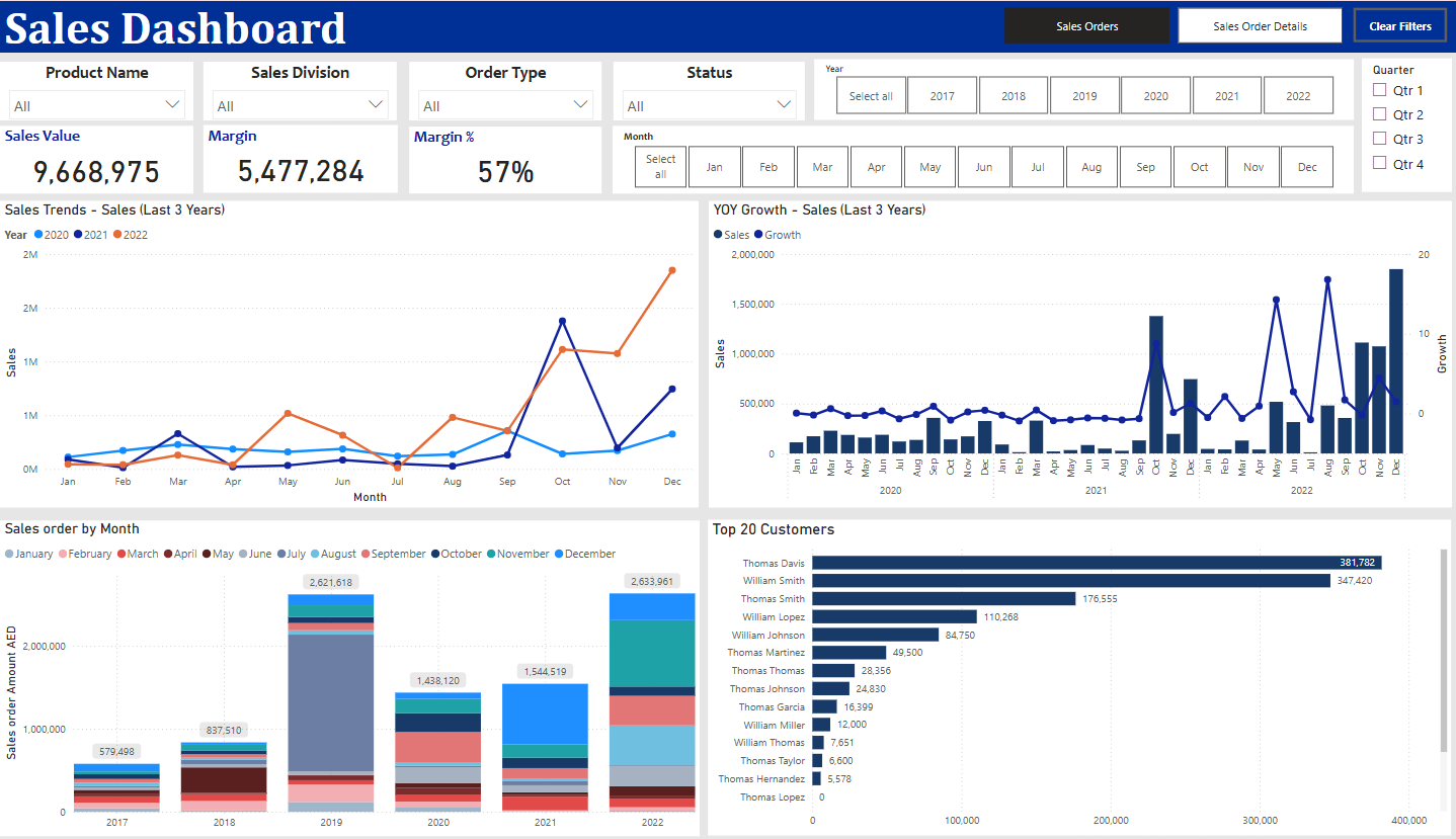
What is the Sales Dashboard?
The Sales Dashboard in Power BI provides a clear and interactive view of sales performance and business growth. It helps organizations track revenue, profitability, and customer contribution in a single dashboard, making it easy to identify trends and evaluate performance across time periods.
What does this dashboard do?
This Sales Dashboard helps businesses to:
- Monitor overall sales performance and revenue growth
- Track profitability using margin and margin percentage
- Analyze sales trends across multiple years
- Measure year-over-year (YoY) sales growth
- Identify top customers contributing to revenue
What does the dashboard show?
The dashboard highlights key sales metrics and trends through interactive visuals, including:
- Sales Value – Displays the total revenue generated during the selected period
- Margin and Margin % – Shows the profitability and efficiency of sales performance
- Sales Trends (Last 3 Years) – Visualizes long-term sales performance to identify growth patterns and seasonality
- Year-over-Year (YoY) Growth – Compares current sales with previous years to measure business growth
- Sales Order by Month – Breaks down sales performance on a monthly basis for better trend analysis
- Top 20 Customers – Identifies the highest revenue-generating customers and their contribution
2. Sales Pipeline Dashboard
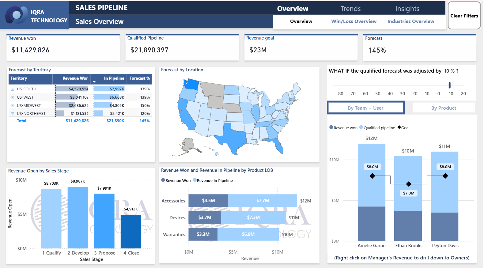
What is the Sales Pipeline Dashboard?
The Sales Pipeline Dashboard in Power BI provides a structured view of sales opportunities across different stages of the sales funnel. It helps sales teams track deal progress, pipeline health, and expected revenue, making it easier to monitor performance against targets.
What does this dashboard do?
This Sales Pipeline Dashboard helps businesses to:
- Track sales opportunities across pipeline stages
- Monitor progress toward revenue goals
- Analyze pipeline strength and forecast accuracy
- Identify bottlenecks or stalled deals
What does the dashboard show?
The dashboard highlights key pipeline and forecasting metrics, including:
- Revenue Won, showing closed deals
- Qualified Pipeline, representing active opportunities
- Revenue Goal, indicating sales targets
- Forecast Percentage, showing expected revenue achievement
- Revenue Open by Sales Stage, showing deal status
- Forecast by Territory and Location, providing geographic insights
- What-If Forecast Adjustments, enabling scenario-based forecasting
3. Financial Dashboard
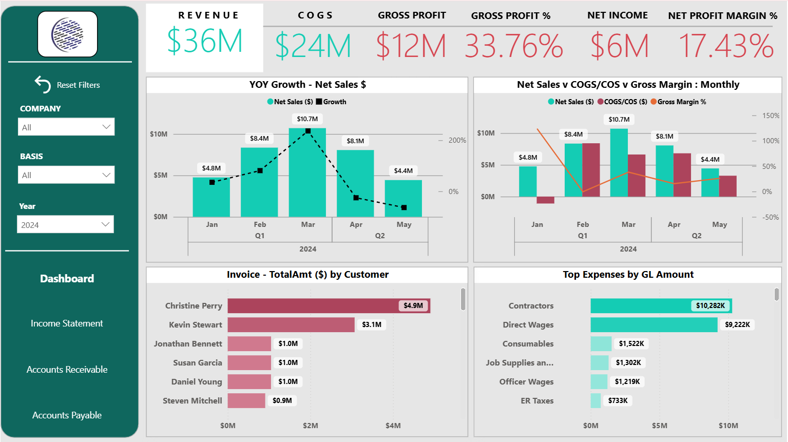
What is the Financial Dashboard?
The Financial Dashboard in Power BI provides a consolidated and interactive view of an organization’s financial performance. It helps businesses monitor overall financial health by tracking revenue, profitability, and expenses in a single dashboard.
What does this dashboard do?
This Financial Dashboard helps businesses to:
- Monitor overall financial performance and profitability
- Track revenue, costs, and margins over time
- Analyze year-over-year financial growth
- Identify major cost drivers and expense categories
What does the dashboard show?
The dashboard highlights key financial metrics and trends, including:
- Revenue and COGS, showing income and cost structure
- Gross Profit and Gross Profit %, indicating operational efficiency
- Net Income and Net Profit Margin %, reflecting overall profitability
- YOY Growth – Net Sales, tracking financial growth trends
- Net Sales vs COGS/COS vs Gross Margin % (Monthly), enabling cost and margin comparison
- Invoice – Total Amount by Customer, identifying major revenue contributors
- Top Expenses by GL Amount, highlighting primary expense drivers
4. Profit & Loss (P&L) and Balance Sheet Dashboard
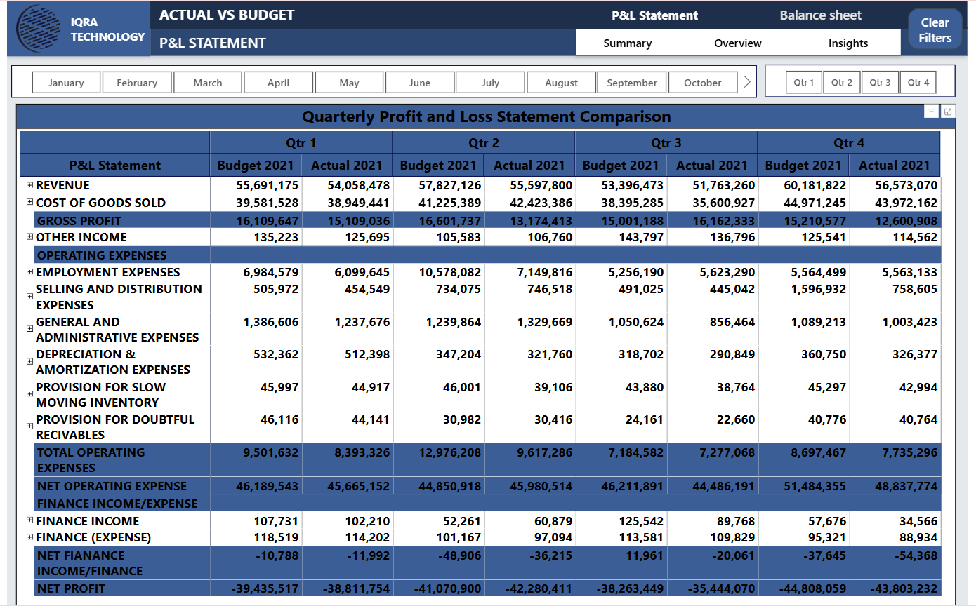
What is the P&L and Balance Sheet Dashboard?
The Profit & Loss (P&L) and Balance Sheet Dashboard in Power BI provides a structured view of an organization’s financial statements through an Actual vs Budget comparison. It helps businesses evaluate profitability, expenses, and overall financial performance across monthly and quarterly periods.
What does this dashboard do?
This P&L and Balance Sheet Dashboard helps businesses to:
- Compare actual financial results against budgeted values
- Track profitability and expense performance over time
- Identify variances across revenue and cost categories
- Support budgeting, forecasting, and financial planning
What does the dashboard show?
The dashboard presents detailed financial statement insights, including:
- Revenue and Cost of Goods Sold (COGS) for performance comparison
- Gross Profit and Other Income, highlighting profitability
- Operating Expenses, broken down into detailed categories
- Quarterly Profit and Loss Statement Comparison, showing Budget vs Actual values
- Month and Quarter Filters, enabling focused financial analysis
5. Actual vs Budget Dashboard
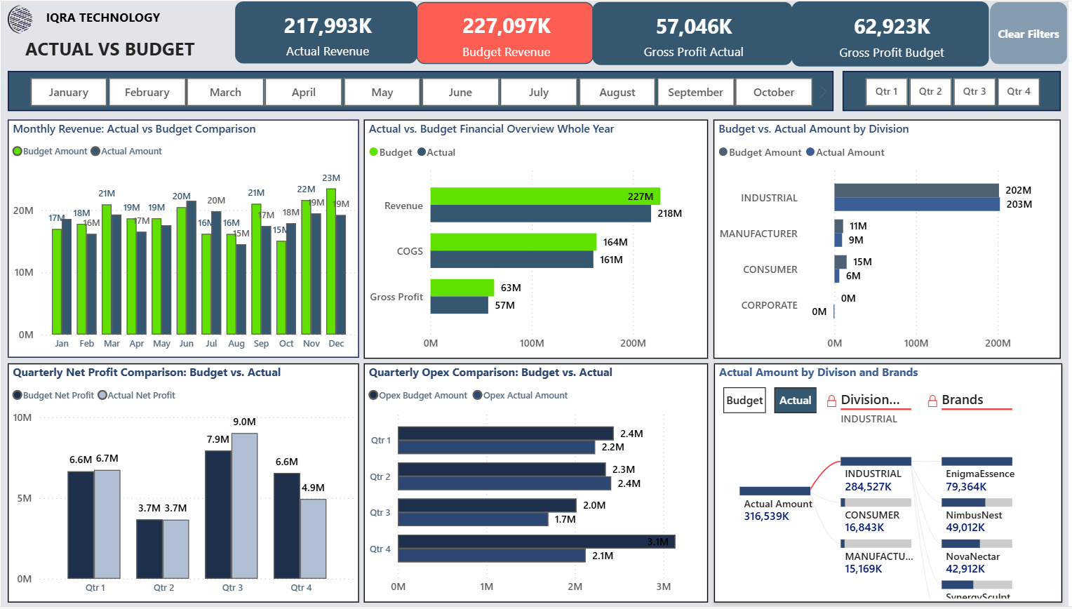
What is the Actual vs Budget Dashboard?
The Actual vs Budget Dashboard in Power BI provides a clear comparison between planned financial targets and actual business performance. It helps organizations understand how revenue, profitability, and expenses are tracking against budgets across different time periods.
What does this dashboard do?
This Actual vs Budget Dashboard helps businesses to:
- Compare actual financial results with budgeted targets
- Identify revenue and cost variances
- Monitor profitability performance over time
- Support financial control and budgeting decisions
What does the dashboard show?
The dashboard highlights key budget-to-actual insights, including:
- Actual Revenue vs Budget Revenue, showing performance gaps
- Gross Profit Actual vs Gross Profit Budget, tracking profitability variance
- Monthly Revenue: Actual vs Budget Comparison, identifying monthly trends
- Actual vs Budget Financial Overview (Whole Year), summarizing annual performance
- Budget vs Actual Amount by Division, comparing departmental results
- Quarterly Net Profit and Opex Comparison, supporting variance analysis
- Actual Amount by Division and Brands, identifying major contributors
6. Customer Aging Dashboard
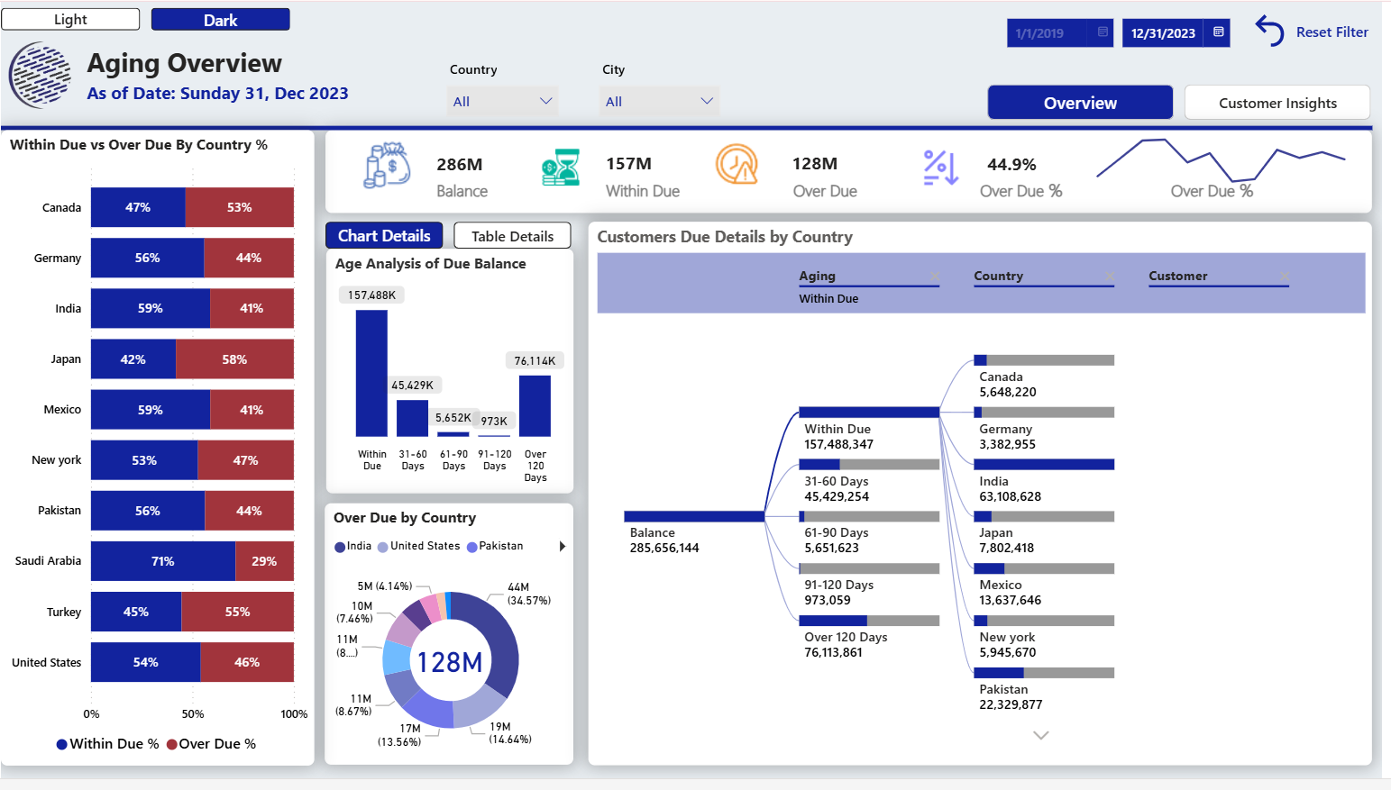
What is the Customer Aging Dashboard?
The Customer Aging Dashboard in Power BI provides a detailed view of receivables by tracking customer balances and overdue payments across different aging periods. It helps finance teams understand payment status and monitor outstanding dues effectively.
What does this dashboard do?
This Customer Aging Dashboard helps businesses to:
- Monitor receivables and overdue balances
- Track payment status across aging periods
- Identify high-risk and overdue customer accounts
- Support better cash flow management and collections
What does the dashboard show?
The dashboard highlights key receivables insights, including:
- Balance, Within Due, Over Due, and Over Due %, summarizing receivables health
- Within Due vs Over Due by Country %, showing regional payment behavior
- Age Analysis of Due Balance, categorizing overdue amounts by time buckets
- Over Due by Country, identifying regions with higher overdue concentration
- Customer Due Details by Country, highlighting high-risk customers
7. CRM Dashboard
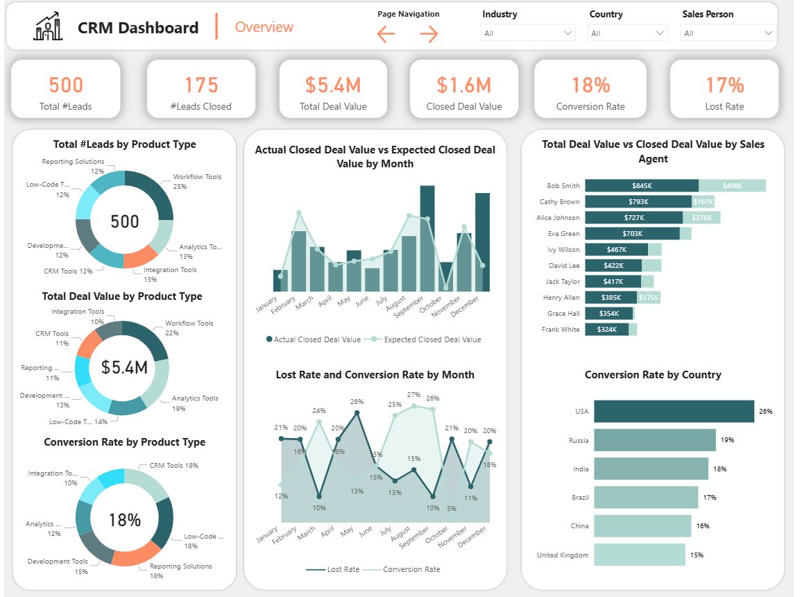
What is the CRM Dashboard?
The CRM Dashboard in Power BI provides a comprehensive view of lead and deal performance across the sales pipeline. It helps sales and marketing teams track leads, monitor deal progress, and evaluate conversion effectiveness across products, agents, and regions.
What does this dashboard do?
This CRM Dashboard helps businesses to:
- Monitor lead generation and deal closure performance
- Track conversion and lost rates
- Evaluate sales pipeline effectiveness
- Analyze sales productivity across agents and regions
What does the dashboard show?
The dashboard highlights key CRM and sales metrics, including:
- Total Leads and Leads Closed, showing pipeline volume and success
- Total Deal Value and Closed Deal Value, tracking revenue potential and realized revenue
- Conversion Rate and Lost Rate, measuring sales effectiveness
- Leads and Deal Value by Product Type, identifying high-performing offerings
- Actual vs Expected Closed Deal Value by Month, tracking performance trends
- Deal Value vs Closed Deal Value by Sales Agent, evaluating individual performance
- Conversion Rate by Country, showing regional effectiveness
8. Inventory Dashboard
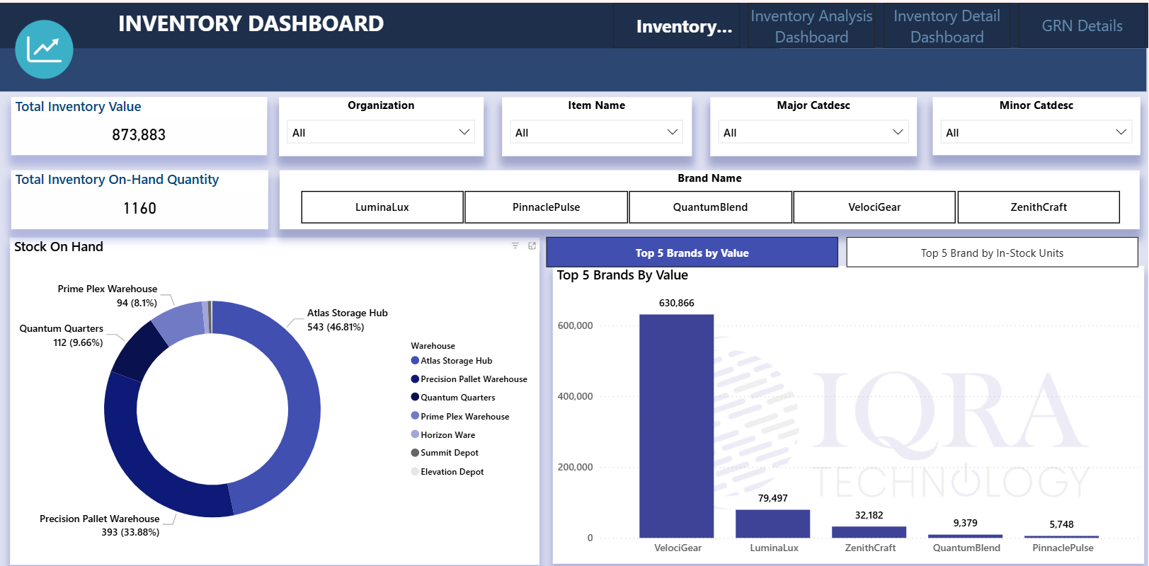
What is the Inventory Dashboard?
The Inventory Dashboard in Power BI provides a clear operational view of stock availability and inventory valuation across products, brands, and warehouse locations. It helps organizations monitor inventory health and make informed supply chain decisions.
What does this dashboard do?
This Inventory Dashboard helps businesses to:
- Track inventory value and on-hand quantity
- Monitor stock distribution across warehouses
- Identify high-value and fast-moving brands
- Support inventory control and stock optimization
What does the dashboard show?
The dashboard highlights key inventory metrics and insights, including:
- Total Inventory Value, showing overall stock valuation
- Total Inventory On-Hand Quantity, indicating available units
- Stock On Hand by Warehouse, showing distribution across storage hubs
- Top 5 Brands by Value, identifying high-value inventory
- Top 5 Brands by In-Stock Units, highlighting volume-based leaders
9. Project Management Dashboard
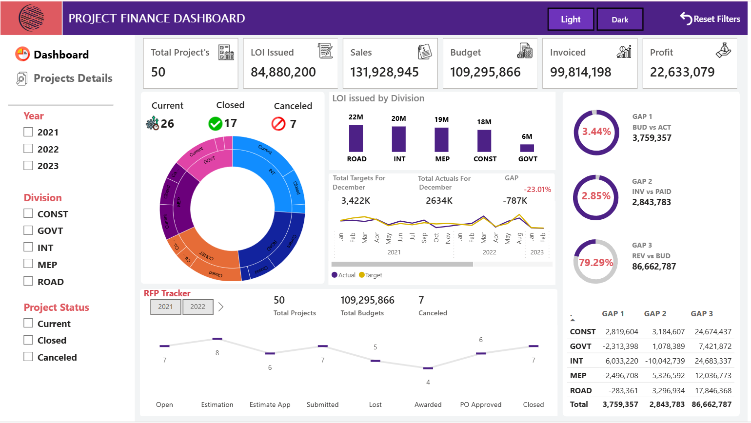
What is the Project Management Dashboard?
The Project Management Dashboard in Power BI provides a consolidated view of project execution and financial performance. It helps teams track project progress, monitor financial outcomes, and evaluate division-wise performance across the project lifecycle.
What does this dashboard do?
This Project Management Dashboard helps businesses to:
- Monitor project progress and completion status
- Track financial performance across projects
- Evaluate division-wise contribution and outcomes
- Identify performance gaps and risks early
What does the dashboard show?
The dashboard highlights key project and financial insights, including:
- Total Projects, LOI Issued, Sales, Budget, Invoiced, and Profit, summarizing overall performance
- Project Status Distribution (Current, Closed, Canceled), showing workload and completion trends
- LOI Issued by Division, highlighting pipeline strength
- Targets vs Actuals, supporting performance tracking
- RFP Tracker, monitoring project pipeline stages
- Financial GAP Indicators (Budget vs Actual, Invoice vs Paid, Revenue vs Budget), identifying performance variances
10. Google Analytics SEO Dashboard
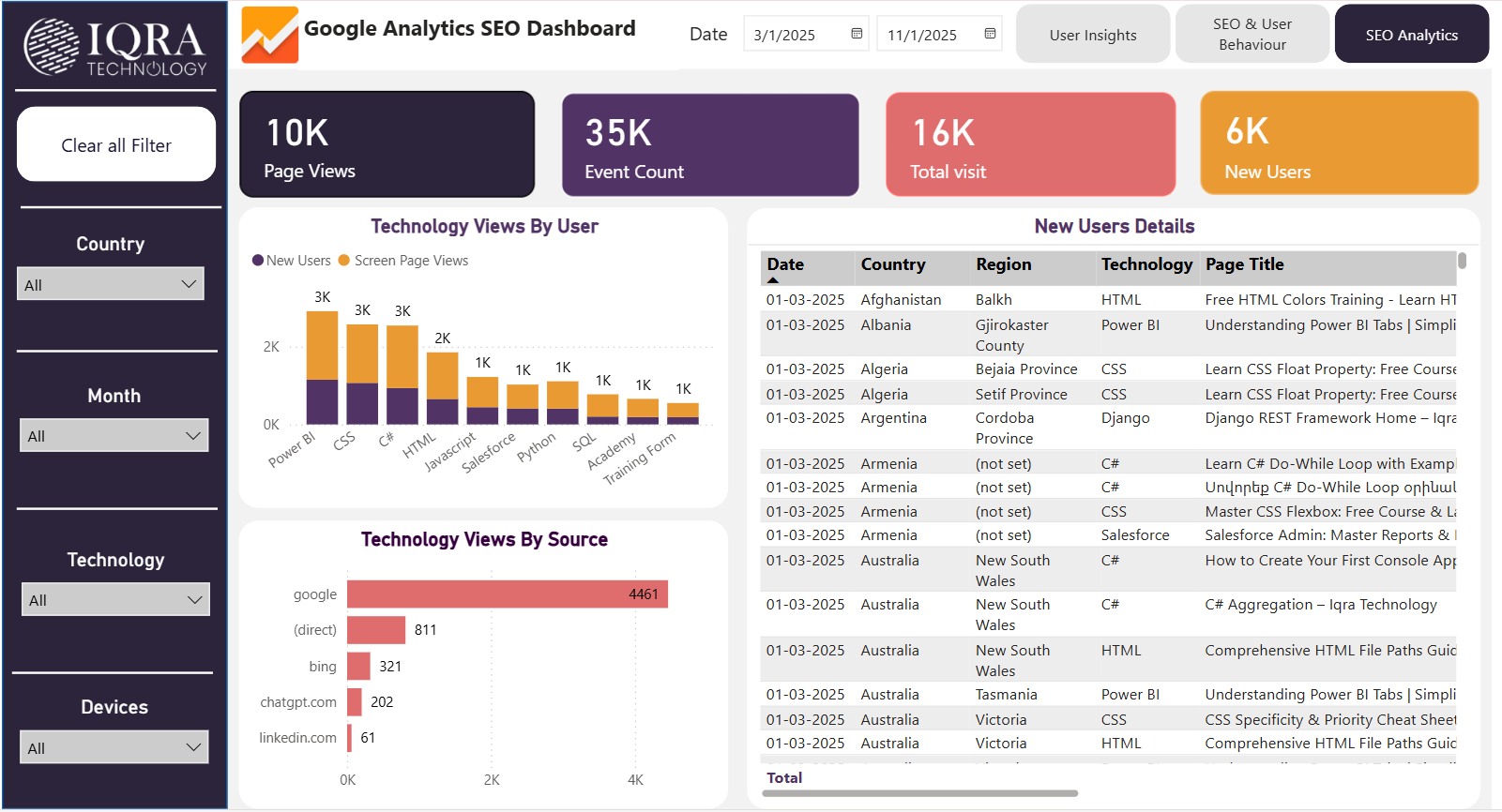
What is the Google Analytics SEO Dashboard?
The Google Analytics SEO Dashboard pulls data directly from Google Analytics and transforms it into an interactive, customizable dashboard. It provides a clear visual representation of website performance, user behavior, and traffic trends, enabling organizations to understand how users interact with their website and assess the effectiveness of their SEO strategies.
The data used in this dashboard is sourced directly from Google Analytics, including website traffic, user sessions, events, geographic locations, and device insights.
What does this dashboard do?
This SEO Dashboard helps businesses to:
Monitor overall website traffic and user engagement
Track new user growth over time
Analyze performance by geography and device type
Measure the impact of SEO and digital marketing initiatives
What does the dashboard show?
The dashboard highlights key website and SEO metrics, including:
Page Views, Event Count, Total Visits, and New Users to summarize overall website activity
New Users by Month to identify traffic and growth trends
Top Countries and Regions by New Users to pinpoint high-performing locations
New Users by Country (Map View) to visualize global audience distribution
Interactive filters by Country, Month, Technology, and Devices for deeper, more focused analysis
The Iqra Technology Advantage: Tailored Power BI Solutions
Outsourcing Power BI to Iqra Technology provides organizations with expert guidance and customized analytics solutions designed to meet specific business needs. Our approach focuses on transforming data into clear, actionable insights that support better decision-making.Our Power BI services include:
- Custom Dashboard Development – Designing interactive Power BI dashboards and reports aligned with your key performance indicators (KPIs).
- Data Integration – Connecting multiple data sources to eliminate data silos and enable seamless, unified reporting.
- Power BI Consulting – Helping organizations identify the right metrics and align analytics with business objectives.
- Ongoing Support and Optimization – Continuously enhancing dashboards to ensure accuracy, performance, and scalability.
- Data Governance and Security – Implementing best practices for data access control, compliance, and protection.
Conclusion
As businesses continue to rely heavily on data in 2026, Power BI dashboards have become essential for converting raw information into meaningful insights. The dashboards covered in this blog show how organizations can monitor performance across sales, finance, operations, projects, inventory, CRM, and digital marketing from a single, interactive platform.
By providing real-time visibility, trend analysis, and clear KPI tracking, Power BI dashboards enable faster decision-making, better planning, and improved operational efficiency. When designed around business goals and integrated with the right data sources, these dashboards help organizations stay agile, competitive, and truly data-driven in an evolving business landscape.
Start Your Power BI Journey with Iqra Technology
Partner with Iqra Technology to unlock actionable insights, maximize return on investment (ROI), and streamline decision-making through data-driven reporting. With proven expertise in delivering Power BI solutions across industries, we help organizations build scalable dashboards and advanced analytics tailored to their business requirements.
Businesses can also hire Power BI developers from Iqra Technology to design, optimize, and maintain robust Power BI dashboards that convert raw data into measurable business outcomes.Contact us today to accelerate your analytics journey and turn data into results.
The top 10 Power BI dashboards commonly used by businesses include sales dashboards, sales pipeline dashboards, financial dashboards, P&L and balance sheet dashboards, actual vs budget dashboards, customer aging dashboards, CRM dashboards, inventory dashboards, project management dashboards, and SEO dashboards built using Google Analytics.
You can find real-world examples of the top Power BI dashboards in this article, along with access to actual live Power BI dashboard demos that show how these dashboards work with interactive visuals and real data.
Yes, the dashboards featured in this blog are based on real use cases, and live Power BI dashboard demos are available so users can explore how the dashboards function in real-time.
Viewing a live Power BI dashboard demo helps you understand how data is visualized, how filters and interactions work, and how businesses use dashboards for real decision-making beyond static screenshots.
Yes, these Power BI dashboard examples can be customized based on your business goals, data sources, and reporting needs. Organizations often use these examples as a reference when building their own dashboards.
Yes, the top 10 Power BI dashboards covered in this article are used across multiple industries, including sales, finance, operations, manufacturing, services, and digital marketing.
Power BI dashboards provide interactive, real-time insights and a consolidated view of key metrics, making them more effective than static reports for monitoring performance and supporting data-driven decisions.
Sales, financial, actual vs budget, CRM, project management, and SEO dashboards provide clear visibility into performance, growth, and risks.
Management teams typically rely on financial dashboards, P&L dashboards, sales performance dashboards, and project management dashboards.
Examples include sales dashboards, pipeline dashboards, finance dashboards, customer aging dashboards, CRM dashboards, inventory dashboards, and Google Analytics SEO dashboards.
The right dashboard depends on your goals, KPIs, and data sources. Many businesses start with sales and financial dashboards.
Common KPIs include revenue, profit margins, growth rates, budget vs actuals, customer performance, inventory levels, project progress, and website traffic.
There is no fixed number of dashboards a business must have in Power BI. The ideal number depends on business size, data maturity, and reporting needs. Most organizations start with core dashboards for sales and finance and gradually expand to additional dashboards for operations, inventory, projects, CRM, and leadership as analytics requirements grow.
Yes, Power BI dashboards can replace many traditional Excel reports by automating data updates and providing interactive, real-time insights. Unlike Excel, Power BI dashboards reduce manual effort, minimize errors, and allow users to explore data dynamically through filters and drill-downs.
Power BI supports scheduled and near real-time data refresh, making dashboards suitable for monitoring live business performance. This allows organizations to track KPIs, detect issues early, and respond quickly to changing business conditions.
Yes, Power BI dashboards can connect to both cloud-based and on-premise data sources. Using secure gateways, businesses can integrate databases, ERP systems, CRM tools, and cloud platforms into a single, unified reporting environment.
A Power BI dashboard is a single-page view that highlights key KPIs and high-level metrics, while a Power BI report contains multiple pages with detailed analysis, drill-downs, and deeper interactivity. Dashboards are typically used for quick monitoring, while reports support detailed analysis.
Yes, Power BI dashboards are designed to be user-friendly and accessible to non-technical users. Beginners can easily interact with visuals, apply filters, and explore insights without needing advanced data or technical skills.
Live Power BI dashboard demos are extremely useful because they help businesses understand real-world dashboard functionality, interactivity, and data flow. Demos also allow stakeholders to validate requirements and visualize how dashboards will support decision-making before development begins.
In 2026, businesses face increasing data volumes and faster decision cycles. Power BI dashboards help organizations gain real-time visibility, align teams around key metrics, improve operational efficiency, and make informed, data-driven decisions in a highly competitive environment.